UPDATE (May 13, 2011 – 11:36 am ET): It appears this logo is a Photoshopped attempt and/or fantasy to complete the logo shown in the video clips – while it’s possible this is close to what the logo may end up looking like – this is not a leaked image, my apologies for posting this bogus story
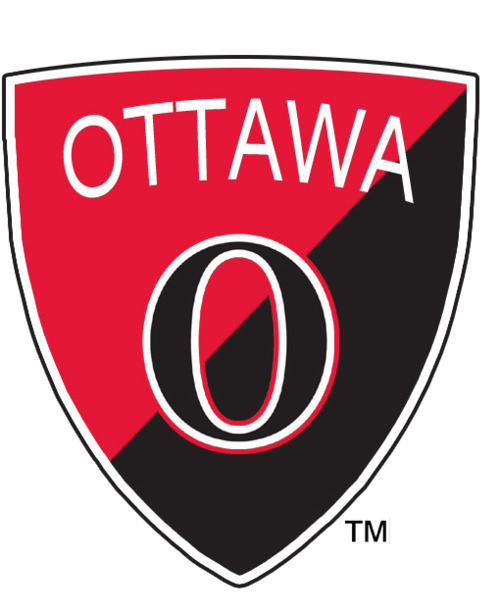
Courtesy a post on The Shark Tank, a new third-jersey logo of the Ottawa Senators for 2011-2012 has been leaked:
“So I know a little birdie at Reebok. No Names, nothing. Im just the messenger.
So the little birdie at Reebok sent me this.
This is the shield on the O jersey next season!!!!
When he sent me this, I was like FREAKIN SWEET! NO ONE ELSE HAS RELEASED THIS!”
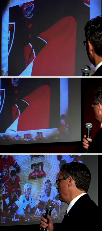
The logo is very consistent with the teaser-graphics the Ottawa Senators had shown earlier this year.
Borrowing elements from the logo of the original Ottawa Senators NHL franchise, the black O graphic was worn on the chest of the previous franchise from 1917-1934 before the club relocated to St. Louis where it was never heard from again. Four Stanley Cup Championships were won while the early Senators wore this symbol on their chest.
The new Ottawa Senators alternate jersey appears to be black (not barber-pole) with red sleeves and this O-shield logo on the upper-left of the chest. The team is looking into it’s deep, disconnected past as a part of the 20th anniversary celebrations for the franchise which includes hosting the 2012 NHL All-Star Game.
This new jersey thankfully replaces the current black “SENS” alternate uniform the club has been sporting the last three seasons.


