
On Wednesday, September 28, 2011 the Florida Marlins take the field for the final time. Never again will we see the flying marlin through the silver circle on an orange-stitched baseball logo that was so familiar to us over the course of nineteen Major League Baseball seasons.
We here at SportsLogos.Net will miss this identity (especially knowing what’s replacing it)… to help us all move on we have here the story of how the Florida Marlins name and logo came to be and how it changed over the years as well as a look at some of the historical moments this branding was there for.

“We never had any thought of calling it Miami” – Marlins owner Wayne Huizenga, 7/5/1991
It was the Summer of 1991 and baseball fans all over South Florida were clear, “we want our new team to be called Miami!” A phone-in poll to the Miami Herald showed 88% of fans wanted “Miami”, while only 1% liked “Florida”; the powers-that-be, however, wanted to go with “South Florida” despite Major League Baseball’s opposition.
Then-owner Wayne Huizenga explained their reasons for going against the popular opinion:
“There’s nothing wrong with Miami but from day one we were going with ‘South Florida’, once word came out we’d be the only one in the state we had the opportunity to use ‘Florida’. Now we have the opportunity to take advantage of the whole state, by the time the next team comes we’ll have already gotten some of those fans to be our fans.”

Going against the popular choice continued when it came time for the name-the-team contest, with the majority of the 17,439 entries requesting “Miami Manatees”, Huizenga was a fan of the name “Florida Flamingos” and was all set to introduce pink to the professional sports world.
This is where Anne Occi, someone we all owe a debt of gratitude to, stepped in to talk some sense into Mr. Huizenga. Anne was the design director of Major League Baseball Properties, who since 1990 had been taking care of league designs such as the World Series and All-Star Game logos, as well as acting on a consulting basis to teams seeking a new identity. While consulting Huizenga and friends, Occi suggested that perhaps America wasn’t ready for a pink baseball team, at least not yet.

Anne had noticed teal (or aqua) was quickly becoming a “hot” colour in the sports world, the NBA’s Charlotte Hornets and NHL’s San Jose Sharks were both selling well and it tied in nicely with the colours of Miami – the teal of the ocean, the teal city fountains and one of those other names Huizenga was considering (other than Flamingos), “the Marlins”, just happened to be a fish that is teal coloured. What a rare opportunity to capitalize on an upward trend, you know… legitimately.
On July 5th, 1991 it was announced the team would take the field in 1993 as the Florida Marlins, Huizenga explained why they chose the name:
“The marlin is slick, powerful, alert, agile and proud. It’s a fierce fighter, and an adversary that tests your mettle. It can shake itself loose just when you think it’s in trouble.”
Despite being the name of a few of Miami’s former minor-league teams, “Marlins” was suggested by only 1.7% of all those who entered; when you factor in that “Florida” was favoured by 1% of phone-in voters “Florida Marlins” was certainly not the most popular choice for a name at the time.
Next up was the logo. The design process involved Wayne Huizenga and his fishingboat captain nephew Ray Goldsby-Huizenga relaying their wishes to Anne Occi who would then direct Boston based designer Jamie Styles at the firm Midnight Oil to bring their collaborated vision to life; teal and orange were the original colours, black and silver were added on Occi’s advice as they are “hot matching colours which accent the primary colour of aqua (teal).”
The team logo was unveiled on July 18, 1991.

While other teal-rich teams in San Jose and Charlotte were at the top of their respective league sales charts the Marlins didn’t quite have the same success, Florida made it as high as 8th place in the 28-team league the summer before their first season began.
The club took the field for the first time on April 5, 1993 introducing the baseball world to teal in a bold way with 45-year-old knuckleballer Charlie Hough on the hill wearing a teal cap and a white uniform with teal pinstripes and ‘Marlins’ across the front in, you guessed it, teal.

The club stuck with their mostly teal look for three seasons before society’s tastes changed in favour of darker, more conservative colours.
In 1996 black replaced teal as the main colour – black caps, black sleeves but teal still survived as the main colour on the team script and the pinstripes. Maybe it was the change in uniforms, maybe it was the sudden surge of talented players, one can never be sure, but the season after the teal was toned back the Florida Marlins stunned the world and won the World Series in only their fifth season.

What followed that World Championship is probably better left unsaid *cough*worst record in MLB history for a defending World Series champion (54-108)*cough*, sorry that’s a nasty cold I’m fighting.
Fast forward five seasons and Jeffrey Loria has absolutely destroyed the fan base in Montreal, at first opportunity he bails on his sinking ship for South Beach purchasing the Marlins and taking his entire front office and coaching staff with him. Shortly after Loria takes ownership of the team the teal was demoted to nothing more than a trim colour with black now the absolute main colour on uniforms and orange sneaking in there, not on-the-field but off-the-field in the Florida Marlins marketing materials.

As if history repeated itself, as the club reduces it’s use of teal it suddenly starts winning, their first season in mostly black outfits, the Marlins – just 5 years removed from a 108-loss season, win the 2003 World Series.
Again, what followed that championship season is not important to this article.
From 2003 up until September 28, 2011 the Florida Marlins identity remained relatively in tact, in 2009 the road uniforms were switched from “Florida” to “Marlins” signalling the beginning of the end for this identity as the first sign of the change from “Florida” to “Miami” for 2012.
How will this logo be remembered? Ultimately in the historic moments it was a part of:
- It was the logo worn by the 1997 and 2003 World Series Champions
- Four no-hitters were thrown by players wearing this logo
- Hall-of-Famer Andre Dawson wore this logo his last two seasons (1995-96)
- Luis Castillo got a hit in 35-consecutive games wearing this logo in 2002
- The Montreal Expos in their last home game, lost 9-1 vs players in this logo in 2004
- Ken Griffey Jr hit his 600th career home run off a pitcher wearing the logo
- Roy Halladay retired 27 straight hitters who were wearing this logo in his perfect game in 2010
- The Marlins won 1435 and lost 1574 while this was their logo
- Dan Uggla hit the most home runs of any player wearing this logo with 154
- Luis Castillo played 1,128 games over ten seasons for this logo, more than any other
- Dontrelle Willis won the most games (68) in this logo from 2003-07
On November 11, 2011 the Florida Marlins will officially be completely re-branded in black and orange as the Miami Marlins.
Related stories:
 Marlins Throwing Back to the 90s For Three
 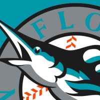 Report: Marlins In Teal Again in 2019 A Teal Treat: Marlins Throw Back to 1993 This Weekend
  Miami Marlins are going Back to the Future with season-long promotion
  Baseball’s Leapin’ Logos My Twelve Days of Baseball Gifts
  Jays, Marlins 2012 Logos Leaked