
When I saw the attachments in my email – the new Toronto Blue Jays logos – and the first thought in my mind was… well, it was something I’m not sure is fit for “print” on this website. I’m still new here and I don’t want to ruffle any feathers. But let’s just say I’m a little tired of feathers. Blue ones, at least.
Do you know how many foods are actually blue in nature? Start at zero and work your way down. Yeah, yeah, “blueberries.” They are sorta blue the way my legs are sorta purple when I get a bad sunburn. Top it off with the fact that I’ve also got to figure out a way to incorporate text, two thin circular strokes, and a lot of baseball stitches. If I was born after 1986, my second thought would have been “L. O. L.” (In reality, my second thought was more profane language.)
I’d eliminate the minutiae and design the logo proper out of food, fighting the evil blue machine once more. It’s not like I wrap Christmas gifts twice, wear anything under my pants/shorts, or need to see the words TORONTO BLUE JAYS wrapped around a Toronto Blue Jays logo.
And I will eliminate all that, but the last thing I want to hear is someone telling me, “Oh, that was too difficult for you? I understand.” Damn you, hubris.
If I was going to go bananas with this thing with less than a week to experiment, I needed to use agreeable food, products that would shape easily. It’s like shooting a rocket filled with astronauts into the stratosphere – without any of the pesky cultural, scientific or technological implications in the way – there is only one chance to get it right.
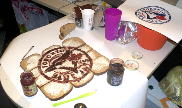
A blueberry jam, although more purple than blue, might suffice. And if I start there, a red jelly wouldn’t be hard to find. I could recreate the process of the Ottawa Senators PB&J logo I made in February and build this Jays piece on bread.
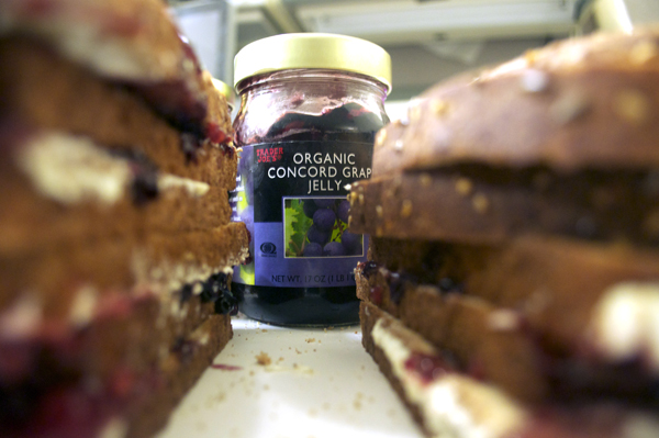
I refuse to eat white bread though (I rarely eat ANY bread at all, to be honest), and I’m certainly not going to start wasting food now, so I studied bread labels for about twenty minutes in Trader Joe’s, and settled on a brown, fiber-infused multigrain loaf. I’m a marathon runner, I told myself. I’ll just have to run a few extra miles this week.
My high maintenance eating habits meant MORE extra work, because there’s no way I’m putting off-color “blue” jam onto a brown base and calling it the Blue Jays logo. (Hmm… this MIGHT work for the Padres…)
Enter the cream cheese.
Slathered on, I added my jams, and fought with the letters (they aren’t perfect) and stitches (acceptable!) to bring you this:
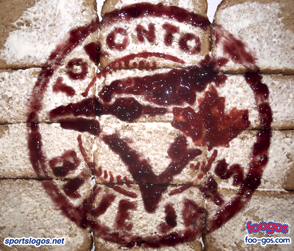
This is a good example of why I need to play around a few times before getting a logo down pat. The jelly wasn’t as firm as I’d hoped, and it ran rampant in a few places. I’ve come up with a simple solution to revisit this at a later date, and it’s to slather on A LOT of cream cheese first, which will sit in place, and form a negative space of shapes which I can simply fill in with the appropriate jams. I could probably do it with or without the tiny flourishes and details.
Still, overall, I’m okay with this one. It’s better than my first Blue Jays attempt in the summer.
Related stories:
 New York Knicks Dump Throwback Uniforms Plus A Look Back at Other Scrapped Sets
  Blue Jays to Retire Number, Wear Patch for Roy Halladay
  Stroman Sports New Jays Anniversary Patch in Promo
  Updates on New MLB BP Caps Plus Lots of Photos
  New MLB Uniforms… In-Action!
  Foogos: The Miami Marlins Logo Made out of Food Sportsnet Shows Parody Alomar Plaque in Promo
  A not-so-Heritage Classic (the uniforms, that is)