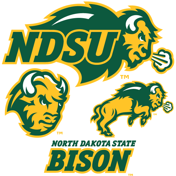
North Dakota State consolidates its two dozen logos into 3 solid new versions.
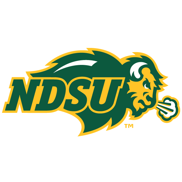
NDSU had the same problem a lot of athletic departments have; too many versions of their logo out there, resulting in an unclear, jumbled, confusing identification of their teams. They brought in Joe Bosack Graphic Design, who sorted through the mess and created three marks for NDSU, associated wordmarks, and a custom typeface.
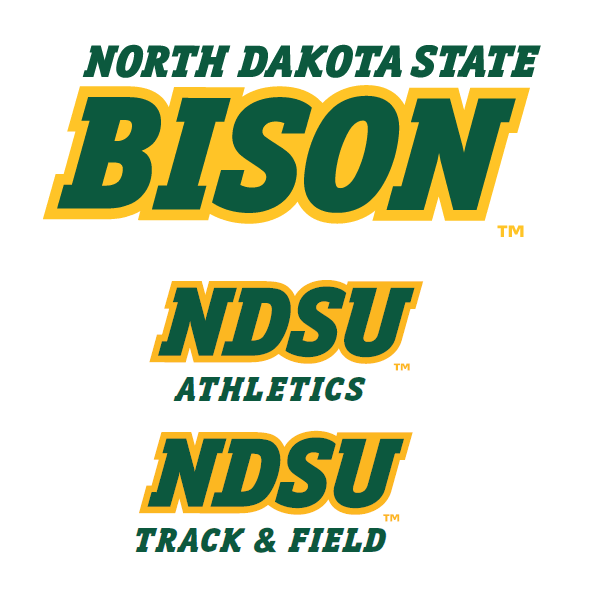
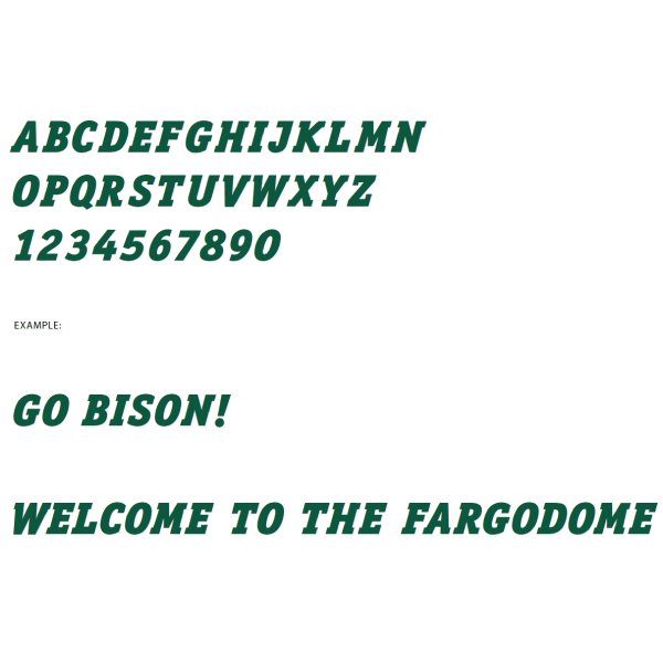
Logos previously created by Flint Communications and later CI Sport were used, slightly tweaked, and colors consolidated to team colors of green and gold. The custom typeface, titled “Bison Bold” will be used in athletic department communication as a titling header font, and to distinguish sports.
NDSU associate athletic director Troy Goergen spoke to the unified look this would give the teams; “With our teams gaining more and more national exposure, we need to have a consistent look among all of our sports teams both on the field and off the field.”
Changes will appear gradually, as budget allows and as natural uniform retirement schedules occur.
This “cleaning up” of the Bison logos is universally liked and appreciated here at headquarters. Are you a fan?

