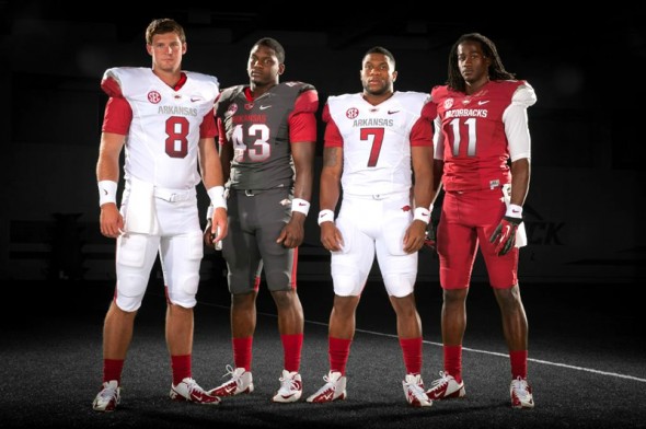
After more than a month of teases, leaks, and photos so blurry they look like they were taken with a ham sandwich, the University of Arkansas finally had a press conference with players modeling the new uniform design by Nike.
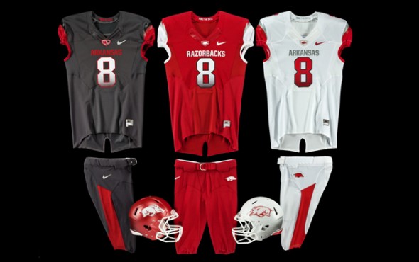
Three different colors of uniforms is a new concept for the Razorbacks, adding a charcoal deep grey set (which Nike and Arkansas are calling “fierce new anthracite.”) Opinions vary among Arkansas fans about adding the grey. They prevailing opinion seems to be, “I don’t like adding a color that isn’t one of our official colors, but if the kids like it and talent comes to the Razorbacks, I’ll live with it.
“We wanted to make sure our student-athletes had the latest in technology when it comes to uniforms,” said Arkansas Vice Chancellor and Director of Athletics Jeff Long. “Our cardinal and white is the basic look and we have introduced other combinations we think add something to the table with our fan base and branding. We are never going to go away from our staple of cardinal and white because that is what is important to us, but at the same time we’ve provided some exciting options as well. Overall, we’ve been conservative in what we’ve done with our uniform and feel we’ve made it cutting-edge with respect to the past and the tradition that are uniquely Arkansas. I think we have a clean, sharp uniform our fans are going to like and I know our student-athletes love. It’s going to be great to run into Donald W. Reynolds Stadium and on to Broyles Field in them in the fall.”
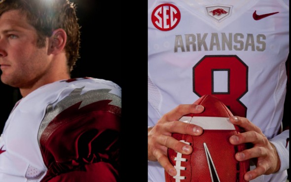
The shoulders have an interesting detail, with a grey, ragged, almost lightning-bolt style stripe where the main color switches at the sleeve. It is said to mimic the razor back of the hog from the logo
The gloves, strangely, don’t feature the Razorback, rather a large Nike wordmark.

Also added to the uniform repertoire is a white helmet. This is a classy look that seems to get a lot of positive feedback. The Razorbacks wore a white helmet form 1946-1950, but this was before facemasks, when many teams also wore white. Nevertheless, this is still a historical color for the team.
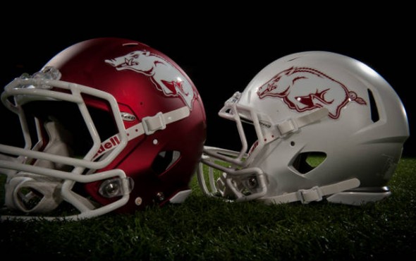
While photos don’t show it distinctly, the helmets are described as having a dark fade at the bottom, to mimic the jersey numbers.
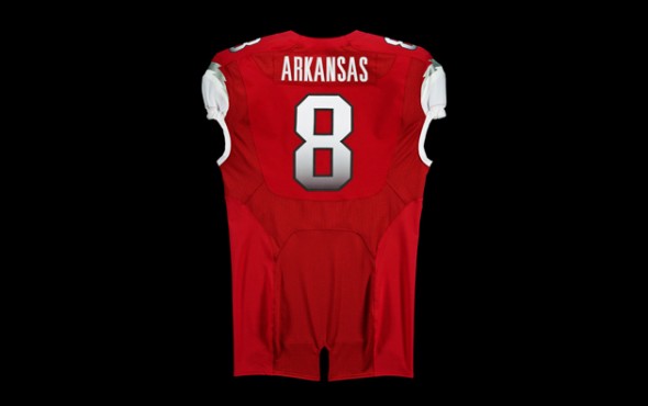
Long time in coming, you’ve had time to think about these uniforms. So, what do you think? Metallic lightning stripes, gradient numbers, charcoal uniform, new white helmet. This seems to be a distinctive look for an SEC team. Will this attract the 17 year olds?
Related stories:
 Arkansas Razorbacks Unveil Throwback Football Uniform
  Oregon Does What Oregon Does Best and Announces New Jerseys… Except, They Aren’t New
  Texas A&M Releases New Adidas Uniforms, Inspired By 1970’s Look
  Eastern Michigan Announces a Mind-Boggling 20 Different New Uniform Looks
  Arkansas Razorbacks Model Their Red and White Uniforms
  Arkansas Uniforms Almost Certainly Real – New Photo
  Possible New Arkansas Football Uniforms?
  Rutgers New Uniforms With Distressing – PICS

