
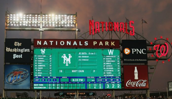
The stadium rolled back to 1924 Thursday night for the game, complete with retro scoreboard, grounds crew, and attendants. The bunting was even up, albeit digital, giving the game a play-off type feel.
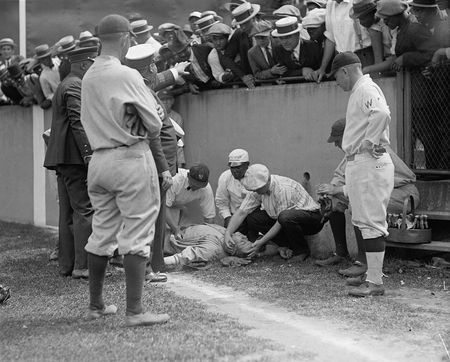
In a remarkable detail, the first pitch was not only thrown from behind the dugout as was done for the 1924 Series, and not just by Walter Johnson’s grandson, Hank Thomas, but the pitch was a game-used ball from the 1924 World Series.
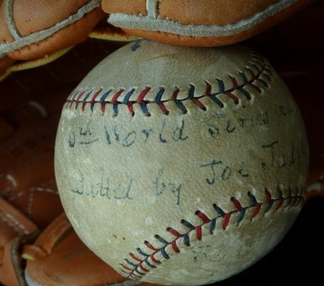
Phil Wood, the D.C. baseball historian who loaned the ball to the team for the game wrote a summary on the ball:
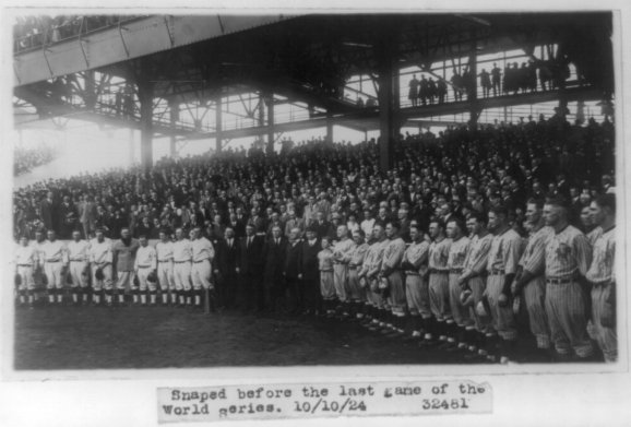
This ball was last used on October 9, 1924 in game 6 of the 1924 World Series. Senators first baseman Joe Judge fouled this ball into the stands at Griffith Stadium off of New York starting pitcher Art Nehf. Washington starting pitcher Tom Zachary allowed 7 hits and pitched a complete game that day in a 2-1 victory over the Giants that tied the series at 3 games apiece.
The next day — Friday, October 10 — Washington came from behind to tie the game with 2 runs in the bottom of the eighth inning. In the bottom of the 12th, catcher Muddy Ruel doubled to left off of Giants’ reliever Jack Bentley. Two batters later, outfielder Earl McNeely hit a ground ball that some say hit a pebble in front of New York third baseman Freddie Lindstrom and bounced over his head, allowing Ruel to score the game — and Series — winning run in a 4-3 victory, Washington’s only World Series championship. The winning pitcher that day was Walter Johnson.
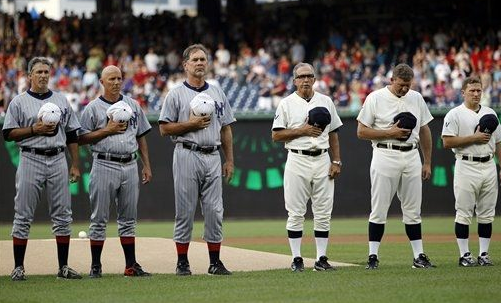
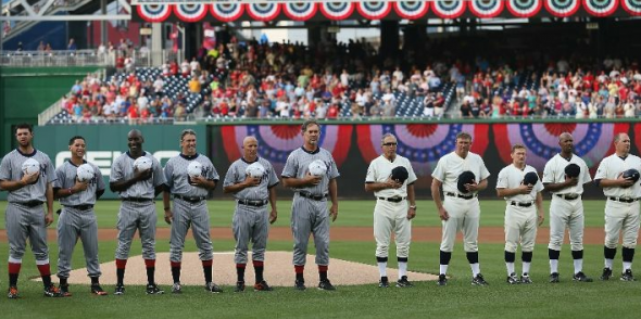
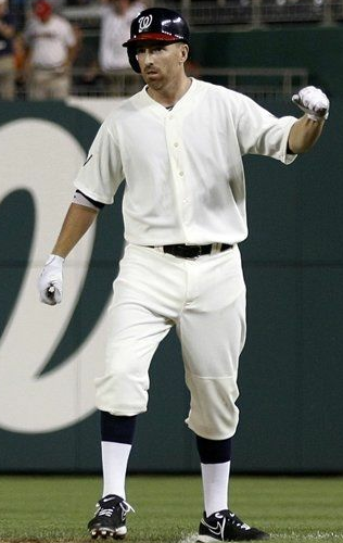
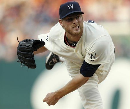
The Senators uniforms were quite plain, which is true to the times. Although close in design, we have come to expect they would not be similar in construction. The large buttons and high necks weren’t present. The color of blue was again up for debate, as the Nationals wore a navy while some depictions of the Senators shows them as more of a royal.
Both teams wore their current batting helmets, especially odd looking in the case of the Giants where it was the only SF marking, or orange in the outfit. Washington wore their away helmets.
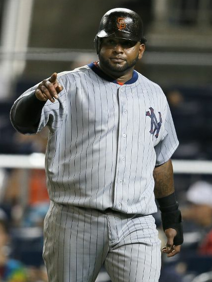
The Giants dark pinstripe set looked good, especially with the red and navy socks. Accuracy seems high as well, a particular challenge, as the Giants wore 3 different uniforms that season. The 2012 iteration seem to match well with 1924 World Series photos in Washington. Those white hats sure looked sharp with the Giants home whites, but looks quite odd with the away greys. I suppose two sets of hats is a much more common modern occurrence than a past one.
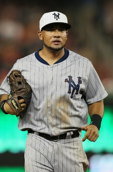
Majestic logos were present on sleeves for both teams, and based on limited photographic evidence, it appears that the modern MLB logo was on the backs of the hats, with no other logos shown. (Please feel free to submit evidence to the contrary!)
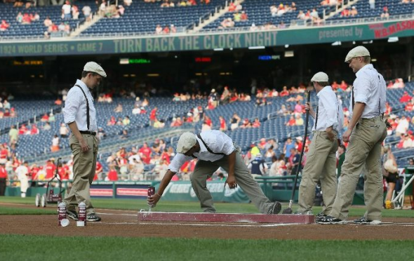
The groundskeepers also got into the action, in their own retro apparel.
The scoreboard, not to be left out, got in the retro feel.
What say you, gentle reader? Top quality uniforms from a day gone by, or silly gimmick, what with all the name and city changes? Should the Nationals throw back to the Expos instead?
Related stories:
 2016 ALDS/NLDS Phantom Champs Merchandise
  2016 MLB Postseason Branding Preview
  New Spring Training Uniforms Across MLB for 2016
  Photos: Brewers, Nats Wear Negro League Jerseys
  Washington Nationals Go Back, Way Back, Back In Time… with Turn Back the Clock Night
  Camo Caps to be worn by all MLB Teams, Full Gallery Here
  Photos from St Patricks Day 2012
  Early Pics from Rays/Cards Throwback Game