
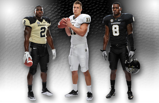
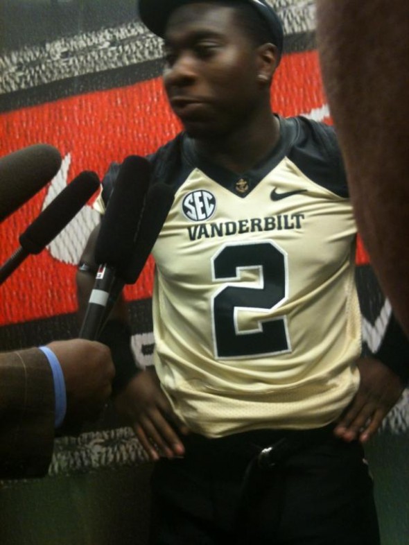
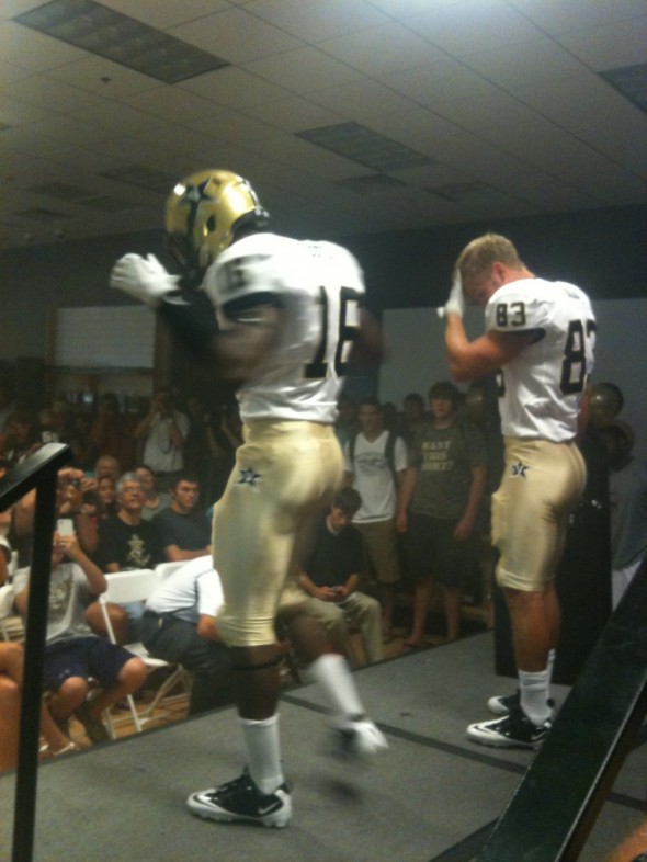
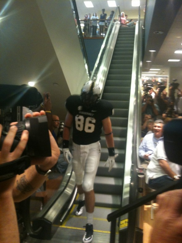
The Commodores held a press conference to show their 2012 jerseys Wednesday night. They have followed the lead of many other schools and have a helmet, jersey, and pants in all three school colors; Black, Gold, and White. At least in their case, they are a school that features black.
Not too many design elements to get very descriptive about, other than the gold jersey, which has black sleeves and the new anchor logo at the chest on all three. All pants feature the Vanderbilt logo stars on both hips of the pants, all jerseys have the standard SEC patches on the chest and the infamous manufacturer logo.
Several combinations were shown, displaying the new white and black helmets, and the previously used other uniform elements, with some new numbering colors.
In inordinate volume of combinations was displayed. Though, still, not all of the possibilities.
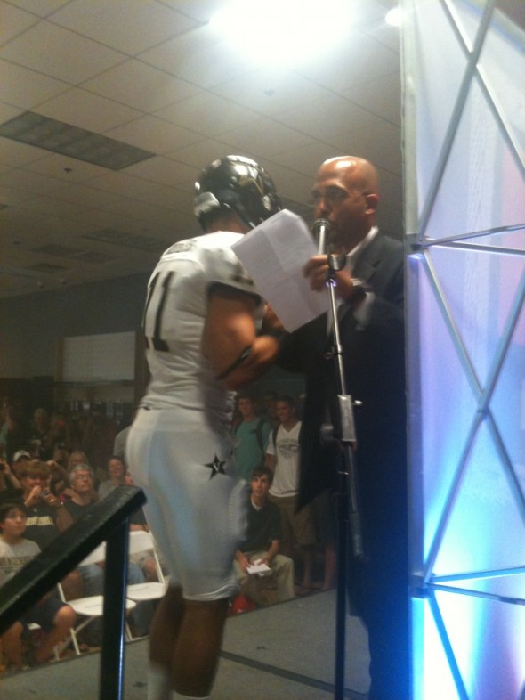
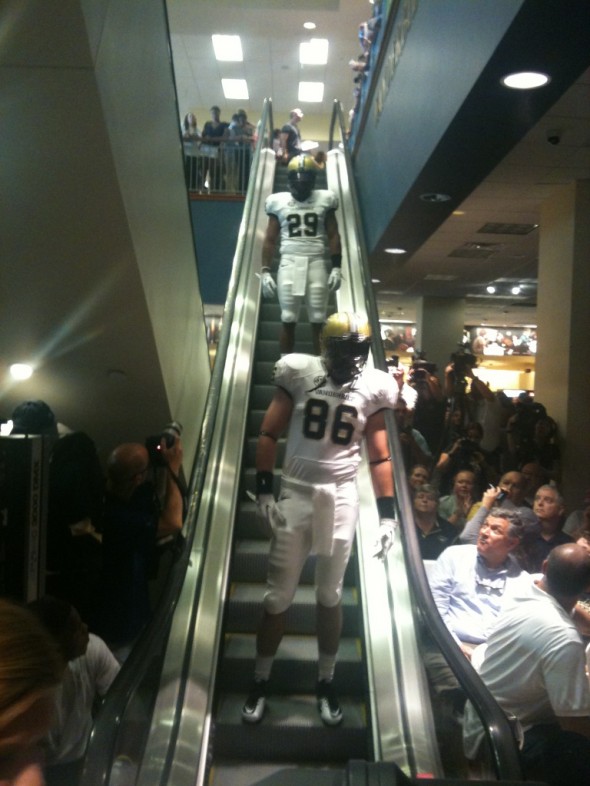
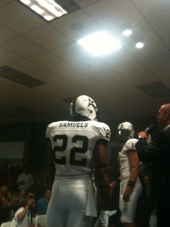
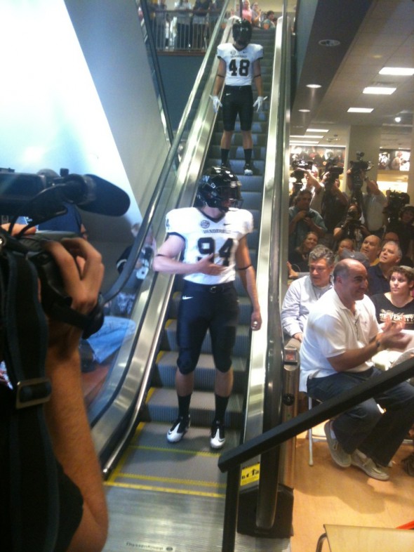
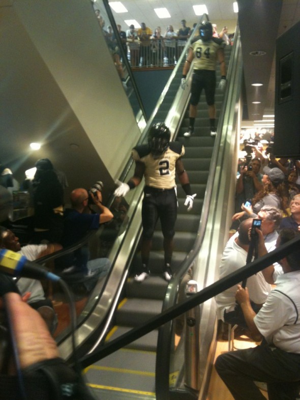
Images from the release party courtesy VandyFootball
So, how do you like them? Did you expect Vandy to go crazy? Are you glad to see the restrained look? Do you like having every school color as an option on every piece of the uniform?
Related stories:
 UNC Set to Unveil New Football Uniforms, Early Pics
  Time To Give You Your Say in the Best, Worst Unis in 2012 NCAA Football
  Monday Night Mare. Georgia Tech Alumn Despises New Uniforms, Begs For Their Ouster
  Oregon Does What Oregon Does Best and Announces New Jerseys… Except, They Aren’t New
  Texas A&M Releases New Adidas Uniforms, Inspired By 1970’s Look
  Vanderbilt Football to Announce New Uniforms for 2012 Season
  Possible New Arkansas Football Uniforms?
  Rutgers New Uniforms With Distressing – PICS