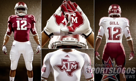
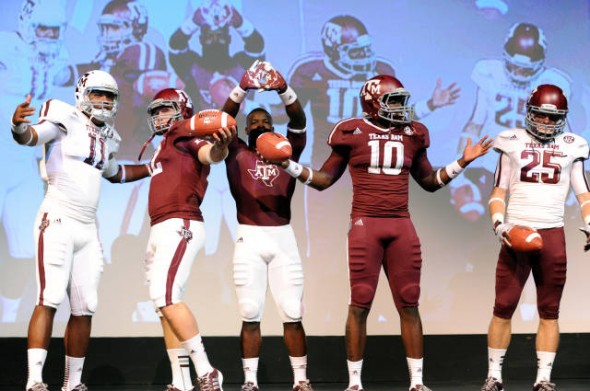
The Aggies and Adidas announced the new uniforms for the 2012 season, the team’s first in the SEC. One helmet color, coated by the wizards at HydroGraphics Inc. Maroon jerseys over white pants. White jerseys over maroon. Its almost as if taste and discretion prevailed in this design.
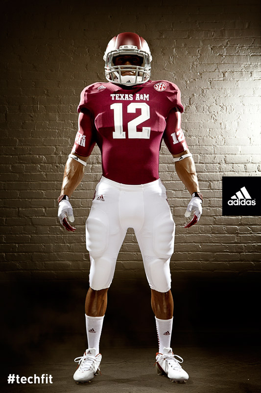
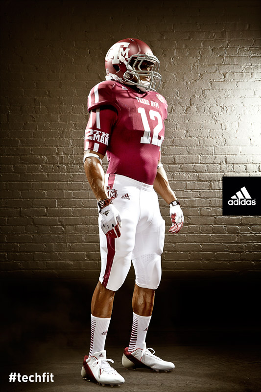
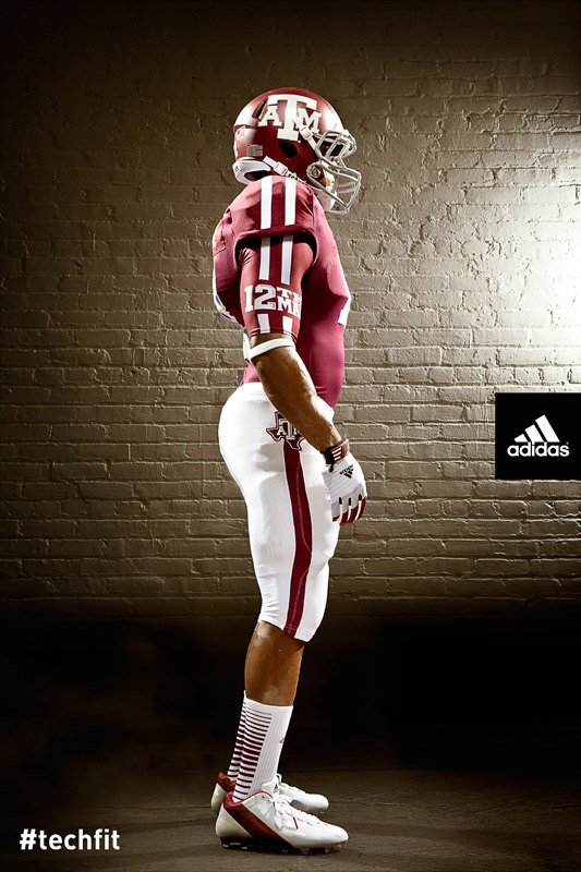
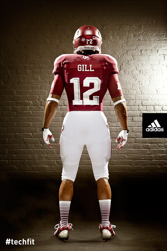
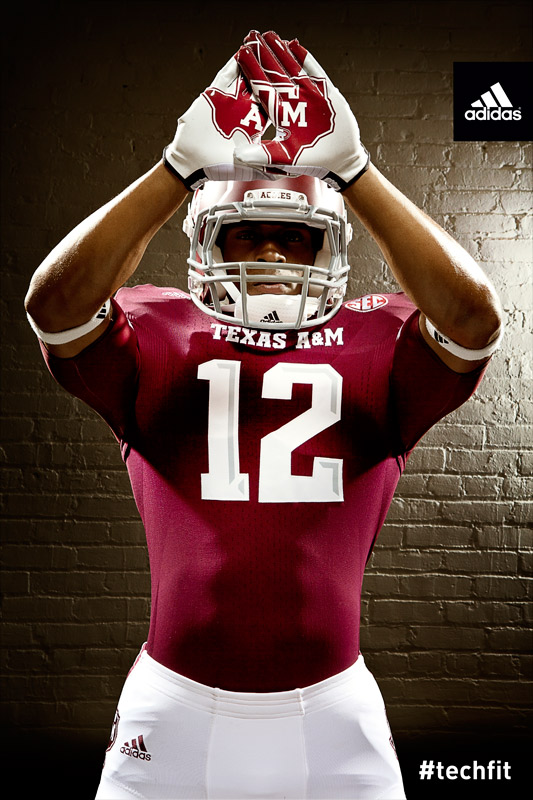
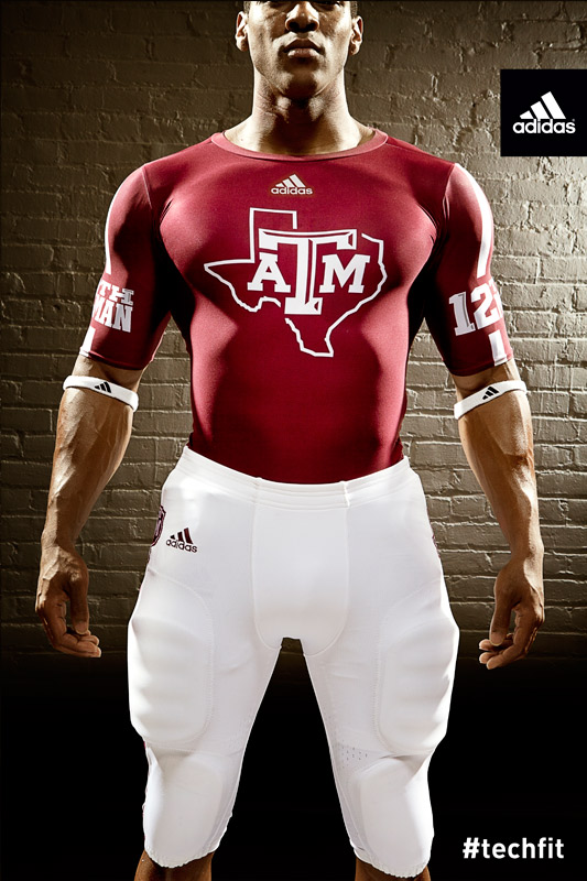
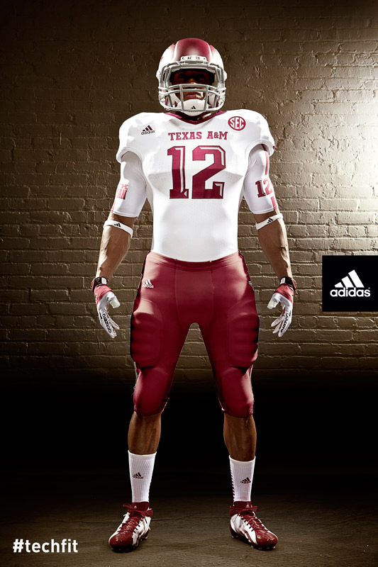
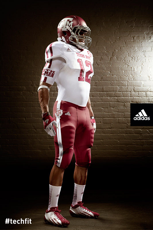
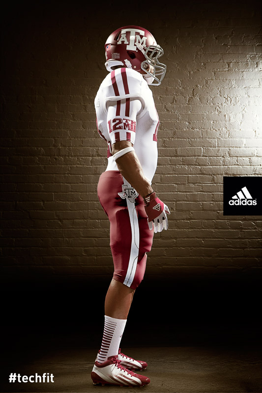
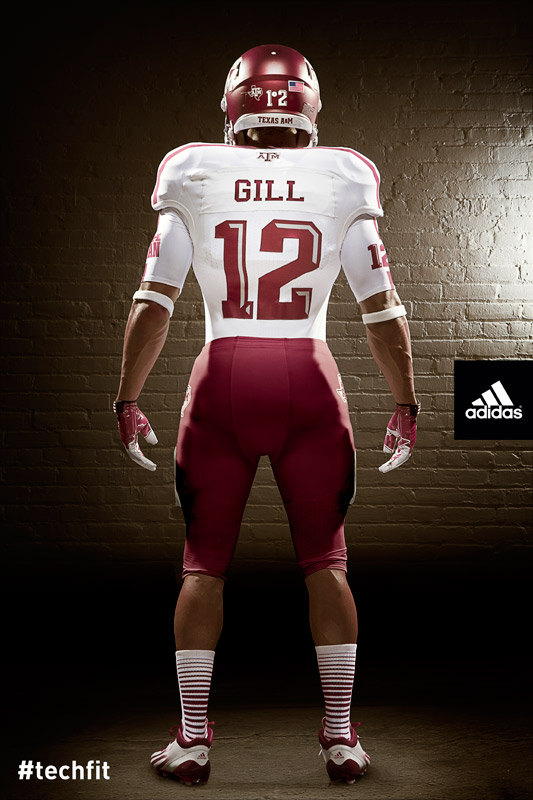
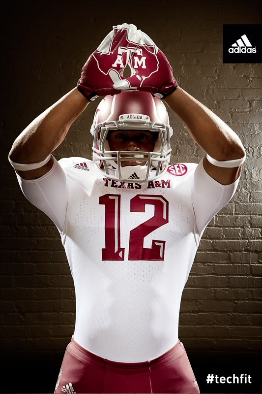
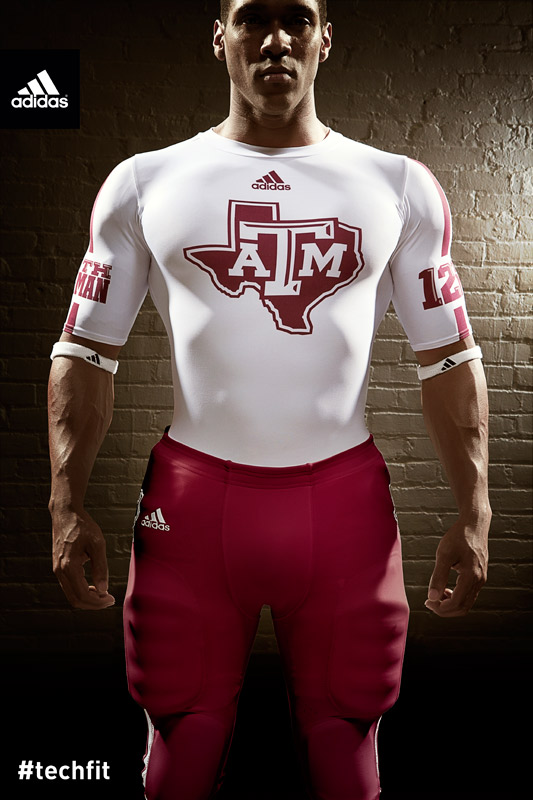
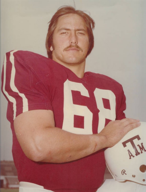
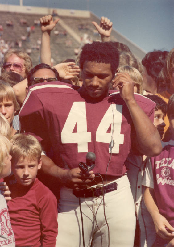
This uniform concept is very similar to, and inspired by, the A&M teams of the 70s.
The Aggies have resisted the “all team colors, plus black” look that so many Nike schools have sported. Are you a fan? Not a huge design blast, but certainly sharp and clean, right? Are you missing a charcoal grey? 3 helmet colors? Or is this well done?
UPDATE:
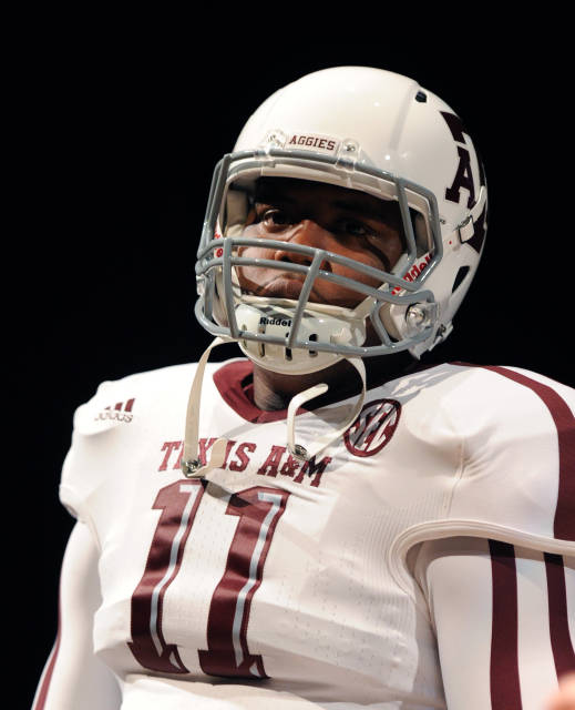
As our always eagle-eyed readers have pointed out, Texas A&M actually DID release a white helemt, though it was not pictured in their promotional pack of photos provided by Adidas. Those are shown below.
JR Francis is an actor, writer, director, graphic designer, UX guru, father, comedian, and craft beer snob. You can reach him at jrfrancis@sportslogos.net or on Twitter @JRFrancisSLN *One of several full-time uniform reporters this site has including its founder, Chris Creamer, who started his site in 1997


D.C. Swinton
Thursday, July 12, 2012 at 17:26This is well-done, I would say. Very simple in the color scheme, and very nice jerseys. I like the numbers having the 3-D illusion. I'm not sure how much a fan I am of the "12th Man" undershirts, but ah well. I am intrigued to see the original USC go against A&M for the first time as a conference foe.
Jed
Thursday, July 12, 2012 at 17:36Very sharp design for the Aggies.
Niko
Thursday, July 12, 2012 at 17:45Wow. Those are good. Good job, A&M
kurt
Thursday, July 12, 2012 at 18:31adidas is doing things right. nike and under armour are dressing teams up like clowns.
Jimmy
Thursday, July 12, 2012 at 19:14They copied the Nike Vapor gloves with the logo on it, didn't know they were allowed too. I like the look though, which is a surprise since its Adidas.
PJINTEXAS
Thursday, July 12, 2012 at 20:27Love it! Whoop!
Ashly Elam
Thursday, July 12, 2012 at 20:50There's actually a white helmet with grey mask as well.
David
Thursday, July 12, 2012 at 22:40Actually the team has 2 helmet colors.
JesseWise
Friday, July 13, 2012 at 00:54Overall, this is a decent design. However, there is incongruity between the design of the socks and the rest of the uniform. I don't like the bevel on the numbers; however, I can't say I dislike them, because it reinforces the A&M brand, and I would rather judge them on the field. I don't like the "12th man" on the undershirt. The players are not the 12th men--the fans are.
JR Francis
Friday, July 13, 2012 at 10:50Thank you, folks. White helmet pictures have been added. Well done!
ingmar66
Saturday, July 21, 2012 at 11:57The 12th man thing is a traditional soccer statement from fans to teams and vice versa and does not belong on a football undershirt, it looks very forced and unnatural here. Otherwise adidas surprise me with the tasteful restraint in this set of uniforms. Well done. Except for the socks. Plain white ones will do, thank you!
Jaybird
Saturday, July 21, 2012 at 19:40I have seen the pictures of the Texas A&M uniforms, and they are a flashback to the 1970s Aggies teams when Emory Bellard was the head football coach. Bellard later coached Mississippi State University from 1979-1985, and from 1982-85 the Bulldogs also wore jerseys with vertical stripes. Unlike the ones at A&M, they were never popular at MSU.
Greg
Sunday, July 22, 2012 at 00:54Cool design, techfit sure is a joke though. Why do the uniform numbers look so cheeseball though?
real estate marketing
Saturday, December 29, 2012 at 16:15Amazing! Its really amazing piece of writing, I have got much clear idea concerning from this piece of writing.