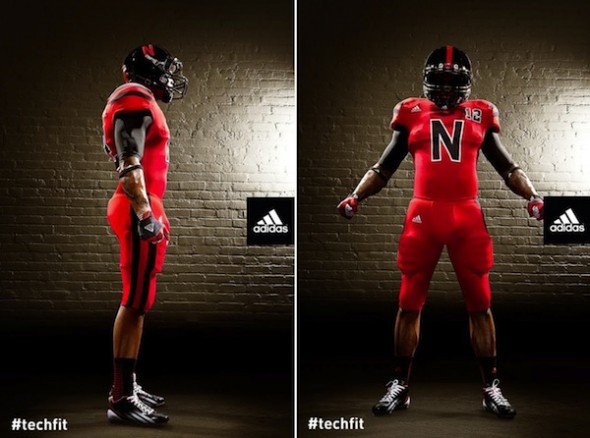
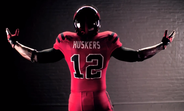
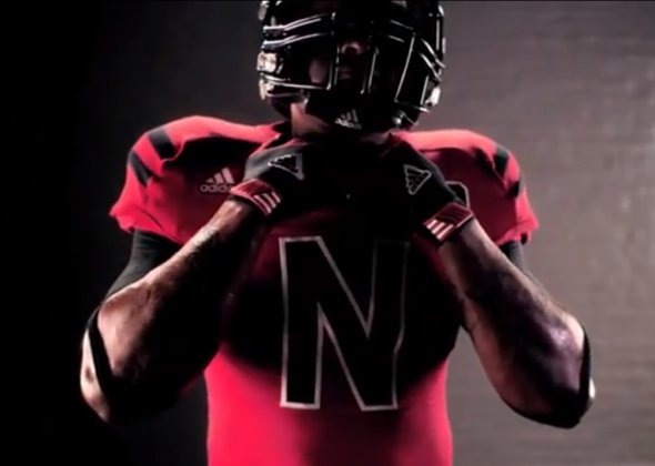
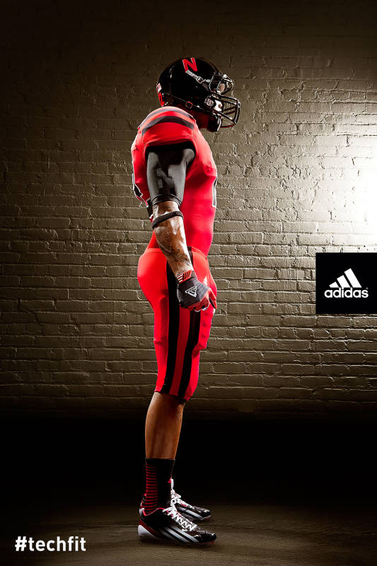
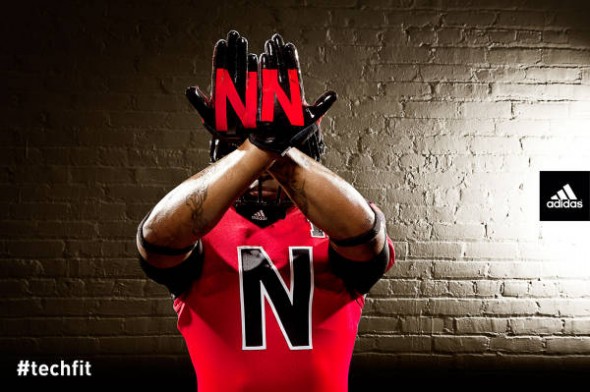
Nebraska adds a special one-game uniform, including black helmets, a jersey with black shoulder stripes, and a large black N on the chest.
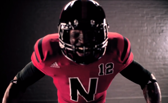
Excusing the addition of black, designers have mentioned the fact that Nebraska vs Wisconsin is all red and white. Adding the black doesn’t sit well with long-time traditional-minded fans.
Check out the video: Nebraska Alt Uniforms
What do you think? Great alternative look to provide distinction? Or, crazy gimmick?
JR Francis is an actor, writer, director, graphic designer, UX guru, father, comedian, and craft beer snob. You can reach him at jrfrancis@sportslogos.net or on Twitter @JRFrancisSLN *One of several full-time uniform reporters this site has including its founder, Chris Creamer, who started his site in 1997


Brad
Friday, July 27, 2012 at 15:34Crazy! I like that they are differentiating themselves visually from Wisconsin. As a fan, it was confusing to see the 2 teams play (uniforms being to close), but as a players, it could only be that much worse. Not really a fan of the Large "N" but I'll respect them for doing something different.
D.C. Swinton
Friday, July 27, 2012 at 16:00I don't know how to respond. This is football, not hockey. Try these on the ice version.
Kevin
Saturday, July 28, 2012 at 05:20Just awful in every way.
Tone
Friday, July 27, 2012 at 16:12Looks very good
AndrewSa888
Friday, July 27, 2012 at 16:43Seriously? These are terrible.
Joseph Newell
Friday, July 27, 2012 at 16:52this is getting worse and worse........Thanks Oregon........
Aaron
Friday, July 27, 2012 at 17:25I'd say put the N on the sides of the jerseys or even the top corner. Not bad looking, but yeah, this is football not hockey. And this reminds me of what some of the CFL teams tried to do in the mid-90's. Logos do not belong on the front of a football jersey unless it's small and put just underneath the front collar.
kurt
Friday, July 27, 2012 at 17:29Haha. Seeing "N12" (N to the 12th power) on the chest makes me think of it as part of a mathematical formula and view this as a player wearing a variable as his number. But seriously, since when has black been a huskers color? Can we stop adding black to teams' color schemes sometime soon? I thought that was just going to be a 90s thing.
thomas
Monday, July 30, 2012 at 12:34Black has been a part of Nebraskas team for a long "Black Shirts" any husker fan could tell you this.
Josh
Thursday, August 2, 2012 at 20:08Hahahaha. I didn't even notice the N to the 12th power. LMAO.
Steven McVeigh
Friday, July 27, 2012 at 18:42I think that may have borrowed a little detail from Michigan's Under the lights uniforms.
Thomas
Friday, July 27, 2012 at 21:32NNN..no
Aaron
Friday, July 27, 2012 at 21:44BTW, thank goodness their only using this for one game.
Nathan
Friday, July 27, 2012 at 23:10dont like the big N and they should have re-done the white helmets instead of making them black.
Rob
Saturday, July 28, 2012 at 06:02No, Not Nebraska too!! No need for these at all, even for one game. The big chest N has to go!!
BL.
Saturday, July 28, 2012 at 15:07Very cool uniforms. Don't thank Oregon, there uniforms are made by NIKE, this is ADIDAS so there just trying to copy NIKEs success.
ingmar66
Wednesday, August 1, 2012 at 15:31Here we go again, adidas messing up everything. The N looks horrible, the small number reminds me of soccer, the socks remind me of gymnastics. Stick to soccer, tennis and athletics, you triple- striped dunces! Those are sports that you know how to handle, but leave US team sports to other apparel brands!
Dude
Friday, August 3, 2012 at 23:45The Norteno gang is gonna buy these jerseys up by the truckload!