Virginia Tech Releases a Helmet So Strange, Even the “Youth” Don’t Like It

Written By:

Monday, August 13, 2012

Virginia Tech Releases a Helmet So Strange, Even the “Youth” Don’t Like It

Virginia Tech Hokies White Helmet close

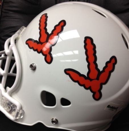
Early in the 2012 season, Virginia Tech will host a “White Effect” game, and seeing as they lack a white helmet, they needed one. In the Backsburg area, many vehicles can be seen sporting the “Hokie Tracks.” Now, they can be seen on the side of the Hokie’s white helmet. Even the name, calling them “tracks” is specious, as they are orange with maroon outlines, looking for like the turkey had its feet chopped off, than tracks in the mud.

Our research into reactions to the helmet show lots of articles calling the reaction “mixed” but we feel confident saying it is decidedly negative. Even junior QB Logan Thomas gave his opinion on Twitter about them.

Our whiteout helmets are so ugly – Logan Thomas


Who are we to argue?

Virginia Tech Hokies White Helmet 3 types

All 3 VT Helmets for the 2012 season

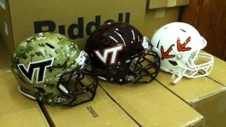
They make the grand total of Virginia Tech helmets so far this season, to three. In case you missed it, the Hokies will be wearing camo helmets with white jersey sporting camo numbers later this year.

Unafraid to push the envelope and questionable taste are two different things.

What do you think? Are the severed turkey feet a cool look or a tacky gimmick? Would you like your favorite team to feature one body part from your mascot?

Article Categories:

Share This Article

Related News

San Diego State University Shows Tweaked Logo, New Uniforms; Little Consistency
Arizona Wildcats Football Announce New Gradient-Crazy Football Unis
The Logocast Episode 28: We’re Going To Kill Off One of the Hosts

About Author

JR Francis

JR Francis is an actor, writer, director, graphic designer, UX guru, father, comedian, and craft beer snob. You can reach him at jrfrancis@sportslogos.net or on Twitter @JRFrancisSLN *One of several full-time uniform reporters this site has including its founder, Chris Creamer, who started his site in 1997

(25) Readers Comments

  1. Rebel Suiter
    Monday, August 13, 2012 at 19:12

    I think they look good, very original

    • Mike
      Monday, August 13, 2012 at 22:38

      I think you have got to be kidding.

  2. Brian Holloway
    Monday, August 13, 2012 at 19:13

    i totally posted about this on here about 40 min ago!

  3. Matt Campbell
    Monday, August 13, 2012 at 19:16

    Please, it beats the hell out of the camo helmet.

  4. BL.
    Monday, August 13, 2012 at 19:20

    The hokie foot print one is pretty cool. Very unique.

  5. New Order (nuordr)
    Monday, August 13, 2012 at 19:23

    Those new white helmets are Fugly! I would rank them as the 2nd worst of all time behind the Rose Bowl Helmets that Oregon wore last year.

  6. Jeff Sch
    Monday, August 13, 2012 at 19:24

    The Turkey feet is the best helmet of those three. Teams really need to turn away from the dumb "intimidating" concept. No one has ever been intimidated by a teams uniform. No matter if it may be a black uniform and no matter how foggy and back lit they make the promotional photos.

    • Douglas
      Monday, August 13, 2012 at 20:39

      Wrong, the traditional helmet (the one in the middle) is much better than the turkey tracks helmets.

  7. kurt
    Monday, August 13, 2012 at 19:42

    not a fan. first, if they are tracks then shouldn't one be the mirror image of the other? this turkey appears to have two left feet...or maybe right. whatever. my bigger complaint though, the feet don't really appear as feet to me until closer inspection. i imagine a lot of people watching the "white effect" game and thinking "why are there arrows on their helmets?"

  8. Chris Oglesby
    Monday, August 13, 2012 at 20:03

    it's bad but i don't think bottom 5 of all time.

  9. Jed
    Monday, August 13, 2012 at 20:33

    Those helmets with the birdlegs on them are just horrific. Whoever thought of that idea should be fired immediately.

  10. Daniel Hall
    Monday, August 13, 2012 at 20:47

    Def my least favorite helmet.

  11. Derek J. Pelton
    Monday, August 13, 2012 at 22:23

    Copycat helmets. Same color/design scheme. We need originality. Worst I think are the U of Delaware Blue Hens helmets are just like the Michigan Wolverines.

    • Keith
      Thursday, August 16, 2012 at 17:26

      Derek J. Pelton, Delaware and Michigan are actually copying Princeton. Look it up. I hate the camo(overused) and the tracks.

  12. Michael Jaworski
    Monday, August 13, 2012 at 22:47

    Those are awful! Other awful ones are Penn State's boring blanks, and Alabama's individualized numbers. Give me a logo any day.

  13. Ryan
    Monday, August 13, 2012 at 23:35

    http://www.hokiesports.com/auction/images/helmet2010.jpg this just in the above image is too good to be used this season?!?!

  14. Nathan
    Tuesday, August 14, 2012 at 02:34

    They should use the white helmets they had with their 09 Nike Pro Combat Uni's But these helmets are odd but kinda cool i guess...

  15. Francis Von Schober
    Tuesday, August 14, 2012 at 04:45

    Love the Camo Helmet !!!! And the white one will be better with an orange outlined marroon "VT" !!

  16. ingmar66
    Tuesday, August 14, 2012 at 09:43

    The horror. Stick to the one in the middle and forget about tacky camo (trailer park trash appeal) or the plain ugly chicken feet. Or try an orange helmet if you want to be different.

  17. magicmk
    Tuesday, August 14, 2012 at 12:27

    If VT has to feature one signature body part from its mascot on their "whiteout" helmet, shouldn't it maybe be the (missing) part that makes it a neutered turkey?

  18. Dave Show
    Tuesday, August 14, 2012 at 13:43

    The maroon helmet is perfect. The other 2 SUCK! Still, the worst helmet I've ever seen is either the Maryland state flag thing or Oregon's mirrors at the Rose Bowl. Or the Jaguars glitter with the teal tongued half asleep Jaguar. Or the amatuer cursive writing "Gators." GO SEMINOLES!!!

  19. Matt
    Wednesday, August 15, 2012 at 03:15

    Love the camo helmets (they scare liberals), but those white helmets look like they were created by a retarded ten-year old. Mr. Hankey?

  20. Marcus Jackson
    Thursday, August 16, 2012 at 01:10

    I'd prefer the white helmet that had the standard "VT" insignia on it instead.

  21. Meary Jan
    Tuesday, September 4, 2012 at 21:34

    I'm really loving the theme/design of your site. Do you ever run into any browser compatibility problems? A number of my blog readers have complained about my blog not operating correctly in Explorer but looks great in Safari. Do you have any suggestions to help fix this issue?

  22. Lady Hokie
    Friday, September 7, 2012 at 20:08

    I am a HUGE Tech fan and I can say, without a doubt, these are the UGLIEST helmets and uniforms!! I thought last year's "technological" ones were bad -- PLEASE -- the feet on the helmet?!?! Please Nike -- give us back some of our pride and stop trying to turn us into looking like the Oregon DUCKS!

Leave A Reply

Leave a Reply

Your email address will not be published. Required fields are marked *

You may use these HTML tags and attributes: <a href="" title=""> <abbr title=""> <acronym title=""> <b> <blockquote cite=""> <cite> <code> <del datetime=""> <em> <i> <q cite=""> <strike> <strong>