
Notre Dame has partially scrapped the golden domes on their helmets. Or exactly 1/3rd which is now navy blue. The Irish announced their Shamrock Series uniforms for their game in Chicago against Navy. The good news is, its for one game only. The bad news is, its almost 100% completely terrible.
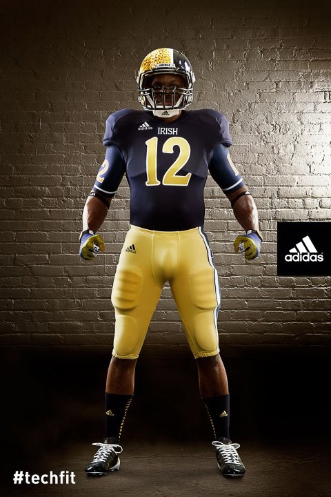
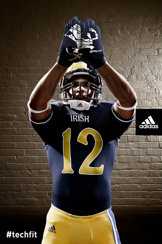
Notre Dame’s adidas TECHFIT football uniform is supposed to be a modern take on the classic blue jersey and features gold metallic numbers and IRISH in a Celtic font. The bright gold helmet is split with a blue section highlighting a large white Leprechaun graphic. Notre Dame’s gold pants feature a blue stripe on the left leg and the updated Leprechaun graphic.
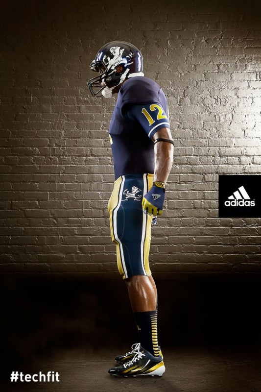
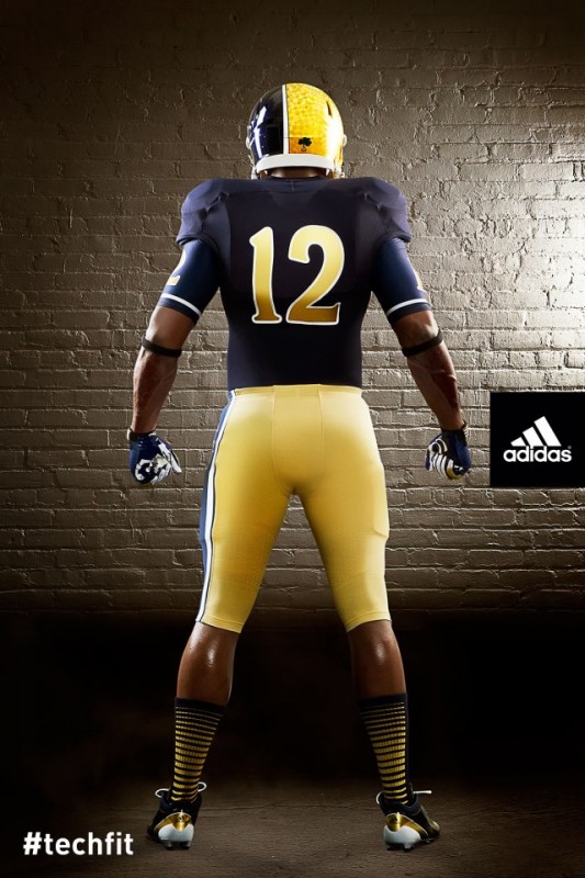
The Fighting Irish’s alternate uniforms are for their Oct. 6 game against Miami at Soldier Field. Even the socks get into the mess, with gradiated stripes, only on the back side. The pants, while still gold, have a giant blue stripe surrounded by white, with the Leprachaun.
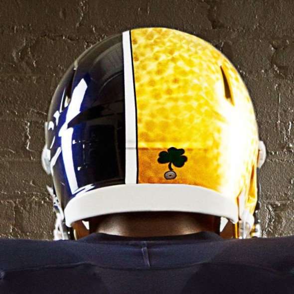
The feature of this uniform is undoubtedly the helmet. At best strange, and at worse an homage to Batman villain Two-Face, the head-buckets have the same textured gold as the one-time use helmets last year, but only across approximately two-thirds of the helmet. The remainder is a opalescent navy with a rather large white rendition of the leprechaun.
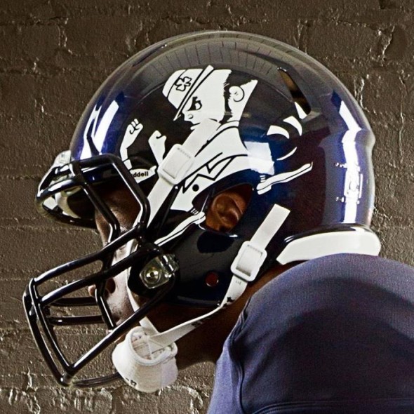
That is two appearances of the leprechaun, and we aren’t yet done. Again I must draw your attention to the sheer size of the decal on the side. It is simply huge.
There is our third! Its like a scavenger hunt for racist iconery! Though, to be fair, the logo may be the single traditional item in this entire unholy mess. Check out the custom jersey numbers. Metallic and outlined in white, the color palate is very strong, the font, however, is almost PrintShop Pro awful. One can only imagine the other numbers, in particular the 5 or 7 which could likely have the descender well below the baseline.
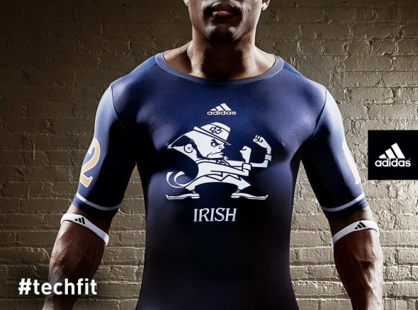
The undershirts will have not only our fourth appearance of the leprechaun but also jersey numbers on the sleeves in two colors.
How did we arrive here? Has “Shamrock Series” always been code word for “Arena-esque?” Not really. This will be the third in the series, which is planned for 3 future matchups. Last year, the uniforms were relatively standard, save for a unique texture in the gold of the helmet, carried over this iteration, and a shamrock, which has not continued.
The Series has been at a neutral location each time, and has been against a particular rival. In the 2011 game, the Irish’s odd helmets were practically unnoticed, when on the field with the abomination that were the two-sided, Maryland-flag-inspired, Terrapin uniforms. Apparently Notre Dame was interested in the two-sided look enough to steal it for the 2012 game.
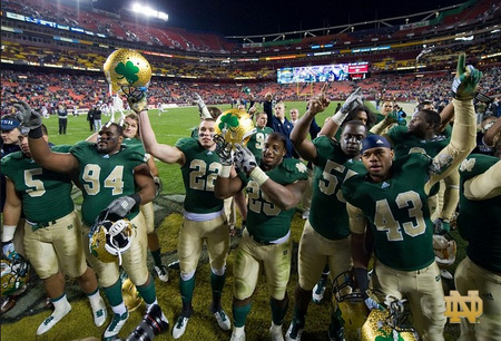
In 2010, the Irish looked practically traditional, in their “lucky” green jerseys.
These helmets were coated in genuine gold leaf, and Adidas was attentive to colors, making sure the helmet matched the numbers and pants. No such luck in the following years.
So, there was a gentle ramping up of lunacy, but it is full blown here in 2012.
There are players on the team who have tweeted their support, and news agencies are careful to mention items from the press release indicating support for the unifoms.
But this is an absolute slap in the face to generation after generation of tradition and honor at Notre Dame. No matter what your personal rooting interest may be when the Irish are on the field, but any sports fan must genuinely nod to the program’s deep and rich history. These uniforms puke all over that in a shameful act of capitulation to the mercurial concept of “youth appeal.”
This is not the last this website will write on this topic. But it may be the proverbial straw that broke the camel’s back.
What do you think? Does anyone honestly support this garbage? Anyone, anywhere?
Andy Moniker
Thursday, August 16, 2012 at 21:54Does college football have any aesthetic credibility left? What a shame.
NJTank
Friday, August 17, 2012 at 01:58Nope and the players get hammered for sneezing wrong the Universities are corrupt as all hell.
Douglas Mellott
Thursday, August 16, 2012 at 21:59What...the...hell? :-\
Erik S. Porth
Thursday, August 16, 2012 at 22:00What in the hell is this mess?!
Splash*Boogie
Thursday, August 16, 2012 at 22:00I actually like this set except for the silly helmet. If they used the standard gold helm and matched the golds on the uniform to the golds of that helmet this would be a perfect set. 7/10. All points off are towards the helmet.
Matt
Thursday, August 16, 2012 at 22:00Pure trash. Adidas and Nike are literally destroying sports tradition with each new uniform design. Pathetic is not a strong enough word. I wish I could fire every single person who's worked on uniforms in the last couple of years. Disgusting!
Jaybird
Friday, August 17, 2012 at 17:56Not to mention Under Armour with Maryland's horrendous uniforms. The only think I like about Notre Dame's Shamrock Series uniforms are the jerseys and the number font on them. College teams should do like the NFL: One Helmet, home jersey, road jersey, alternate jersey, pants for home and road games, plus alternate pants, plus a throwback uniform.
Matt
Saturday, August 18, 2012 at 05:56This is what happens when you hire the guys from Zoolander to do your design. Nike, Adidas & Under Armor should all be banned from uniform design. What's next, Michigan helmets with a cartoon wolverine? Pathetic!
Matt the Brave
Thursday, August 16, 2012 at 22:02Exactly when did college football go crazy? I mean, I know this is a one-off jersey just to generate sales, but my goodness that looks awful from a design standpoint. I guess it could be worse, though. As a UGA fan, we looked like bloodclots on the field last year against Boise.
Matthew Schilling
Thursday, August 16, 2012 at 22:05The number font is the ONLY good thing about this uniform set.
New Order (nuordr)
Thursday, August 16, 2012 at 22:10Well these uniforms are about as bad as the schools reputation over the last 10 years, they both are in the dumps.
Agent New Era
Thursday, August 16, 2012 at 22:13The jersey and pants are good. Heck, even the socks are alright for a one-off. But the helmet...the helmet kills it all.
oz loya
Thursday, August 16, 2012 at 22:16..eyesore!! seen much better innovations on other way simple designs.
Tim Stoklas
Thursday, August 16, 2012 at 22:20I think adidas went to a 6th grade classroom and said "OK, Kids, show us the uniforms... of the future!!!"
Manuel Dos Santos
Thursday, August 16, 2012 at 22:22adidas came doing an excellent job with the designs, is it another case of the designers proposed better but managers at the end choose what they like?
Brent Stewart
Thursday, August 16, 2012 at 22:24wats with all of the gimmick unis enough already
Rob Sydell
Thursday, August 16, 2012 at 22:31Knute Rockne is throwing up right now...
Justa
Saturday, August 18, 2012 at 21:24These uniforms will never shake down the thunder!
Nathan Hoeffner
Thursday, August 16, 2012 at 22:35The jerseys are the only good part the pants stripe is 3 ft too big and no helmet should ever be half and half or 3/4, 1/4
Seth Weisenbarger
Thursday, August 16, 2012 at 23:04Rudy would quit the team if forced to wear this sack of garbage.
Zoltan Lasak
Thursday, August 16, 2012 at 23:37One word...horrible
Zoltan Lasak
Thursday, August 16, 2012 at 23:37One word...horrible
Mike Sydell
Thursday, August 16, 2012 at 23:41Okay.?
Mike Sydell
Thursday, August 16, 2012 at 23:41Okay.?
JKLAND
Thursday, August 16, 2012 at 23:44I know its just for one game right, but still these are Fugly. I would have rather seen ND actually use their original colors of Madonna blue(a light blue shade)if they just had to have another alt unie.
Darnell Cheers
Friday, August 17, 2012 at 00:15Awful and I can't stand Notre Dame! Could've at least used green instead of navy blue.
Matty Gehm
Friday, August 17, 2012 at 00:19Bring back the green and gold for the shamrock series !!!
MadPanda
Friday, August 17, 2012 at 00:22"Mmmmm-blaaaargh!"...(wipes mouth)...sorry. Reflex action after seeing that. Another badly-contrived idea to promote another badly-contrived idea. Like ND actually needs more promotion?? Proof once again that corporations are the tail wagging the dog. MadPanda...(Wondering what adidas or Nike would do if Penn State asked for a one-time makeover)...
Mike Reynolds
Friday, August 17, 2012 at 00:31Agreed. There are horrible
John Gladding
Friday, August 17, 2012 at 00:37Am I the only one that likes them?
Brian Castner
Friday, August 17, 2012 at 00:41Well as much as I hate this I hate it less than their regular set. Granted I'm very much not an ND fan but I just don't like their everyday look. But with my being more of a modernist & hating all things classic/retro/fauxback/gray facemask without gray in the team colors isn't a shock.
Mat Mueller
Friday, August 17, 2012 at 01:20Looks more like a michigan uniform from the front with this blue/yellow jersey and the blue/yellow helmet. really hate that. Jersey font is good.
Frank Fleming
Friday, August 17, 2012 at 01:58Awful Awful
Ryan Martin
Friday, August 17, 2012 at 08:07Ditch the blue side of the helmet, the abnormally large single sided pant stripe, and those ridiculous socks and they would look downright beautiful...too bad they didn't do all those things. The pant stripe doesn't even seem to be the same shade of blue as the jerseys, at least in this photo.
Chris Oglesby
Friday, August 17, 2012 at 09:52good god those things are ugly. if this wasn't real, i would have presumed this was a troll concept for the concept section.
Sam Doucette
Friday, August 17, 2012 at 10:19This is not my father's (Domer '67) Notre Dame. Let's see, Notre Dame rejects its Catholic identity by inviting pro-abortion Obama in 2009 for its commencement speech. Now it rejects its glorious football tradition for an ugly marketing gimmick.
Aaron
Friday, August 17, 2012 at 10:57The uniforms are okay. But the helmet, please bring back the plain gold helmet. I don't mind the small shamrock at the back of it though.
Rob
Friday, August 17, 2012 at 12:38Absolutely horrible!! I am a Notre Dame fan and will not watch this game.I would actually like to have them get their butt kicked in these if they weren't playing Miami(Fla). Could never root for the Hurricanes.So best not to watch at all.
Kanoot
Sunday, September 30, 2012 at 11:38Rob Are u for real. You must be a spoiled little 10 year old or a set in his ways 90 year old. Not watching a game because of the uniforms and wishing your team a loss because of the way their dressed. Go root for penn state. Their uniforms haven't changed for 50+ years.
Nathan
Friday, August 17, 2012 at 12:42The jerseys are great! But the helmet.... they need to make up their mind. Blue with the guy or that weird gold. Pants arent that great either...
Josh Truax
Friday, August 17, 2012 at 12:48They might as well have put the Buffaslug on the helmets instead. At least they're the same colors, and one aesthetic monstrosity deserves another.
undfs
Friday, August 17, 2012 at 13:40It's a fantastic look! STICK WITH IT!
Marcus Jackson
Friday, August 17, 2012 at 15:52I like everything except for that damn helmet! That's about as bad as the Maryland helmet that has its state's flag as the design. Epic fail!
Joe Smitty
Friday, August 17, 2012 at 16:45when you have one of the most iconic pieces of uniform in the world you should not change it. that helmet is atrocious. you would think, as strict as the NCAA is with all their rules and regulations governing nearly every aspect of both the athletes and programs, they would come up with some sort of rule or guideline regarding uniforms. at the rate this is going every program will have 20 different uniforms (not counting different combinations of pants, jersey, socks or helmet) despite the fact the maximum amount of games any school can play is only play 14.
Kyle
Friday, August 17, 2012 at 18:26The actual jersey itself is nice. Same with the pants (if the stripe was on both sides). The rest is a mess and a half. ugliest helmet ever.
Jed
Friday, August 17, 2012 at 19:14Whomever designed these should be fired or even those that came up with such a ludicrous idea as this.
BL.
Friday, August 17, 2012 at 20:15The only thing I like the one half of the helmet with the leprechaun on it.
B. A. Smith
Friday, August 17, 2012 at 21:58Does any school's team believe in the time honored tradition of there uniforms anymore.
ingmar66
Sunday, August 19, 2012 at 07:48Simply horrible. My favourite college football team pulling this off,even for one game, shame on you, ND and adidas! This is so disgusting, from the bowling ball helmet to the sissy socks.
best voip phone for mac
Thursday, October 4, 2012 at 05:45Thanks for the interesting things you have exposed in your text. One thing I'd really like to touch upon is that FSBO human relationships are built after a while. By presenting yourself to the owners the first saturday their FSBO is actually announced, prior to the masses start out calling on Mon, you create a good interconnection. By giving them methods, educational components, free reports, and forms, you become a great ally. Through a personal curiosity about them plus their problem, you make a solid relationship that, on most occasions, pays off if the owners decide to go with a realtor they know as well as trust -- preferably you.