Central Michigan Goes With Mix-N-Match Colors in their New Uniforms

Written By:

Friday, August 17, 2012

Central Michigan Goes With Mix-N-Match Colors in their New Uniforms

Central Michigan Chippewas new uniforms adidas all 4

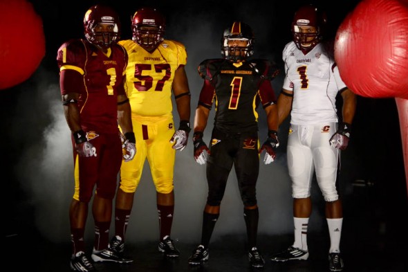
Central Michigan announced yellow, maroon, black, and white sets of jerseys and pants, along with a new black matte helmet. The pieces are meant to be mix-and-match, with the exception of the black helemt, which is said to go with the all-black look only.

Central Michigan Chippewas new uniforms adidas grey shoulder

Note the grey shoulders

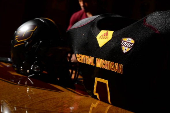
The black uniform features a maroon piping and a grey inset shoulder. This goes with the flat black helmet.

As is standard in new uniform reveals, there is a custom undershirt.

Central Michigan Chippewas new uniforms adidas fireup

Undershirts say Fire Up on the right arm

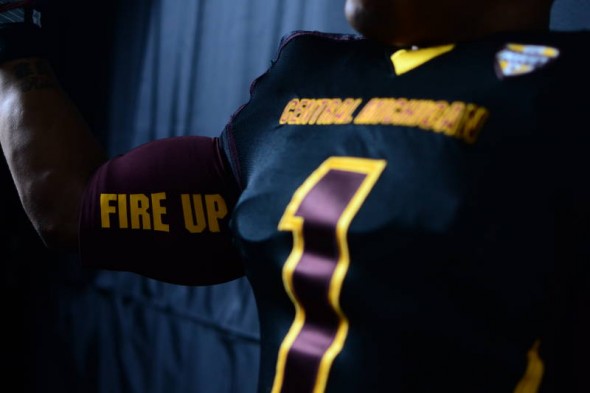
The undershirts feature the team’s rallying cry, with Fire Up on the right arm…

Central Michigan Chippewas new uniforms adidas chips

Undershirt left arm

…and Chips on the left.

Central Michigan Chippewas new uniforms adidas black helmet

I know you were looking forward to the matte black

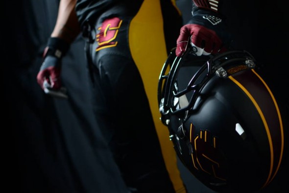
The matte black helmet has a tapered stripe down the middle in the maroon and gold team colors.

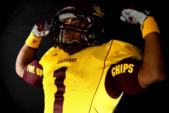
Also worth noting here is the large C logo on the hip. Not shown here, but in photos above and below, is the large NCAA Football logo on the opposite hip. Very odd inclusion on the pants. especially since they (of course) included the Adidas logo, which makes for a total of 3 large logos on the front of the pants.

Central Michigan Chippewas new uniforms adidas mismatch maroons

Odd mismatch of maroons

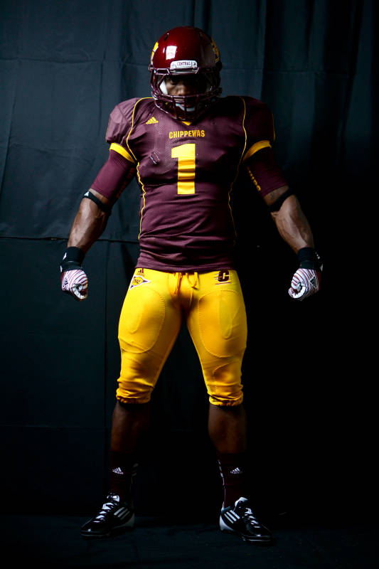
While avoiding the monochrome look by pairing the maroon jersey with gold pants, this photo brings up a problem some teams seem to have; non matching colors. The maroons between the helmet and jersey are blatantly, obviously, not even similar.

Central Michigan Chippewas new uniforms adidas gloves

Obligatory gloves logo

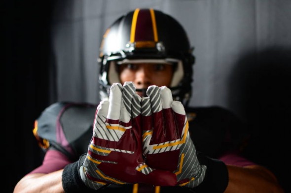
Flying C with extra lines and gradiations decorate the glove, per football requirements. (Not really, it just seems like its a law.)

So, Central Michigan releases the assorted color set of jerseys and pants, some of which even have a different cut or piping look. The combinations should last them seasons of few repeats.

We think this is a good look, color appropriate, even if the matte black is gimmicky and an all black uniform is intimidating no one. Do you agree? How would you have designed the Chips?

Article Categories:

Share This Article

Related News

San Diego State University Shows Tweaked Logo, New Uniforms; Little Consistency
Arizona Wildcats Football Announce New Gradient-Crazy Football Unis
The Logocast Episode 28: We’re Going To Kill Off One of the Hosts

About Author

JR Francis

JR Francis is an actor, writer, director, graphic designer, UX guru, father, comedian, and craft beer snob. You can reach him at jrfrancis@sportslogos.net or on Twitter @JRFrancisSLN *One of several full-time uniform reporters this site has including its founder, Chris Creamer, who started his site in 1997

(23) Readers Comments

  1. Jesse Jaymz
    Friday, August 17, 2012 at 14:14

    I think that would honestly be a good uniform scheme for the Redskins if they ever decide to do any changes.

  2. Joseph Newell
    Friday, August 17, 2012 at 14:16

    these are actually ok.....

  3. JKLAND
    Friday, August 17, 2012 at 14:20

    I never like it when a teams helmet color doesn't match the uniform tone(pic 6). Its the 21st century, your telling me that they cant match the color tone exactly? Out of these pic 6(besides the different tone in helmet from the jersey) and the white unies are the only ones I like.

    • David
      Friday, August 17, 2012 at 15:11

      Just like the Saints, Cowboys, Vikings (Throwbacks) and Rams (Throwbacks)

  4. Brent Stewart
    Friday, August 17, 2012 at 14:22

    its a subtle combination

  5. Reuben Jesse Cohen
    Friday, August 17, 2012 at 14:24

    Go Chippewas

  6. Brad Brookens
    Friday, August 17, 2012 at 14:40

    Fire Up Chips!

  7. Nathan Hoeffner
    Friday, August 17, 2012 at 14:48

    Not plain not flashy I like it

  8. David
    Friday, August 17, 2012 at 15:10

    If the rest of the uniforms had the same striping as the Black, then this would be a great looking set.

  9. Aaron
    Friday, August 17, 2012 at 16:26

    I like the mix and match concept. Very cool. Love the creativity without going overboard.

  10. Brian Castner
    Friday, August 17, 2012 at 16:52

    Of course there has to be a matte helmet. But other than that and the all white look it's not a bad look.

  11. BL.
    Friday, August 17, 2012 at 20:13

    I love that all black uniform.

  12. William Stohl
    Friday, August 17, 2012 at 20:22

    and groan. I'm so done with this "trend".

  13. JUSTIN
    Friday, August 17, 2012 at 21:02

    The Maroon and white look a lot like ASU's older uniforms.. the black reminds me of their current.

  14. Scott
    Saturday, August 18, 2012 at 05:47

    Am I the only one bothered by jerseys being made so tight that the front numbers fold up like an accordion?

  15. Matt
    Saturday, August 18, 2012 at 06:06

    Wow, what a shock...another uniform design with multi-colored helmets and jerseys. Have Nike, Adidas & Under Armor ever heard of something called "tradition"? I agree with an earlier comment. I, too, am so done with this trend.

  16. Tony Masella
    Saturday, August 18, 2012 at 12:12

    we should be going bk. to the uniform trends of the 70s-80s // awful looking cent. michigan!!

  17. Splash*Boogie
    Saturday, August 18, 2012 at 12:13

    Those all blacks are sick. So I may have missed something...why don't we like matte black? As far as the monochromes the ranks are black > white > maroon > gold. But we'll see how some of the mixing and matching works out for 'em.

  18. Alexander
    Saturday, August 18, 2012 at 23:19

    I love the black jersey, and I kinda wish the other 3 were similar with the piping design. The gloves are pretty cool too.

  19. ingmar66
    Sunday, August 19, 2012 at 08:02

    If it is so easy to come up with this OK set of uniforms for a mid-size school, why is it so difficult to come up with a nice design for major schools, adidas? Still disgusted over the Notre Dame mess up.

  20. Jacob Behrman
    Sunday, August 19, 2012 at 09:38

    I can see both the maroon and yellow uniforms, maybe even the white one as an occasional alternate. But the black uni is unnecessary, as is the two different shades of maroon. I'm sad to see this, the colors the Chips use has so much potential.

  21. Rob
    Sunday, August 19, 2012 at 16:29

    I really have to start weaning myself off of football.I've just about had it.Every year gets worse with all these stupid combinations and lame tight tech uni's.This is a circus and these athletes are clowns!! I even can't stand this undershirt trend with stupid sayings.I wonder if in 10-15 years everything goes back to traditional??? Can only hope that a new generation will look back at these and laugh!!

  22. Pat
    Thursday, August 23, 2012 at 12:17

    Direct ripoff of Arizona State. Almost embarasssingly ripped off. As a Sun Devil myself, it would bother me more if I knew who Central Michigan was.

Leave A Reply

Leave a Reply

Your email address will not be published. Required fields are marked *

You may use these HTML tags and attributes: <a href="" title=""> <abbr title=""> <acronym title=""> <b> <blockquote cite=""> <cite> <code> <del datetime=""> <em> <i> <q cite=""> <strike> <strong>