Major League Soccer team Toronto FC has registered a new logo with the Canadian Intellectual Property Office.
The new logo was registered on June 20, 2012 by MLS Canada LP, which is the same group to have registered trademarks for Toronto FC in the past as well as for other Canadian MLS clubs the Montreal Impact and Vancouver Whitecaps.
What you’re seeing above is a colourized version of the logo that was registered. The team registered a black and white version of the mark so we took our best stab at how it would likely be coloured. It is possible we were wrong in a few places.

The newly registered logo features the clubs initials “TFC” inside a circle with the full team name surrounding above and below it. The club motto “All For One” and the establishment date is included on either side of the center circle.
It’s not clear if this graphic will be the new Toronto FC primary logo for the 2013 season, or be used as an alternate or secondary logo in future years, but it is remarkably similar in design to that of the brand-new Toronto FC Academy logo, unveiled just this past month.

Another interesting bit with this registration is that this and other registrations made around the same time, all identified the team as “Toronto Football Club”, whereas every previous registration in Canada and the United States the team was identified as “Toronto FC”. Looking at the new Academy logo and the other TFC logo registered you can see there is a much heavier emphasis on the full name of the team.
So if this is indeed the new look, what do you think? Is this a step in the right direction or a step back in terms of the branding of the club?
Personally, I love the TFC Academy logo and the use of the hawk holding the sword and soccer ball, the shield is also a massive upgrade over the current TFC primary logo. I’m hoping what I’ve discovered is simply an alternate logo which will be used to compliment a logo featuring that hawk next season.
If this is the new logo, the immediate “Pros” in my eyes are the lack of a maple leaf, it’s unnecessary especially in a league where all clubs wear their nations flag on their jerseys, it’s a cleaner logo than the one we’ve seen the last 5 years, and I like the newly designed “TFC” abbreviation in the centre of the logo.
The Cons? Looks rather plain, the repeating of the team name up-side-down at the bottom seems like it doesn’t need to be there, and it really pales in comparison to their own Academy logo.
How will the logo look on the jerseys you ask? Well let’s play Photoshop…
First, the straight up circular logo that the club registered:

But what I’m really hoping for is this…

Now that’s seven kinds of awesome right there.
We’ll await word from Toronto FC about how this logo fits in with their future plans, as always we’ll keep you updated with anything else we hear from here on out.
UPDATE (Aug 17/12 10:11am ET):
According to a Tweet from Toronto FC Community Manager Asif Hossain (@asifintoronto) the logo had been used in the past as a design element in a torontofc.ca website graphic during a previous season, when asked why a registration just took place now he replied suggesting it was likely just to register several graphics at the same time. He also pointed out the team recently installed “a couple of giant originals (logos) on the training ground”, therefore “probably not (changing)” when asked if the team was considering something new.
With this new information it’s looking more and more like this will be an alternate or secondary logo (phew) to be used in future seasons along with the primary logo used since 2007.
UPDATE (Aug 17/12 10:30am ET):
And it’s now confirmed via an email from MLSE Director of Corporate Communication Rajani Kamath that this is indeed just a secondary trademark, used “in a subtle way” for the past season and a half but only just registered now. The current primary remains the primary.
Related stories:
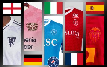
 Toronto FC Captures Caribbean Energy With New Third Kit
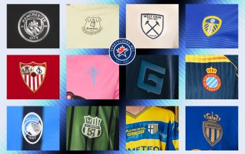
  2023 Football Kit Preview: Major League Soccer
  Toronto FC, Orlando City Round Out MLS Kit Unveilings Ahead of 2023 Season
  2022 Football Kit Preview: Major League Soccer
  Four More MLS Clubs Unveil New Kits for 2022 on Saturday
  Toronto FC pays tribute to Toronto soccer history with 2016 away kit
  Multiple 2015 MLS Kits Leak Over This Past Weekend