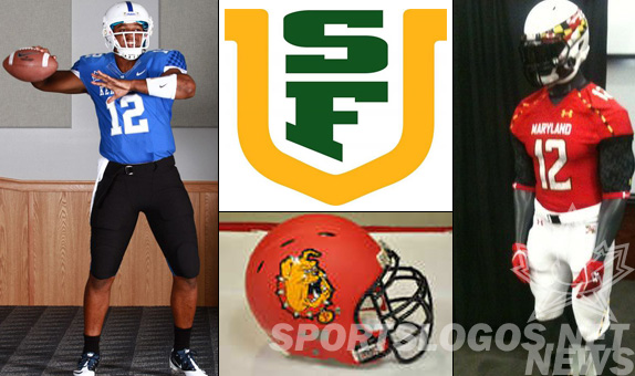
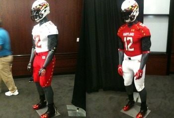
- Maryland
Maryland, often referred to as the Oregon of the East for their wild uniform combinations, has done it again with another new edition for 2012. They went back to something (shock) traditional for the school, with a red jersey and white pants. But of course they went and Maryland-ed them up with black and yellow checkered piping, and the helmet, oh the helmet. Apparently the Rook/Pawn half and half look will return for a game or two, but now Maryland has a flag-inspired helmet that takes the flag and stretch/wraps it across the side. It actually looks like speed and energy. Best of all it fits on the side of the helmet and shows the whole visualization of the flag. Distinctive but well done, we say.
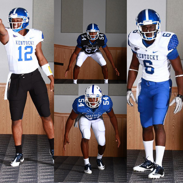
- Kentucky
Oh, how the mediocre have fallen. OK, that’s not fair; Kentucky‘s team performance has nothing to do with their uniforms- traditionally a gorgeously simple blue and white. Now, the athletic department and head coach Joker Phillips have destroyed what used to be right about the Wildcats and have added black jerseys and pants for no discernible reason, save for the lousy scapegoat excuse of “for the kids.” More mix-and-match selections available on the Kentucky Facebook Page
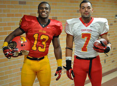
- Ferris State
Alas, it is too late to Save Ferris from matte helmets. In order to clash as much as possible with their new shiny red jerseys, the Bulldogs have been saddled with matte “red” helmets, that by all accords, look pink with the matte finish. The uniforms are nice, however, with sharp colors, TWO total jerseys like a real team should, and clean, simple striping.
- San Francisco
Your humble author admits he didn’t even know this school existed before this story crossed his desk. Apparently, there is a school named the University of San Francisco. Even they admit that their previous identity, which used “USF,” wasn’t distinctive enough and was often confused with University of South Florida. The color palate couldn’t have helped. Their new identity and logo set is using a spelled out San Francisco and their mascot, “Dons.”
Thanks for tuning in to the Grab Bag. What do you think? Mad at Kentucky for adding black? Hate the sherbert helmets for Ferris? Irritated that I didn’t know the U of SanFran? Pissed at Maryland of continuing to dishonor the state flag?
Or, are you happy about some of this news? Speaking of happy, how do you like the smaller updates being grouped like this?
Also, what’s your favorite deciduous tree?
Related stories:
 Arizona State Unveils Valley Heat Reverse Retro Uniforms
  New Tennessee Volunteers Black Alternate Jersey Leaks Online
  Washington Huskies Replacing Turf At Alaska Airlines Field At Husky Stadium
  Duke’s New Helmets, One Reversed, the Other Blacked Out.
  UNLV changing up their helmet design
  Are the Fighting Illini Looking at New Uniforms?
  Rutgers New Uniforms With Distressing – PICS
  Logo Links: NCAA, Canada Day, Nike redesigning the NFL, Soccer, Rugby, Cricket oh my!