With bated breath, the sports uniform world expands to perhaps its largest on the eve of an Oregon Duck uniform release. People otherwise not interested will tune in to see what wild and wacky stuff the playground of Nike will sport in their next year’s matches.
Today was such a day, as the Ducks promised to show their 2012 uniform sets. The time came and the artsy, closeup photos from the Nike studios, lit and posed so that one might think this was the latest Gucci release.
The problem is… they aren’t different. Or all that wacky. In a college football uniforming landscape that is overrun with Oregon imitators, goofy color combo wannbes, and the addition of black, matte, aranthacite (whatever that is) and textures… Oregon turned the whole universe on its head and…
Didn’t change anything.
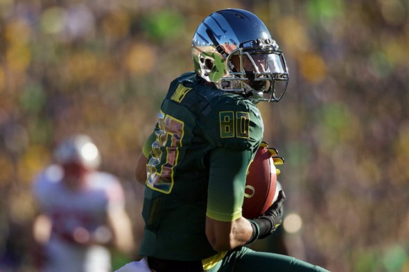
Now, to be clear, the jersey technology has changed (we will discuss later,) and the white and yellow versions were shown, but check out this photo from the promotional materials for the Rose Bowl from last year:
Released today was the same uniform worn on the 2nd of January. Aren’t you glad you got so excited about the release today?
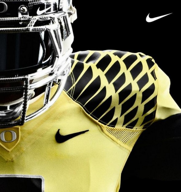
Also shown were the yellow and white versions.
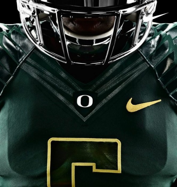
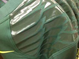
Here you can see the mesh again, under the arms. The black wings almost appear to be a patterned fabric sewn in to the shoulder pieces. Helmet designs weren’t exactly featured, so there aren’t many details, but here you can see the carbon fiber pattern on the facemask. Very few items actually made of carbon fiber, many are faked.
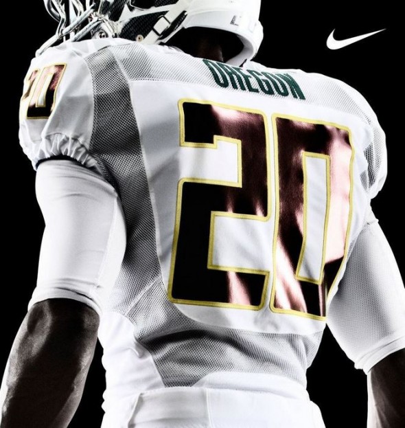
The white set actually seems, if you can believe it, tame. While one assumes the wings are present, they aren’t seen here. What is, however, is the ventilation pieces, which Nike has needlessly gothed up with the name “Chain Maille Mesh” which does little to describe it. Mesh, sure.
All that was left were additional art shots and some detail.
Posted on twitter by various folks (and hard to be certain who was the original source) was a photo from the Ducks Bookstore
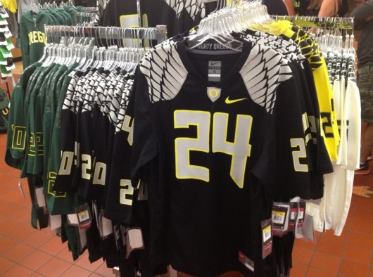
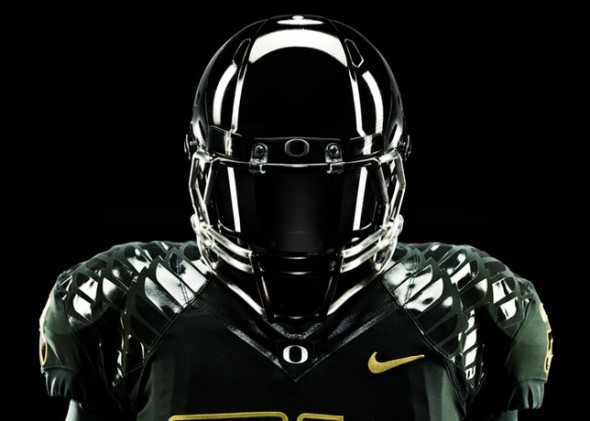
The Nike promotional materials seemed to show a black jersey, though only right at belt level, so the design was not visible enough to be judged. If the wings actually end up being as white-grey on the field as in this photo, it will be the “wildest” look of a tame bunch.
Again, for your reference, the Ducks will look this season, largely like they did at the Rose Bowl last year.
The phrase, “well, its not as bad as Oregon” will need to be retired if this is as crazy as they get. It remains to be seen how many different helmet finish iterations they will end up wearing each week. As always, stay tuned here where we will keep you up to date!
How do you like the Oregon look? Do you agree it is tame, for the team that has spent years on the bleeding edge? Are Notre Dame fans disappointed today, that the Ducks didn’t bail them out and they still have the ugliest uniform in college football for 2012?
Related stories:
 Oregon Ducks Unveil “Eggshell” Alternate Uniforms
  Oregon Ducks Unveil New Nike Football Uniforms
  Oregon Ducks Unveil “Ohana” Alternate Uniforms
  Oregon Ducks Unveil New Uniforms, Nike Vapor Fusion Template
  Oregon Ducks Unveil New Uniforms for 2013 Alamo Bowl
  UNC Set to Unveil New Football Uniforms, Early Pics
  Time To Give You Your Say in the Best, Worst Unis in 2012 NCAA Football
  Rutgers New Uniforms With Distressing – PICS