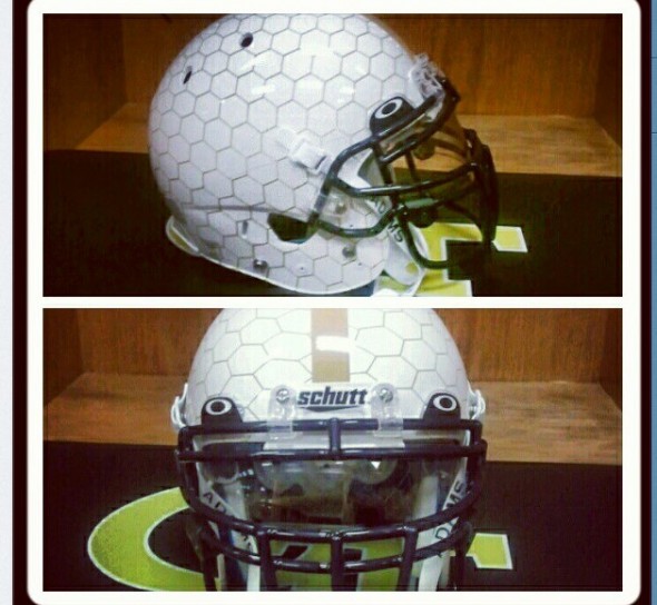
Tech Quarterback Synjyn Days tweeted today with a photo of a new alt helmet for Georgia Tech. His message: “New helmets … Lets Get It 9/3.” The tweet has since been deleted, surely the results of a hand-slap from the administration.
“We do have a second helmet that we have to wear a few times in practice in case we want to wear it during the season,”
-Dean Buchan, Assistant Director of Athletics – Media Relations
This validates our earlier report that the Yellow Jackets would be sporting a new uniform for the Virginia Tech game.
In the Instagrammed photo, the honeycomb looks almost grey, though one assumes, hopes, nay: PRAYS that the paint is a gold color.
What do you think? Further down the slippery slope of ugliness, or a trashing of a team steeped in tradition? Those really seem, to this author, the only two choices.
UPDATE – The badasses at HGI posted this photo a few hours ago.
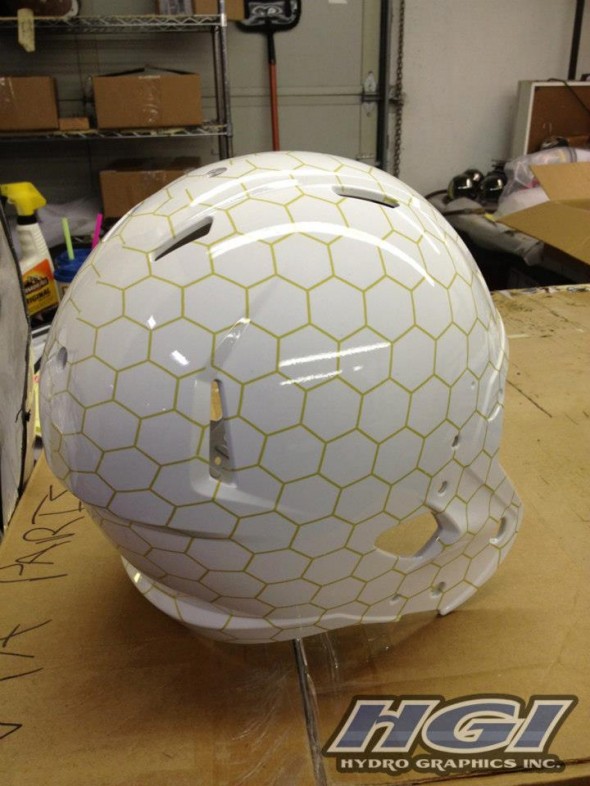
In a reply to this picture on their Facebook page, they say this is “just a concept” but its hard not to think they might be responsible for the actual production of the helmets and have been asked to keep quiet. If this is an actual Tech helmet, all we can say is… Thank goodness the lines are gold instead of grey or silver.
JR Francis is an actor, writer, director, graphic designer, UX guru, father, comedian, and craft beer snob. You can reach him at jrfrancis@sportslogos.net or on Twitter @JRFrancisSLN *One of several full-time uniform reporters this site has including its founder, Chris Creamer, who started his site in 1997


Danilo Navarro
Wednesday, August 29, 2012 at 15:04Horrible one ! Just like a Golf Ball
Matt Marczel
Wednesday, August 29, 2012 at 15:05The honey comb pattern on white makes it look almost like a golf ball.
yh
Wednesday, August 29, 2012 at 15:16"Chicken wire?" - Lou Marini
Jeff
Wednesday, August 29, 2012 at 15:25The only problem with this is that Yellow Jackets don't make honeycombs! As a GT alum, I applaud the effort for something new. The only saving grace is if they saw it's a wing pattern
C. Willis
Wednesday, August 29, 2012 at 19:38No yellow jackets don't make honeycombs. That's an error on the writer's part though. This is intended to represent a yellow jacket nest. Which is formed from hexagons just like this.
Brian Castner
Wednesday, August 29, 2012 at 15:31It would've looked better in gold but at least from this picture it doesn't look like the jumped on that horrible matte trend. They get points for that at least.
Daniel Hargis
Wednesday, August 29, 2012 at 15:44After listening to the GT beat writer on local sports talk radio, the helmet will have the 'GT' decal on them when they are worn.
Kyle Elgarten
Wednesday, August 29, 2012 at 16:13thats a golf ball
Splash*Boogie
Wednesday, August 29, 2012 at 16:21Make the honeycomb gold on gold, toss the black GT on it and that helmet will be *shades* golden.
Douglas
Thursday, August 30, 2012 at 02:44Black belongs nowhere on a Georgia Tech uniform, haven't used that in football since the 80s, and Navy was made the official accent color for all sports (ending the use of Black in all other sports) in the mid-2000s. Make it the standard GT logo (white with Navy outline) and it would be golden.
Kevin
Wednesday, August 29, 2012 at 16:53Im suing Georgia Tech. Last week I told everyone that I was going to make a concept for our high school football team with honeycomb helmets. I'm not joking I am suing GT
Douglas
Thursday, August 30, 2012 at 02:41Yeah these are older than a week old, its only now that the design is being shown off on the real thing. I guarantee you this was part of the package presented with the new uniforms months ago.
Zack Paps
Wednesday, August 29, 2012 at 17:00This is just getting ridiculous.
D.C. Swinton
Wednesday, August 29, 2012 at 17:18This isn't terrible, but it doesn't make too much sense. Of course, "sense" was thrown out the window with the Norte Dame jerseys...
Jed
Wednesday, August 29, 2012 at 17:19What a horrible design for a helmet.
C. Willis
Wednesday, August 29, 2012 at 17:30You can tell it's football season. All the curmudgeons are out complaining about helmet designs.
Nathan
Wednesday, August 29, 2012 at 19:03Honeycomb with gold and darker lines would be cool. Not white!
Matt
Wednesday, August 29, 2012 at 19:34Fore!
will
Wednesday, August 29, 2012 at 21:05listen, i go to tech and its pretty sad when your "brand new" uniforms the past few years have been App. State knockoffs. we have to deal with Russell athletic, remember. everyone has been wanting something new and creative, but once something finally gets put out all the naysayers pitch a fit. its for one game, its creative. Im for going back to the traditional uniforms we had in the Gailey years, but I'm also for something innovative that will excite the players and get recruits attention.
William Stohl
Wednesday, August 29, 2012 at 21:50I hope this madness stops.
Nathan
Wednesday, August 29, 2012 at 22:05Make the helmet gold and the "honeycombs" navy and the stripe navy or white
SportsLogos.Net
Wednesday, August 29, 2012 at 22:22HGI ( Hydro Graphics, Inc. )
Lindsay Resnick
Wednesday, August 29, 2012 at 22:36As a Georgia Tech student, I disapprove, even though I love white helmets. But I also always hate our unis, I hope this year they aren't so "arena football-ish." I wish it was how the old GT helmets were: white with a navy-gold-navy stripe and gold GT decal
Douglas
Thursday, August 30, 2012 at 02:56The post should be updated to mention that there will be a GT logo on this thing (and hopefully Navy Stripes, effectively making this the late 1960s/early 1970s helmet with a comb pattern applied to it). As a Tech fan I have absolutely no issue with these, as long as they are limited to twice a season at most. If they are used for the VT game I imagine they will also be worn in the whiteout game later this season, preferably they'd be limited to the whiteout game only moving forward.
JR Francis
Thursday, August 30, 2012 at 15:01Douglas, do you have any source on the idea that there will be a logo and additional striping? I havent seen anything referring to that. I'd love to update this appropriately.
ingmar66
Thursday, August 30, 2012 at 04:14Reminds me of EPCOT or those Buckminster Fuller domes from the sixties. This is a very wrong design indeed.
Aaron
Thursday, August 30, 2012 at 09:38Kind of reminds me a little bit of the Ontario Place Cinesphere. Would definitely look better in gold with black lines!
Daniel Keeling
Thursday, August 30, 2012 at 10:41I really like this idea. It is really wise to use a honeycomb design in reference to Georgia Tech's athletic nickname.
baseball
Tuesday, September 4, 2012 at 13:13At this time I am ready to do my breakfast, after having my breakfast coming yet again to read further news.