

Hey, this is Steven Little of The Sports Design Blog doing a guest post for SportsLogos.Net News. This week kicks off the most exciting time of the year, college football season, which means it’s time for my favorite post of the year – who’s getting new football uniforms in the NCAA?
This list is growing exponentially every year. I imagine if I wrote this post 10 years ago, it wouldn’t have taken very long to research all the changes. Last year introduced a whole bunch of new trends and continued some others (see my 2011 NCAA uniform preview from my site here), and we saw more teams than ever changing their uniforms or adding a one-time uniform to their arsenal. This year is no different, and there’s a lot of material to cover, so let’s get to it.
While I love that design is becoming so important in sports, college football in particular, some of this has just gotten ridiculous. Some of the one-game uniforms unveiled this off-season are insane, and the fact that so many teams feel the need to jump on a particular trend is making some of what would be unique or special overdone. And what’s most crazy to me is that classic teams like Notre Dame, Michigan, Nebraska, and the service academies are in on it now. But it’s not all crazy. Some of the innovative uniform design has been awesome.
Trends that I like:
- Matte finish helmets – BUT, too many teams have added one just to get in on the trend. It looks great when a team SHOULD have a black helmet (or other color that looks good flat) or the matte finish complements the uniform design well. Some look nice on their own but make no sense with the accompanying uniform.
- A big chest logo instead of a number – I always wondered why football didn’t do this more. It’s more of a one-game thing right now, but I’m sure someone will introduce an everyday uniform like this soon enough.
- Having a couple helmets – See below for my thoughts on more than a couple.
Trends that I don’t like:
- Having 6,000 uniform combinations – You can blame this one on Oregon (like many uniform trends). I like that teams have a few options now, and even a couple helmets, but 4 helmets, 4 pairs of pants, and 4 jerseys means you’re not going to use most of the combinations available, and you’re probably not even going to use some of the individual choices available. We should be able to tell at a glance on TV which team is playing. I don’t want to piece the colors together and wonder which combination a school with those colors is wearing that day.
- Putting STUFF all over the uniform – While I prefer a more classic uniform look, I still enjoy a lot of the design coming out today. But the ones that are well-done are modern more because of the cut of the uniforms, the technology, and the sleek design – not because they invented a new piping pattern to slap all over the uniform. A uniform can be great and modern with a couple shoulder and pants stripes if there are good, subtle choices and attention to detail.
- Half-and-half helmets – I’m looking at you Maryland and Notre Dame.
- All the one-game uniforms – I like seeing a team wear a special uniform for a big game or a throwback in honor of an anniversary of a historic team, but does everyone need a uniform they wear one time just because? And these are the ones that mostly look ridiculous.
So here are the 2012-13 changes to FBS schools’ uniforms in alphabetic order, including one-game uniforms.
Air Force

The Air Force Academy has always had the least traditional uniforms of the three service academies, though not that modern. Now they’re pretty modern, and they look good. This is a rare instance of the colored shoulders that I think looks good. It appears they’ve added the gray helmet and uniform that they wore against Navy last year to the permanent rotation.
Arizona
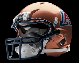 Arizona, probably feeling the need to keep up with Arizona State from last year, added a copper helmet to this year’s repertoire. It’s a nod to the state’s copper mining history, and it’s a cool, unique color for a football helmet, but I think it looks terrible with the blue and red logo.
It also appeared Arizona may be adding this red helmet, but that rumor was debunked by the school’s athletic director.
Arizona State
Is Arizona State adding this new silver helmet to their already big list of helmet choices? If so, I like the helmet despite already having plenty of choices.
Arkansas
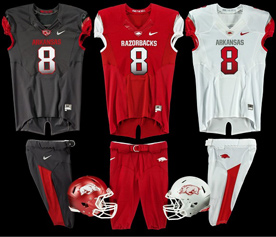 Ugh. Arkansas continues to have bad uniforms; just different ones. The only ones I think are ok are the white ones because the shoulder color and gradient number don’t look as bad. But the black to white gradient numbers are awful. And you can’t read “Arkansas” very well on the black jersey. I’ve never been a fan of the Razorbacks’ helmet logo, which now comes on white. The worst part is probably the lightning bolt shoulder stripes, which are supposed to represent the hairline on the mascot’s back. Should have just gone with the lightning bolts explanation over back hair.
Arkansas State
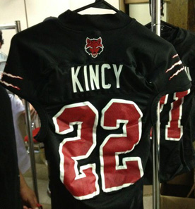 The Arkansas State Red Wolves have new uniforms with claw marks on the shoulders. How
 intimidating lame.
Army
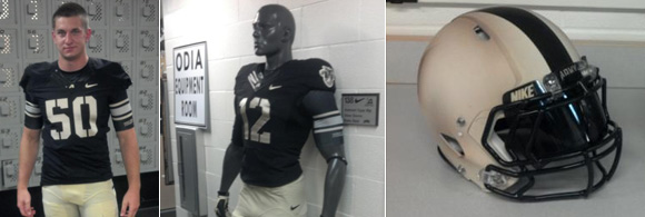
I love Army’s new uniforms. The stencil numbers are great, and the shoulder patches look great on black. The new helmet is an improvement, too. I love the matte gold look they’ve achieved, and the thick stripe is fitting.
Ball State
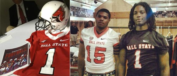
Ball State cleaned up their uniforms, and while they’re nothing flashy, they look nice. It’s better to look nice while a little boring than look ridiculous trying something more.
Baylor
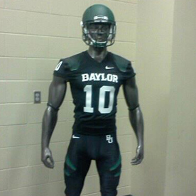 Baylor added a black alternate to their already ugly set of uniforms. Those pants stripes make me sad.
Bowling Green
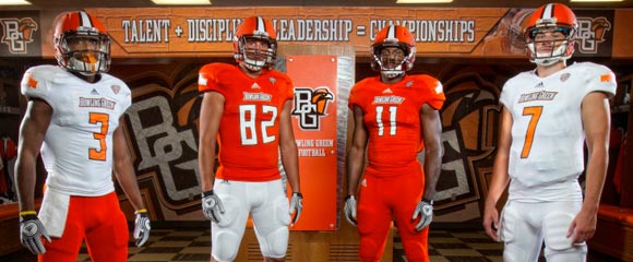
Despite changing uniforms last year, Bowling Green has changed again. They ditched last year’s ugly number font, and the helmet this year is – what else? – a matte finish.
Central Michigan
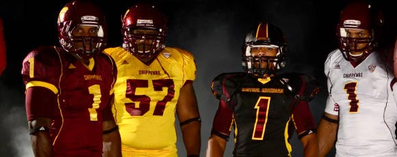
Central Michigan’s new uniforms added an all-black and all-gold uniform. The black set is a different template than the other three, and the helmet is a – wait for it – matte black helmet that includes a giant center stripe.
Colorado State
 Colorado State simplified their uniforms a ton. I didn’t like what they had before, but this falls into the Ball State camp: Boring, but better-looking than the cluttered alternative. They have pretty classic helmets, too, so this look goes well with those.
Duke
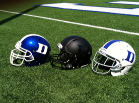 Duke already has one of my favorite football helmets. The blue one is ok, so I’d be fine if they left that out, but the black one is a pretty sweet alternate. The black may seem a little random, but the basketball team has been using it as an alternate color for years, so it’s not completely out of the blue (get it?). It would look terrible with their current uniforms, so I’m guessing there’s a black alternate uniform coming as well.
Eastern Michigan
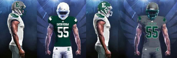
Add Eastern Michigan to the list of teams that have roughly 1,000 possible uniform combinations. They now have a white, green, and gray version of everything that they can combine however they like. The simplicity is nice, and the shoulder wings are done better than any Oregon has done in my opinion, but the uniforms are also a little boring. The E helmet and chest text could be spiced up for sure. And the all gray one probably doesn’t look very good in real life.
Georgia Tech
 My alma mater is making some uniform noise the day the college football season begins. Multiple players tweeted an image of the helmet to the left, which were taken down shortly thereafter. It was released in June that Georgia Tech would be unveiling new uniforms this season, but not until they come out of the tunnel at Virginia Tech Monday night. This helmet is most likely part of that uniform, so the “new uniforms” we heard about may be a special occasion set instead of a new everyday uniform. It sounds like the new helmet will get a GT logo before it’s used, which should look something like this.
When I first saw the helmet, I thought it was a little hokey, and I didn’t like it. But seeing it with the GT logo made like it a little more, but only as an alternate helmet for occasional use. I really do hope the new uniforms we see Monday are for everyday use with the gold helmet and look better than what we’ve had to look at the last few years.
Houston
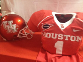 Houston got a new set of logos and updated the uniforms along with them. I love the new cougar logo, but it doesn’t make an appearance on the uniforms. Really, they just beveled the old UH logo. A really cool uniform rebrand could have accompanied the new logos, but they pretty much stuck with what they had plus some 90s beveling.
Idaho
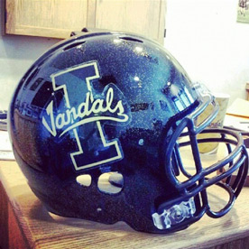 Idaho added a black football helmet with gold specks in it, which looks pretty cool.
Iowa
 Iowa will wear throwbacks honoring the 1921-22 team against Iowa State on September 8. I’ll be honest – I love these (as throwbacks). Here’s the 1921 team they’re modeled after. The uniforms will also include a gold helmet.
As a side note, I wish all throwbacks from the leather helmet era included the Washington Redskins’ faux-leather helmet.
Marshall
 Marshall updated their uniforms last year, but added a white version with green pants this year. It’s a really good look overall, and the custom type on the chest, while not the best mark ever, is a nice touch.
Maryland
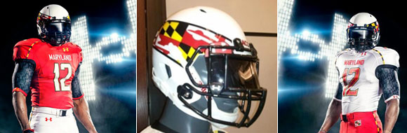
The poster child for bad uniform design in last year’s post has come pretty full circle. They took the two combinations I liked last year (red tops, white pants, and vice versa) and added to it a helmet that’s actually pretty cool. No more turtle shell, no more yellow or black (at least that we’ve seen yet)… I actually LIKE these. A lot. The infamous “pride uniforms” will remain, but as long as they keep the yellow and black uniforms and the turtle shell helmets in the closet, Maryland will have gone from my least favorite uniforms in the country to one of the better in one year.
Massachusetts

UMass is joining the ranks of FBS this season, and they’re bringing new uniforms with them. The regular set looks really good, actually, with a custom mark on the chest. The all blacks aren’t great, but at least black is one of their colors.
Michigan
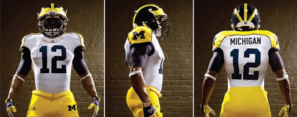
Michigan will wear the alternates above against Alabama this Saturday. I like them, but it’s strange to see a team with one of the best uniforms ever messing with them so much in the past few years.
Middle Tennessee State
 Middle Tennessee State added a black alternate uniform. All are still generic.
Minnesota
Minnesota went with a new, simple design that looks really good. The yellow ones are a bit much, but paired with the new matte helmet, the new uniforms look really nice.
Mississippi State
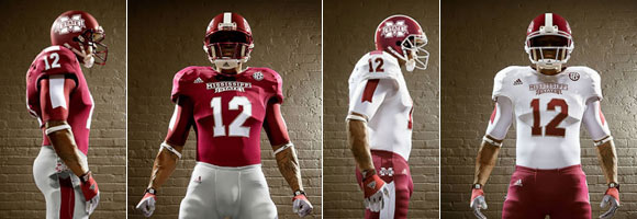
Mississippi State’s new uniforms are pretty solid. The thick shoulder stripe continues onto the under armour, forming a banner like the one in their chest wordmark. Another nice use of a custom mark on the chest instead of generic type, though it may be a little big.
Missouri
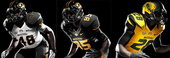
Missouri’s entering the SEC in style. They got a whole new look, parts of which I love and parts of which could have been better. I LOVE the white jersey with the gray shoulders. That design seems like it would be perfectly paired with a matte black helmet, but only the yellow jersey got that helmet. As for the shiny helmet, it’s ok. I would have preferred it without the stripes. The matte helmet with the big tiger head looks good, but I think it might have looked better with either a more subtle tiger (maybe gray) or the yellow and white tiger instead of all yellow.
Nebraska
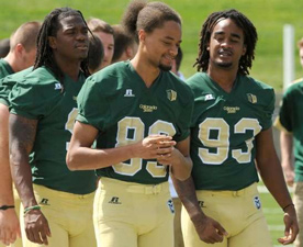
 Nebraska will wear these uniforms against Wisconsin on September 29. Wisconsin will have a similar alternate (at the bottom of this post). I don’t love the monochromatic look, and I think the helmet could use some white, but I love the big chest logo concept. I’ve always wondered why football teams didn’t do this more. While I don’t think this would be a good look every week, it’s a cool alternate.
New Mexico State
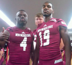 New Mexico State has a new, clean look that falls into the “a little boring, but way better than what they had” crowd. Would be better with white pants.
North Carolina
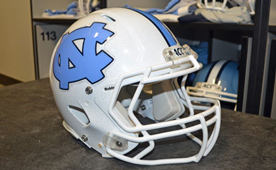 North Carolina will add this white helmet option this year. I love white helmets, but for whatever reason, I prefer their Carolina Blue helmet. Probably because it’s their own unique color that no other school uses.
North Carolina State
 NC State added this nice little touch to their uniforms this year. The “S” in state includes the “NC” from their logo.
Northwestern
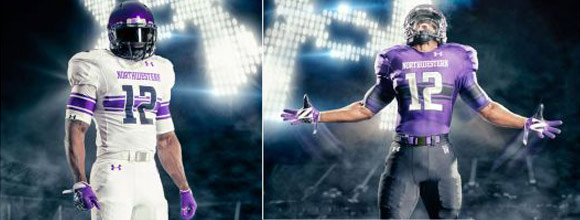
Northwestern got one of my favorite redesigns of the year. Or maybe ever. I’ve always hated Northwestern football uniforms, and I think these are great. Northwestern switched to Under Armour this year from Adidas, and boy did it pay off. The “Northwestern stripe” is that pattern of one wide stripe bordered by two thinner stripes, and it was introduced by the 1928 Northwestern football team. It’s a shame this is just now making it back onto their uniforms. And it’s done so in an awesome new way. I love the stripes passing behind the numbers. The white jersey is a lot better than the purple because of the contrast between the jersey and the lines, but I love these and can’t wait to see them in action.
Notre Dame
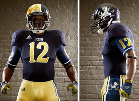 I’m sure you’ve seen it by now. Notre Dame will wear the uniform to the left against Miami on October 6. Honestly, the jersey is gorgeous and the pants are ok (because the stripe is too big) – the helmet is just awful. Both sides of it suck, and it sucks more because it’s uneven. The number type and the “Irish” wordmark are great, though.
The Irish will also be wearing these Ireland flag shoes in their opening game against Navy, being played in Ireland.
Ohio
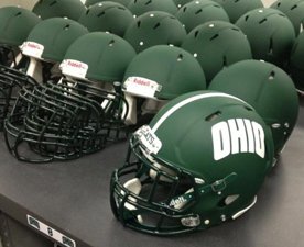 Ohio added a matte green helmet, which they’ll wear in the season opener against Penn State.
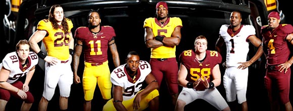
Oklahoma State
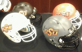 One of my favorite redesigns from last year, Oklahoma State, is getting one addition and one tweak. They’re adding an orange helmet, as if they didn’t already have enough, and the gray jerseys will now have black numbers with an orange stroke instead of the other way around. These are still some of my favorite uniforms in college football.
Oregon
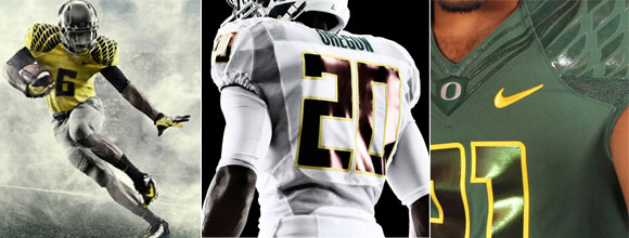
Now we come to the team that started all this. This post wouldn’t be 1/10th this long if Oregon and Nike hadn’t started experimenting years ago. They’ve tweaked their shoulder wings, which I have never liked, and I think it’s an improvement. The old ones looked like robot bird wings. These look sleek and fierce, and I love the subtlety of the wings on the green uniforms. I always thought the old wings were too prominent, and they still are on the yellow uniforms. Some of the new helmets are a little ridiculous.
Rice
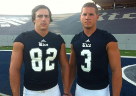 Rice switched from Nike to Adidas, but not much else changed. Another nice wordmark instead of generic type on the chest.
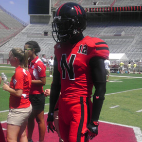
Rutgers
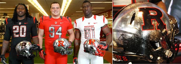
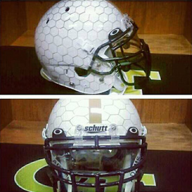
I’m all for using design elements that are specific to a school or team to create a unique design, but you have to know when it crosses to line to corny. Rutgers crossed that line. The new Rutgers designs took Scarlet Knights a bit too literally. Let’s start with the helmet. The “battle-scarred” chrome helmets are a really cool idea…if they’re for a special uniform, like a Pro Combat. They did a good job of making the helmets look like used armor, but it’s just a little too themed for an everyday helmet.
The uniforms are pretty normal, except for the number font, which is also knight-like. This I don’t mind as much because it’s less strange, but it’s still close to that line where it’s a little too Medieval Times.
San Diego State
 San Diego State’s new uniforms are pretty 90s with an ugly number font and a huge name font on the home jerseys, but the new helmet is a huge improvement. They have a pretty good logo, so it made no sense not to be using it on the helmets.
San Jose State
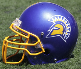 Much like San Diego State, San Jose had a logo that’s good for a helmet that they weren’t using. Now they are as well, and they’re using a spear as a helmet stripe, which is pretty cool and looks pretty good. Too bad their colors and uniforms stayed the same.
SMU
 SMU tried Northwestern stripes in a new way on the shoulder, and I really like it. Their old uniforms were nice and traditional, but I thought they had a few too many lines. These new uniforms are what I think is a great example of blending tranditional and modern. They took a traditional design element, the Northwestern stripes, and applied them in a new way that I think looks really good. They really cleaned up the rest of the uniform, too.
Southern Mississippi
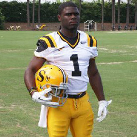 Southern Miss is wearing 1970 throwbacks against Marshall on October 20. The jersey is really cool. The helmet is ugly, though, but that’s just because they had ugly helmets in 1970.
TCU
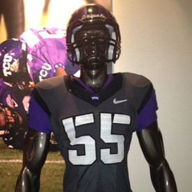 TCU added a dark gray uniform and helmet to its many choices.
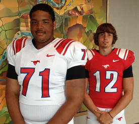
Texas A&M
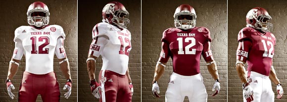
Texas A&M, like Missouri, is joining the SEC with a new set of uniforms. They’re pretty similar to Mississippi State’s Adidas uniforms, but with 2 shoulder stripes instead of one thick one. I like the number bevels on the white numbers, but it’s too prominent on the maroon numbers. I really like the two stripes, especially the continuation onto the under armour. It seems a little weird to me that they didn’t continue to use two lines on the pants, though.
Texas San Antonio
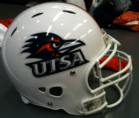 Texas San Antonio is making the jump the FBS this year, and they got a new white helmet, which looks nice.
Toledo
 Toledo got a new helmet that they’ll wear for one game this season. They should wear it every game. It’s really cool, and their current one is not.
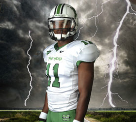
Tulsa
 Tulsa’s new uniforms are a huge improvement over the awful ones they had before. Now if we could just do something about those colors…
UAB
 UAB went really simple, which is an improvement, but that thin, letter-spaced type doesn’t really make sense there.
UNLV
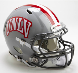 UNLV has a new helmet, and it’s really nice. I generally hate text helmets, but this is well-done, and it’s acceptable when your school goes by a short acronym like that.
Utah
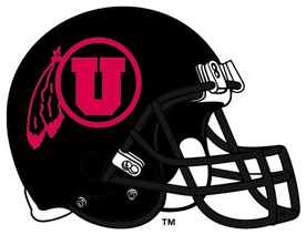 Utah added a black helmet and, at least in concept, it’s ugly. Red on black doesn’t work very well, much like the Nebraska alternate helmet.
Utah State
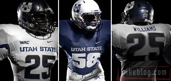
Utah State got a new logo and new uniforms. The logo is so-so, but the new uniforms look nice. Like some others, there’s not much to them, but that’s not such a bad thing.
UTEP
 UTEP’s monochrome uniforms are not very good, but the all-orange set they added for their opener against Oklahoma is even uglier.
Vanderbilt
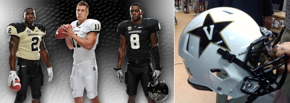
Vanderbilt got new uniforms and unveiled them on an escalator in a bookstore. Like Utah State, there’s not much there, but they look good, with the exception of the gold uniform. The black shoulders look awful. The new white helmet is really sweet, though.
Virginia Tech
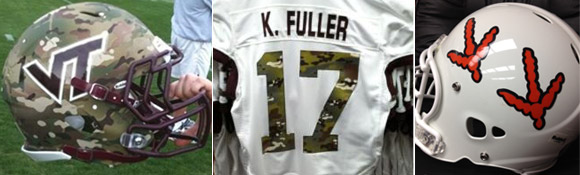
Virginia Tech continues to have really great uniforms, but they’re using a couple awful special uniforms this year. The camouflage uniforms will be worn against Bowling Green, and the turkey feet helmets will actually be worn in a real game of American Football against Austin Peay. I’m just glad they’re not wearing them in the opener vs. Georgia Tech. I don’t think the world could handle turkey feet vs. yellow jacket nest helmets.
West Virginia
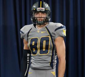 West Virginia is adding a gray alternate uniform.
Wisconsin
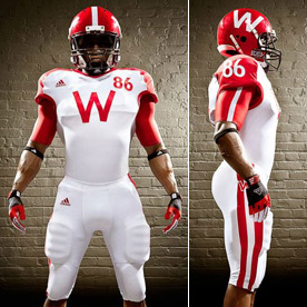 Wisconsin also has an alternate uniform for the game against Nebraska mentioned above. I like these a little better than Nebraska’s, but they may have just benefited from being the road team and getting white. Though I think Wisconsin’s in red and Nebraska’s in white would have been really cool and alleviated the red and black issues Nebraska’s have.
Wyoming
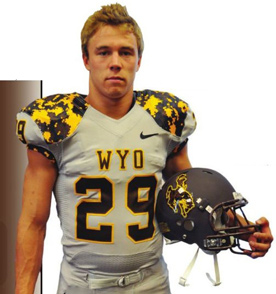 Wyoming already has ugly colors to deal with. Now they have camouflage to add to the list. And for whatever reason, they’ve paired a matte gray helmet with these. But that decal sure is shiny still.
Anything I missed? What are some of your favorites and least favorites?
[cardoza_wp_poll id=4]
Related stories:
 2021-22 College Football Uniform Preview
  UNC Set to Unveil New Football Uniforms, Early Pics
  Monday Night Mare. Georgia Tech Alumn Despises New Uniforms, Begs For Their Ouster
  Oregon Does What Oregon Does Best and Announces New Jerseys… Except, They Aren’t New
  Texas A&M Releases New Adidas Uniforms, Inspired By 1970’s Look
  Arkansas Finally Goes Official With Their New Uniforms
  Possible New Arkansas Football Uniforms?
  Rutgers New Uniforms With Distressing – PICS