
Tonight the Dallas Cowboys take a trip north up to East Rutherford, NJ where the defending Super Bowl Champion New York Giants will play host, together kicking off the 2012 National Football League regular season.
So let’s take a look around the league to see what’s new from a design point-of-view for the 2012 season…
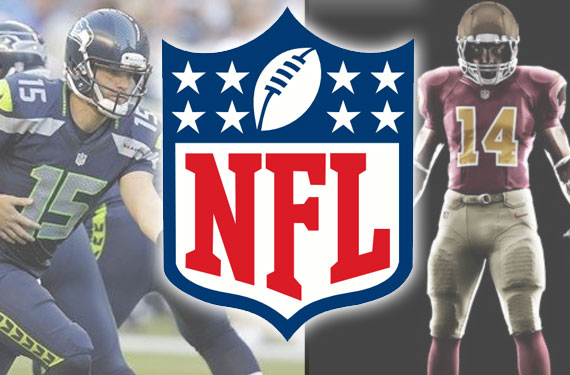
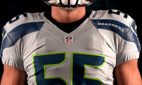
SEATTLE SEAHAWKS
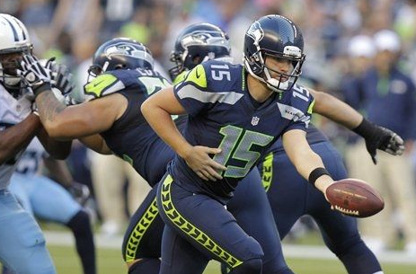
While the big news uniform-wise over the off-season was the league-wide switch from Reebok to Nike, in terms of design changes we didn’t see too much. The Seattle Seahawks were the one team to salvage a disappointing off-season by really overhauling their look.

I’ll admit, the Seattle duds are still going to take quite some time for me to warm up to and according to our poll we held last month…
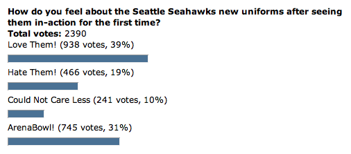
… a third of you put them on par with an Arena League team. Ouch.
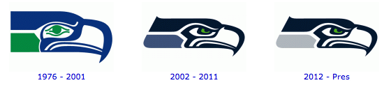
In addition to their new uniforms, the Seahawks also made a colour change to their primary logo. Light blue has been replaced with silver… I think I’d still like to see that green of the eye replace the silver to create more of a flow from the original logo:
Seattle also will wear a “wolf grey” alternate jersey during the season, which you can see here:
PITTSBURGH STEELERS
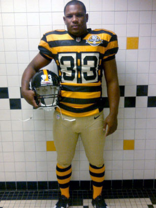
Oh, no… did nobody learn anything from the Broncos’ throwback uniform debacle? I mean, I haven’t laughed that hard at the Broncos since they hired that Daniels clown (and you just KNOW that Peyton took John E’s elbow and said, “John, I don’t really have to wear those awful throwbacks, do I?”) Well… I guess the Pittsburgh Steelers weren’t listening.
Prison stripes! It’s a jailbreak!!! (and who thought to take that picture in the SHOWER stall…?!?) I know, I know! They used to wear it, and yeah, anything to make more revenue from jersey sales.
All I can say is… it’s not worth this.
I wouldn’t want to play the Steelers most weeks, but I sure wouldn’t want to face them when they come out angry because they have to wear this crap. Grandma used to say, “Mark, if you’ve got nothing nice to say….” OK, Grandma, moving on.
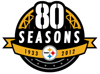
Okay, that’s better.
It’s just what you would want in a patch from Pittsburgh; the stylized split numbers, the girders, the logo, the years. It’s perfect for the target market, and will actually be the best-looking part of those awful uni… oh, okay, Grandma. Classic. Very nice. No B.S… just like Steeler fans.
WASHINGTON REDSKINS
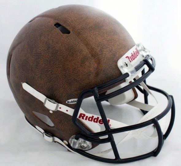
Oh, that is SO cool. Come on. You know you want one.
There have been some bad retro helmet attempts before, and it HAD to be tough to get something that looked right and was still durable enough for actual game play and didn’t look terminally stupid. Maybe the NHL can borrow this texture for their pants when teams go retro
Back to the topic at hand, these helmets are damn neat – and when coupled with the uniforms…
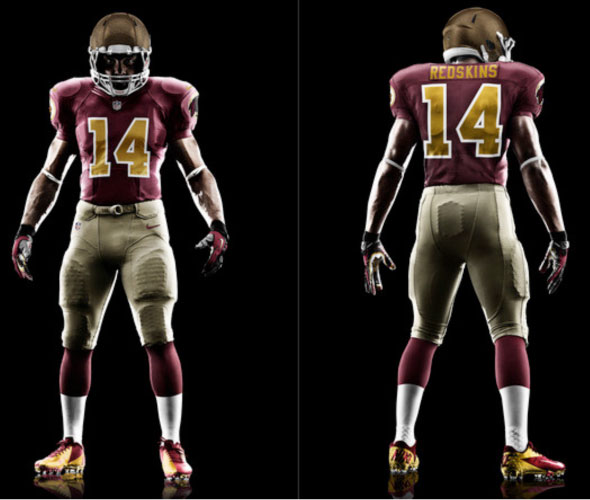
Yeah, I DO like it. Mean enough, simple, and it sticks to the scheme. You’ll know that’s a Washington Redskins player when you tune in halfway through SportsCenter, which is a key – you cannot have people squinting, going “What team is that?”
This accomplishes that goal, and I can see fans wearing these uniforms in droves… well, the jersey, anyways – I sincerely hope some of the ‘Skin fans I’ve seen don’t try on the pants. Wonder if they’ll sell leather replica hats?
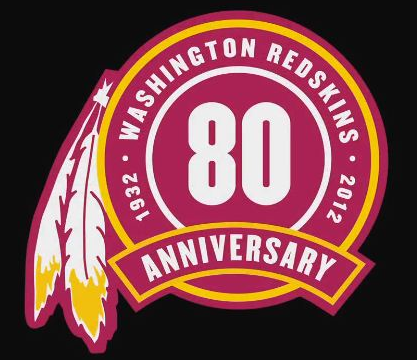
The Redskins also have an 80th anniversary patch which it looks like they will not be wearing on their uniforms:
The ‘Skins have had some great uniforms and some AWFUL duds. The logo? Sure. Art Monk would approve.
It’s the right colours, it’s got the feathers and it looks like it could be applied to 1932 team apparel.
CAROLINA PANTHERS
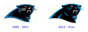
Aside from the Seahawks, the Carolina Panthers were the only team to take advantage of the Nike switchover to change their primary logo — the first time in Panthers history.
Carolina did a perfect job modernizing their logo, cleaning it up to make it appear more 2012 while making the changes so subtle that the average joe wouldn’t even notice a difference. A tactic I wish more teams would use when changing their look.
HOUSTON TEXANS
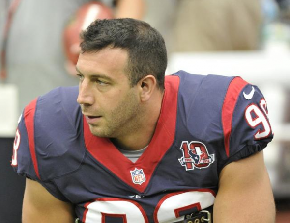
The Houston Texans have been here for ten years? When the heck did THAT happen? Okay, I’m old enough to still remember Gary Kubiak as a player, but it still raises my eyebrows that the Tex have been around for a decade.
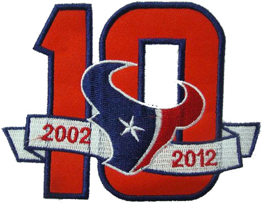
The patch? Meh, plain vanilla. Of course, most Texan folk don’t go for a lot of fancy dressing-up, and this one’s nice and simple, with classic easy-on-the-eyes lines. It’s clean, it’s clear, and it’s boring… but it works.
PHILADELPHIA EAGLES
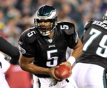
The Philadelphia Eagles surprised quite a few of their fans (as well as yours truly) by ditching their popular kelly green alternate jerseys in favour of the black alternates last seen in 2010.
Rumours are circulating that the Eagles may be returning to kelly green full-time in upcoming seasons, or are at least looking into it… so there’s still hope yet for fans of the classic look.
The Eagles will also be wearing a memorial decal on the backs of their helmets in honour of the son of head coach Andy Reid.
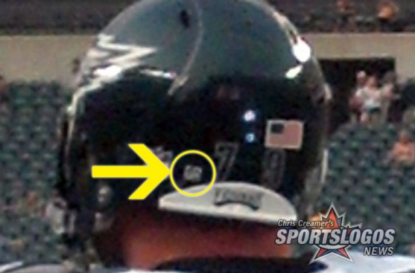
The decal are the initials “GR”, for Garrett Reid, in white on a black circle.
KANSAS CITY CHIEFS
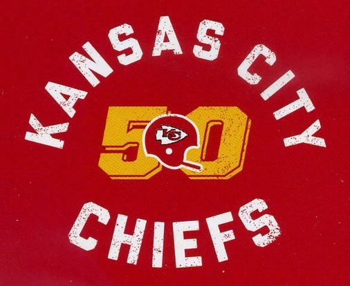
As head coach Scott Pioli put it, “How do I put 50 years in perspective? It’s longer than I’ve been alive.”
Now, a lot of people are solidly on the retro bandwagon, and I understand the homage to the past. This one pretty much defines the word “classic”. However, as a logo, it leaves a lot to be desired. Even as a devout San Diego Charger fan, I have to say that the Kansas City Chiefs’ uniforms are darn distinctive. The design is right, the logo is cool and the colours are pretty much perfect.
As a matter of fact, if I were picking a new fave NFL team the same way I picked the Chargers when I was 5 or 6 years old, the Chiefs would be in the running (because I like their uniforms).
The Chiefs are celebrating 50 years since their relocation from Dallas with this logo, it will not be worn as a patch on their jersey. Kansas City did a lot more to celebrate their 50th anniversary as a franchise (including their Dallas years) back in 2009. Still, to me Kansas City is selling themselves short with this design. There’s nothing wrong with it…but there’s not a lot to crow about.
When I turn fifty, there’d better be more of a fuss than this.
In other news…
The San Diego Chargers will be wearing a Junior Seau memorial decal featuring his number for their game on September 16th against Tennessee (although I’d be surprised if they don’t wear it all season). The Chargers will also be retiring Seau’s #55 before that game.
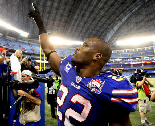
There are two International Series’ taking place during the 2012 season, the Bills In Toronto Series annual series continues for a 5th straight year on December 16th and as always the Buffalo Bills will be wearing their “Bills Toronto Series” patch on their jerseys for the game.
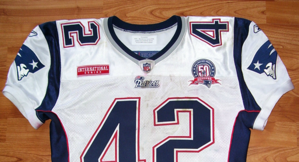
Starting up is the St. Louis Rams annual “International Series” of games played in London, England – both the Rams and their opponents the New England Patriots will be wearing a patch similar to the one the Pats wore just a few seasons back during a previous trip of theirs to England.
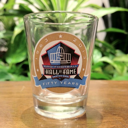
During both Week 14 and 15 every NFL team will celebrate the 50th anniversary of the Pro Football Hall of Fame in Canton, Ohio by wearing the above logo as a patch on their jerseys. Yes… I know that’s a shot glass but it’s the best shot I could find of the logo, use your imagination.
We’ll end this off with a partial list of what’s been confirmed so far for special throwback jerseys and alternate jerseys to be worn during the season:
Throwback jerseys
Atlanta Falcons black 1980s, Buffalo Bills white 1960s, Chicago Bears navy 1950s, New England Patriots 1980s red, Pittsburgh Steelers 1930s black/yellow, Washington Redskins burgundy 1930s
Alternate jerseys
Arizona Cardinals black, Baltimore Ravens black, Carolina Panthers light blue, Miami Dolphins orange, Philadelphia Eagles black, San Diego Chargers light blue, Seattle Seahawks wolf grey
All in all, some interesting changes this season. All kinds of fun for the logo junkie in all of us!
Related stories:
 All The New NFL Uniforms And Logos For 2022
  Pittsburgh Steelers will have new throwbacks for 2018 season The Steelers are finally retiring the bumblebee throwbacks
  A look at the 10 best Super Bowl uniform matchups
  Phantom Merchandise: NFC, AFC Champs, Super Bowl 50 Matchups
  Old Navy Fails at NFL History with New T-Shirt Line
  SportsLogos.Net Poll Of The Week: Thoughts on the New Seahawks Look?
  Pittsburgh Steelers Unveil Throwback Uniform