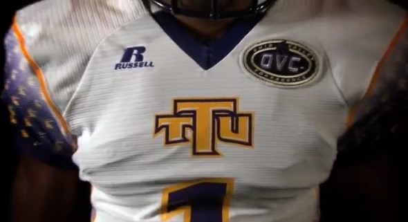
Tennessee Tech is going into Oregon this Saturday, and is taking on the Ducks with their best shot… at crazy uniforms. The Golden
Eagles will sport new duds from Russell. Which look very familiar. As we reported at the first of the season, Georgia Tech showed some new Russell uniforms. These look quite similar. Perhaps started from the same template.
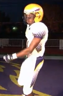
The sides have a sublimated Eagles head logo in a repeating pattern on top of a purple background. This pattern appears on the shoulders, the ribs, and down the leg. In addition to the pattern, the whole of it is faded out to white at the top.
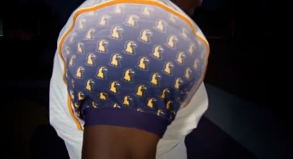
The eagle head logo is difficult to make out, though it makes a unique texture.
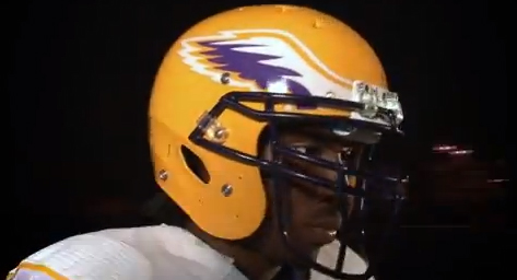
Golden Eagles nod to their past with a helmet design “inspired by” the 1972 conference championship team. They will be yellow with white and purple wings.
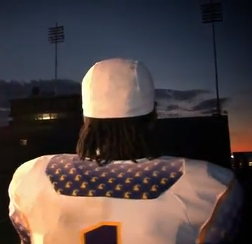
The back shows the Georgia tech style textured nameplate. Though now, this may need to be referred to as the “Russell-type” nameplate. It was not made clear how the name will be displayed, but one assumes it would need to be white text. Even then, how legible will the names be?
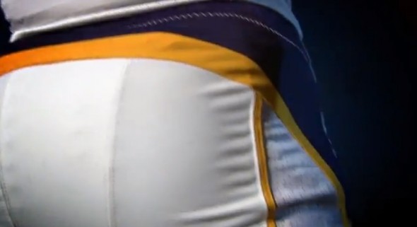
The rear of the pants have a wrap-around striping.
How do you like the uniforms? Does it make you more or less thrilled in that they now make the Georgia Tech uniforms appear to be a Russell template style?
Will you be more likely to tune in to the Oregon vs Tennessee Tech game for the new uniforms?
Enjoy!
Related stories:
 Maryland Reveals ‘Black Ops’ Uniforms For FSU Game
  UMass Welcomes Itself to FBS With New Black Helmet, Tweaked Unis
  UTEP to add modern-style Orange Uniform for the Oklahoma Game
  Mississippi State Bulldogs Unveil New Unis For 2012
  Eastern Michigan Announces a Mind-Boggling 20 Different New Uniform Looks
  New Unis in 2012 (and again in 2013) for Colorado State
  West Virginia is Going Grey for 2012
  Arkansas Uniforms Almost Certainly Real – New Photo

