The Cavaliers will celebrate the outstanding career of Frank Quayle in their game against Louisiana Tech.
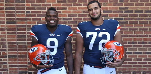
Special programs will have graphics from 1968, souvenir cups featuring Quayle will be available at concession stands, and the team will wear special throwbacks inspired by the 1968 uniforms. Nike created the throwbacks, with the V logo and stripes on what remains of the shoulders.
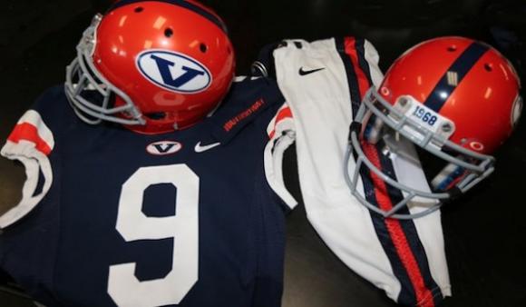
The helmets will also feature the retro V logo, with 1968 on the front bumper.
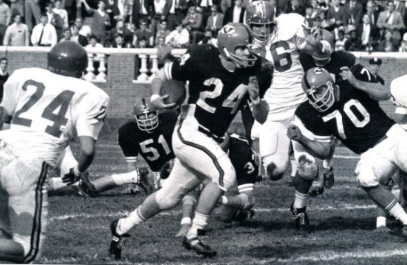
As you can see in this photo from the 1968 game against Tulane, the current season throwbacks are “inspired by” rather than direct copies. No patches, logos, or decoration on the old uniforms, other than the arm stripes.
Do you like the look? Seem clean and classic to you?
Related stories:
 Nebraska Cornhuskers Unveil Throwback Uniforms Celebrating 100th Anniversary of Memorial Stadium
  Purdue Boilermakers Promote Drew Brees-Era Throwback Uniforms To Full-Time Status
  Yale Bulldogs To Wear Walter Camp-Inspired Uniforms
  Tennessee Volunteers Unveil “Dark Mode” Black Alternate Uniforms
  Boise State Broncos To Wear Vintage Logo On Helmet For Homecoming Game Against Nevada Wolf Pack
  Michigan State To Wear “Gruff Sparty” Helmet Against Penn State
  Vanderbilt Commodores Unveil Alternate Helmet With Vintage Script Logo, Nashville Skyline
  BYU Cougars Unveil Retro-Inspired Alternate Uniforms

