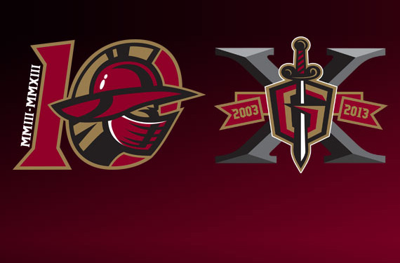
The Gladiators begin their 10th season of play at the end of October and have released two different 10th Anniversary logos for use on merchandise, jersey patches, and in-game graphics.
The first logo features the Gladiator’s head from their primary logo, seen on the front of the jerseys, within the zero of the 10. The roman numerals for 2003 and 2013.
The second logo uses the team’s alternate logo, as seen on the team’s shoulders. It displays the G-sword against a giant X with a banner showing the years of operation.
I’m sure our readers can help me remember another time multiple anniversary logos were used. No word was forthcoming which would be used on which jersey, or if both will even appear in patch form on jerseys.
Related stories:
 ECHL Gladiators Pay Tribute to Atlanta Hockey History With New Uniform
  ECHL’s Royals take ugly sweaters to the next level
  Sting Rays Hold Vote to Choose Military Jersey
  ECHL Team Unveils “Greatest Jerseys in the World” Trenton Devils suspend operations… Titans returning?