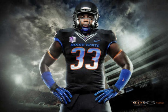
The Boise Broncos, known for their blue field, already pushing the boundaries of good taste and design and sports, has now announced that they will, for reasons we can only guess are somehow related to these tasteless esoteric “youth.”
Gradient numbers fade from Broncos blue at the top to what at the bottom.
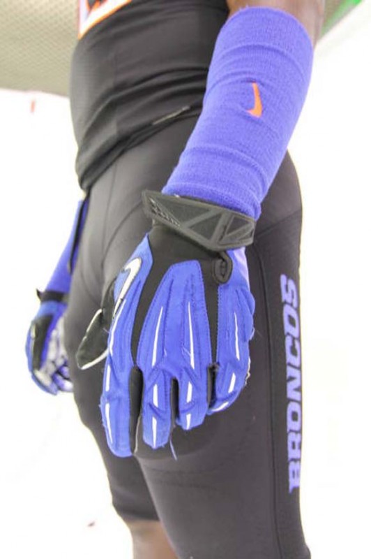
The models are shown with blue gloves and sweatbands. The pants are solid black all over, with a blue “Broncos” written down the side. The jerseys also feature the Nike-sperm collar that is goofing up several NFL uniforms this year.
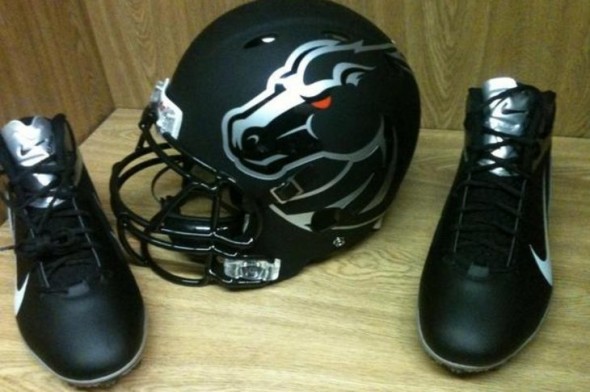
The helmets are painted a flat black, a notoriously un-favorite among our readers, with a HUGE broncos decal in silver. The shoes are a black and silver combo to match.
Something confusing is that different angles of the helmet seem to show different things. The above photo seems to show the decal being empty in the middle, allowing the matte black to shine through.
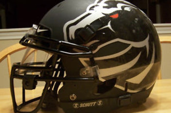
This photo appears to show a full decal, creating a shiny bronco head. Of course, flash and angles and so forth are to blame, as well as low quality photographs. But we can’t tell which will be true on the field. My guess is the full decal with shine, but tune in this Saturday to see.
Does matte, giant logo, gradient number, and black-for-no-GD-reason add up to be a universally panned uniform set? Or is this setup greater than the sum of its frequently-hated parts?
JR Francis is an actor, writer, director, graphic designer, UX guru, father, comedian, and craft beer snob. You can reach him at jrfrancis@sportslogos.net or on Twitter @JRFrancisSLN *One of several full-time uniform reporters this site has including its founder, Chris Creamer, who started his site in 1997


Chris Oglesby
Thursday, October 18, 2012 at 08:12Good God that is ugly looking.
C.d. Luebke
Thursday, October 18, 2012 at 08:28Someone needs to tell them that it is no longer 1996.
Andy Moniker
Thursday, October 18, 2012 at 08:30I wonder if there will ever be a day when we talk about the 00's/10s era of college sports where every team had a black alt and we all awkwardly rub the back of our necks and change the subject
wolfgangII
Friday, October 19, 2012 at 17:58there will be a day when this uniforms become "retro" (or even worst "vintage") and people will say: "I love this one, bring it back".
Lindsay Resnick
Thursday, October 18, 2012 at 08:38So, so ugly
Dude
Thursday, October 18, 2012 at 08:46Someone needs to call Boise and tell them that it is no longer 1996.
Jim Pericotti
Thursday, October 18, 2012 at 09:02Needs more trends. And stripes.
IPGComic
Thursday, October 18, 2012 at 09:06Call me crazy but I don't hate it. It's certainly out there but I dunno I kinda like it in a weird "Boise State what are you doing" kinda way
Marcus Jackson
Thursday, October 18, 2012 at 10:07Not a bad uniform, but I'd rather see them wear orange instead.
Matt
Thursday, October 18, 2012 at 10:38The apparel Taliban strikes again. Awful.
Angel Ortiz Jr.
Thursday, October 18, 2012 at 11:05The uniform is bad, but the Helmets are pretty bad-ass IMO
Stephen Peters
Thursday, October 18, 2012 at 11:06Is it bad that all I can think after reading this post is that I wish EA's Teambuilder even had the ability to do this kind of uniform creation. I hate this look, but I wish these type of options were available (e.g. large logo on helmet, matte, Nike collar, lettering on pants,etc.)
Frank Vespe
Thursday, October 18, 2012 at 11:08I like the helmets, but the rest of the uniform is god-awful. These new uniforms are getting ridiculous.
Justin Goff
Thursday, October 18, 2012 at 11:17Black helmet looks awesome with the silver head. Unfortunately, the uniform as a whole is a bad idea. There is no black what so ever in their colors. So no need for a black uniform. I do, however, like the whiteout uniforms from last year vs Georgia
Matthew Schilling
Thursday, October 18, 2012 at 12:31I actually like these. And they're much better than the whiteout ones they had.
Boyee
Thursday, October 18, 2012 at 14:43They should stick to Royal Blue and Orange...their colors. DePaul University's basketball team has a black uniform despite their colors of Royal Blue and Scarlet.
Aaron
Thursday, October 18, 2012 at 15:02It's the New York Mets (2000s) of football.
Chris McCabe
Thursday, October 18, 2012 at 15:05Black is what teal used to be in the 90s.
Brian Castner
Thursday, October 18, 2012 at 15:52Oh good. Another matte helmet. Just what the world needs. Hate this trend. The rest of the costume I can go either way on. Just looks like a black version of the ugly set they already have. Not needed but could've been worse. It could be gray or cammo. Then again I don't hate the black trend that much since black is my favorite color.
Jed
Thursday, October 18, 2012 at 16:20What is it with Nike creating all these crap uniforms for many of these NCAA teams? These are hideous! Stick with what works and stop experimenting with tradition! Matte sucks!
Justin
Thursday, October 18, 2012 at 16:42It's all about revenue Jed. How much can you get. Each new jersey means more money in the pockets of Nike.
ingmar66
Thursday, October 18, 2012 at 16:20Ban gradient numbers and logos by law right now! The rest of the uniform and the helmet are also very regrettable. Stick to royal blue and orange, Boise State!
Peter Riportella
Thursday, October 18, 2012 at 18:03i dont understand why nobody likes them, i think they look awesome, i think black jerseys are a very good idea.
Nicolas Ballou-Perez
Thursday, October 18, 2012 at 21:30What is Nike smoking when they are designing uniforms? First they went too far with Oregon then all throughout the NCAA Football people tried to copy them. Now they take ugly uniform designs to the NFL (Seahawks) which make me think that the NFL is gonna be like the NCAA soon all thanks to Nike. Just put your logo on the side of the uniform and that's it!
Jeremy Cating
Thursday, October 18, 2012 at 22:58Can Boise State please just go away? Nobody outside of Michael Wilbon and the people of Idaho care about you. Black for the sake of black? Get real!
Lights Out
Friday, October 19, 2012 at 01:04As a Boise State fan, I can't stand any part of this uniform except for the helmet, and even that I'd rather not see on the field. Why on Earth would Nike choose to push black of all colors on BSU when that's one of the Vandals' main colors? That's like if the Dodgers decided randomly to come out in orange jerseys one day.
BL.
Friday, October 19, 2012 at 01:19Beautiful uniform.
Ben Anijar Andersen
Friday, October 19, 2012 at 08:18I like it. But I do understand that too many colleges are adorning black as an alternate and that gets kind of repetitive.
Drew
Friday, October 19, 2012 at 14:03I really liked the helmet design when it was on the more-traditional blue helmet (though I really wish the logo was on both sides). This uniform, however...not really a fan. I don't despise it as a one-off, but I don't like it either.
Aaron
Friday, October 19, 2012 at 16:03I've mentioned this before, unless black is meant to be part of a team's colour scheme, please refrain from using black jerseys or the colour in general.
Skyler
Saturday, October 20, 2012 at 09:24Too many colors... blue, orange, white, black.
Bryan Grant
Saturday, October 20, 2012 at 16:47Very sharp.
Bobby
Monday, October 22, 2012 at 21:36I honestly can't stand teams that either currently don't have black in their color scheme or have never had black in color scheme introducing a black alternate jersey. If you want to produce a fashion black jersey for the fans, that's fine, but as an alternate don't do it. With that being said, these aren't too bad, actually quite nice.
Mark
Saturday, October 27, 2012 at 14:42So they went black to look exactly the same as half the entire sporting landscape... bravo. Boise's Smurf tone was a huge selling point, even the field turf- why turn away from that?? So dumb. Ask the Chargers if they think blue is hot.
Joey
Tuesday, October 30, 2012 at 14:24Coooooooooooooooooooooooooooooooooooooooooooooooooool