
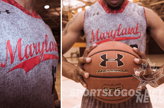
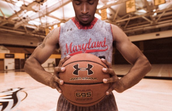
OK, let us get all of the facts straight. On November 9th, the Maryland Terrapins will play the Kentucky Wildcats at Barclay Arena in Brooklyn. Maryland has announced that to honor the “sports history of Brooklyn” they will have a one-game “wool-look” grey uniform that is intended to look like the Dodger’s old Brooklyn uniforms.
Did you catch all of that?
A school is honoring a city they aren’t from by wearing a uniform that isn’t made of the material it looks like, after a team that doesn’t play in that city any longer, while playing a game against a team from a third state, in an arena for professional basketball.
Is your head spinning yet? (Yes -Ed.)
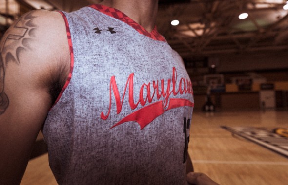
The uniforms, with their wool-texture sublimated on top of the normal light-weight Under Armour material will have an old-school baseball type script across the chest and the Maryland flag shapes on the collar and sleeve openings.
From a distance, they look almost like digital camo, but upon closer inspections they look like a combination of concrete-too-close-in-a-video-game, and chicken scratch. Only because of Under Armour’s press release did we know this was intended to look like wool.
The shorts will match the grey texture, and appear to not have a top stripe. We will have to wait for the game to see all of the hsorts, as the above two images were the only two made available.
Grey is becoming the new “Black-for-no-damn-reason” in sports. What do you think? Does it look good? Do you see the point in honoring the Dodgers? Will you run out and buy the replica? What if it actually WAS made of wool?
Related stories:
 Michigan Wolverines Forward Isaiah Livers Wears #NotNCAAProperty Shirt At NCAA Tournament
  Michigan State Basketball Announces Presenting Sponsor
  Ohio State Buckeyes Unveil Home Version Of 1980 Throwback Uniforms
  Kansas State Wildcats Unveil New Lavender Throwback Uniforms Wisconsin Badgers Add ‘4Moore’ Patch in Honor of Family of Assistant Coach
  The Weirdest Mascots of the NCAA Logo Links Mar 16, 2012: NCAA and High School Unis, New name for NHL arena