The Reading Phillies, Double-A Eastern League affiliate of the Philadelphia Phillies, unveiled their new name, logo, and uniforms at a fan event today at First Energy Stadium in Reading, Pa ending 46 seasons being known as the Phillies.
Just a heads up that this identity is all over the place, in fact the club now sports the most uniform options throughout all of professional baseball. So, I hope you’re strapped in and ready for this ride.
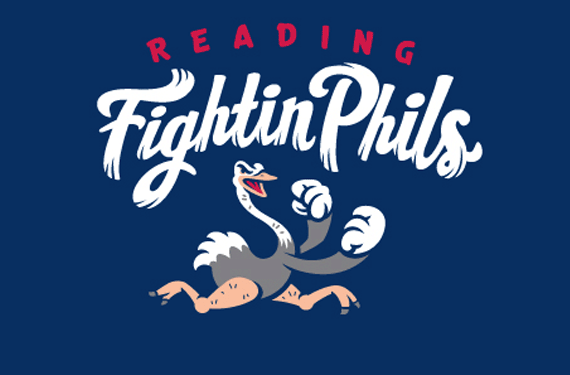
As SportsLogos.Net called it back two weeks ago the team will be called the Reading Fightin Phils, a play off of the nickname the press and fans used for the Philadelphia Phillies “Whiz Kids” teams of the 1950s, and while the new team uniforms further make the connection to those ’50s Phillies, the logo and everything else does anything but… If you are a fan of the Reading Phillies, the logo makes a lot more sense to you than it would to anyone else on the planet:
Yes, that’s an ostrich. No it has nothing to do with Philadelphians who fight… unless they’re suggesting they “ostrich” when challenged…
Nah, see the Reading Phillies have a mascot, “The Crazy Hot Dog Vendor”. Basically the character is a hot dog vendor who’s crazy and rides a fake ostrich around the stadium while tossing frankfurters to anyone with a sawbuck.
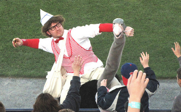
With that in mind, the following alternate logo should (repeat SHOULD) make a little more sense when you see it:
That’d be Bunbino, the hot dog that goes along with the ostrich… man are they really playing up this hot dog guy. It’s like when they used to show “Who Wants to Be a Millionaire?” once every three months, everyone watched it! When it switched to four times a day, well, we all got sick of it. I can’t imagine people won’t get sick of the Crazy Hot Dog Vendor now that he’s shoved in everyones faces at all times.
On to the uniforms…
First off the uniforms do incorporate something we haven’t seen before, faux-flannel pattern thanks to Wilson Sporting Goods, much like the Washington Redskins faux-leather pattern football helmet earlier this year. This could really help the appearance of throwback uniforms around the baseball world.
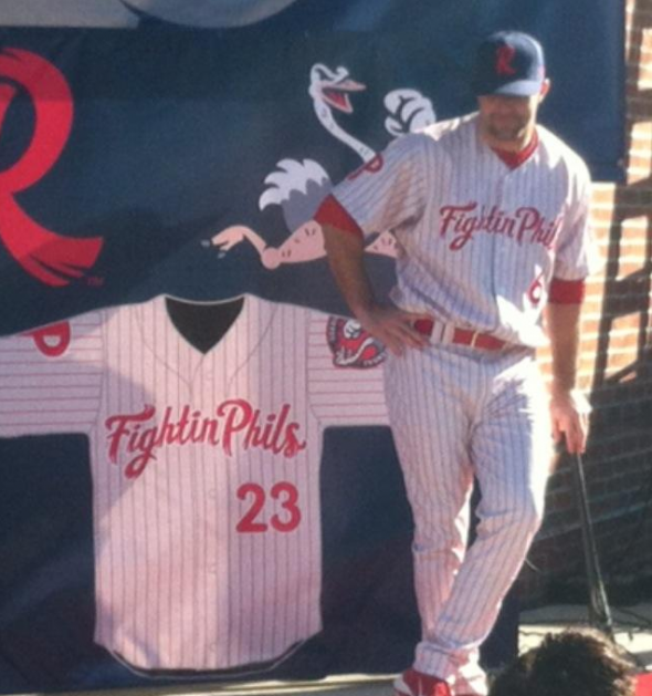
The home uniform is based off of that of the Major League Phillies, white with red pinstripes, “Fightin Phils” across the front in red and a blue cap. From the Fightin Phils site: “With the help of historians, the Fightin Phils will wear a faux-flannel uniform with pinstripes that recreate those worn by Richie Ashburn et al. The Fightin Phils will wear either the navy cap with the feathered “R” logo hat or the navy ostrich hat. ”
Speaking of caps the club has SEVEN of them, your standard home and road plus FOUR alternates and a B.P… Hey, ‘member when the Blue Jays only unveiled one cap with their new uniforms last year? We really didn’t appreciate how refreshing that was at the time.
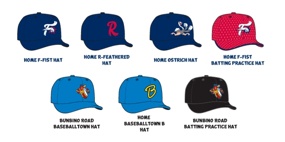
On the road, it’s a grey jersey also made with the “faux-flannel” material seen on the home (but much more visible on the road edition). As if we needed anything else unique with this set, the road uniform has absolutely nothing to do with the primary branding of the club.
The road “iris blue” cap features that Bunbino the Hot Dog logo mentioned earlier, while across the front of the jersey it reads “Baseballtown” (not “Reading” or “Phils”) in yellow and blue with a Phillies logo on one sleeve and the Bunbino circle logo on the other.
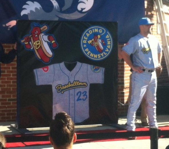
Player numbers are on the back in yellow mustard-squirt font.
“Our analysis showed us that Baseballtown resonated across all metrics… our fans love Baseballtown and what it represents from a historic standpoint. Fans in visiting cities are fascinated by the Baseballtown identity and how it spoke to the baseball history of the entire region.” – Fightin Phils GM Scott Hunsicker to milb.com
There are two alternate uniforms with this set, one meant for at home and the other for on the road – which makes sense as this team seems to have a separate identity on the road as it does at home.
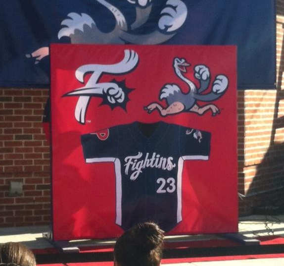
Home alternate is navy blue, white side “BP style” panels with “Fightins” across the front in white, fighting ostrich logo on one sleeve and Phillies logo on the other.
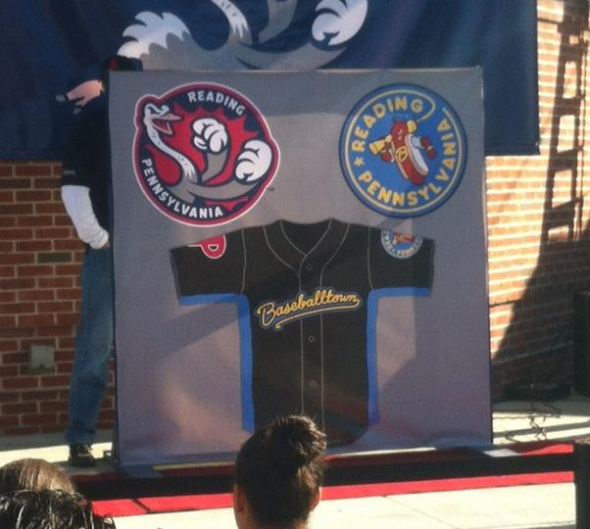
Road alternate is black with “Baseballtown” script in yellow and iris blue side panels.
The new logo set was developed by Brandiose who were also responsible for the Scranton/Wilkes-Barre RailRiders logo unveiled earlier this week and previously for such classics as the Richmond Flying Squirrels.
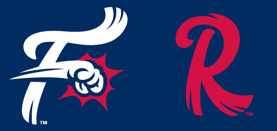
My thoughts? Well, this is a guy here who loves minor league characters like Mr. Celery and the Hillsboro Hop, so the ostrich and the Bunbino fits right in with that group of fantastic mascot logos. Let me make this clear, I love the logos in this set, Brandiose always hits a home run. But…
What I’m lost on is the name, and the connection to the rest of the brand not to mention the overuse of the “Baseballtown” identity. Sure, you can play up “Baseballtown”, why not, afterall, the Detroit Red Wings love their “Hockeytown USA” branding, but on two separate road uniforms? And without giving a non-“Baseballtown” alternative for road games? How about a road uniform that says “Reading” across the front? How about representing your city, not the (likely fictional) idea of your city.
The team doesn’t have an identity with this set, unless their identity is that they have so many identities. I mean c’mon… Are they the ostriches? Are they the hot dogs? Are they Baseballtown? Are they the Fightins? Are they the Fightin Phils?
All I know is I’m exhausted just trying to make sense of it all.

