Eugene Emeralds Show Off New Home Uniform

Written By:

Tuesday, December 11, 2012

Eugene Emeralds Show Off New Home Uniform

At the Winter Meetings in Nashville, the Eugene Emeralds of the Northwest League unveiled their new home uniforms. Readers will remember that last week, the Emeralds had a big announcement for their new logo set.

In an interview with The Logocast, Emeralds GM Allan Benavides explained the look.

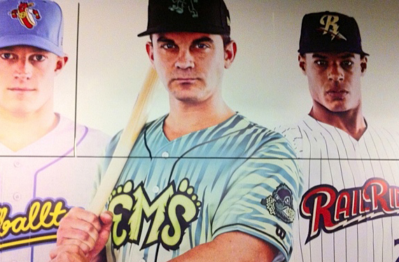
We have gone away from the pinstriping to a real fun like wood grain pattern, that’s on our jersey top now, and it’s got a real Oregon feel to it. So it’s different, it’s a little unique, but it’s flashy still.

The jersey features the lime green Ems script on a white jersey with black sleeve and placket piping and a multi-tone green wood grain. The back of the jersey features white numbers bordered in black. (photo credit CCSLC member Bradbury)

Are these “insane in a good way”? Or have the Emeralds and Brandiose gone too far? What do you think?

Article Categories:

Share This Article

Related News

MLB Updates Both AL and NL League Logos
Twins, Brewers go Reverse Jersey for 1948 Throwbacks
Pics: Brewers/Cardinals Go Back to 1913

About Author

Michael Waldrop

Michael Waldrop is a co-host/producer of the world's only sports design podcast, The Logocast, in addition to writing for sportslogos.net. You can reach him at @Michael_Waldrop on twitter.

(20) Readers Comments

  1. Aaron
    Tuesday, December 11, 2012 at 16:58

    I hope this is just their alternate jersey. Pretty flashy though.

  2. John Burlie
    Tuesday, December 11, 2012 at 17:52

    I usually don't like gradients, but some teams can pull them off. Like my picture :P I think these are pretty solid for an alternate. Sure its gradients but there are enough of the green (tree?) stripes to make the gradient just a background.

  3. David J. Peterson
    Tuesday, December 11, 2012 at 18:20

    Comment from my wife: "It looks like they held still and somebody tagged them."

  4. John Aiken
    Tuesday, December 11, 2012 at 18:25

    I like the squatch on the unis these shirts just don't look good

  5. Dylan Alexander
    Tuesday, December 11, 2012 at 18:40

    I'm a fan. I enjoy Brandiose's work.

  6. Burmy
    Tuesday, December 11, 2012 at 18:43

    I miss the old Emeralds logo package-that was BEAUTIFUL.

  7. Brian Castner
    Tuesday, December 11, 2012 at 19:03

    When I see EMS I think "Emergency Medical Services" not "Emeralds". Can we please stop with the "Ems", "Baseballtown" nicknames and abbreviations in the logos, wordmarks, and on the jerseys? That includes that stupid OKC, PHX, ATL crap too. I'm hating Brandiose more with each new unveil. If it was an alt or a 1 time thing it would be OK but this looks so horrible the Cincinnati Bengals should be jealous. Junk...

    • Aaron
      Wednesday, December 12, 2012 at 11:10

      Yeah,, please spell out the name Emeralds on the jersey. Fans will likely mistake this jersey for that of the other EMS. I think too many teams use abbreviations on their jerseys.Some are good, others nah!

  8. Troy Griggsby
    Tuesday, December 11, 2012 at 23:49

    I totally get the MiLB thing, but it seems a lot of the recent unveils within the past several months (by Brandiose or whomever) are simply too gimmicky bordering on cartoonish mockery.

  9. mark
    Wednesday, December 12, 2012 at 00:48

    Whose the team with the Hot Dog logo on their cap.

    • Chris Creamer
      Wednesday, December 12, 2012 at 10:37

      That's the Reading Fightin' Phils... the hot dog appears only on the road cap, they use an ostrich at home

  10. Michael L.
    Wednesday, December 12, 2012 at 03:18

    I would love to see the Swingin' Sasquatch logo on a cap with these or any uni for that matter.

  11. Alex Giobbi
    Wednesday, December 12, 2012 at 10:25

    Uh...Ew?

  12. Sean M.
    Thursday, December 13, 2012 at 02:16

    guh... I hate it, AND Brandiose. Brandiose used to be good, but now they're going too far. I honestly think every design I've seen of theirs this offseason has been terrible.

  13. Chris W
    Thursday, December 13, 2012 at 11:46

    No..they (the fans) get them confused with the other EMS. They have been called the Ems locally by the media and fans for years. Just like ATL, OKC, RipCity, Baseball Town and the rest is a tie in to the city and surrounding areas. It doesn't have to make any sense to the rest of us. If the fanbase and city take a feeling of ownership, the wordmark works..however silly. And It's minor-league ....the team ...and yes the uniform too. It might grow on me, but again, if the fans love it, it works.

  14. sportchange
    Thursday, December 13, 2012 at 19:49

    I think the new Emeralds brand is certainly fun, but has strayed too far from the Emeralds identity. Since they've gone this far, I'm surprised they haven't changed the moniker to the Eugene Sasquatches. I like a lot of Brandiose's work, but this one and the Reading Fightins unveiling introduced too many changes all at once. Three new logos is plenty--you don't need twelve.

  15. ingmar66
    Friday, December 14, 2012 at 06:05

    I like the idea behind the shirt, but this is 100% kitsch. Why not take classic pinstripes (green, black or lime) and bend them like a wood pattern and repeat that on the pants?

  16. Discrim
    Friday, December 14, 2012 at 22:22

    This would've been better off reading Emeralds...the wood grain is a nice idea, though I'm not sure about the execution, especially seeing as this is the home uni, apparently. I'd be all for it were this an alt though.

  17. Tom O'Grady
    Friday, December 14, 2012 at 22:45

    The Eugene WoodChucks would be a 1000% better name. I don't know the guys at Brandiose, so this is NOT personal but this identity is horrible at every brand touchpoint. Seriously take a look at this? It is absolutely one of the ugliest identity packages EVER. A bad cliche at every turn. If you're going to sell out then go for the super obvious. http://static.ddmcdn.com/gif/bigfoot.jpg Minor League Baseball should stop looking away and think about engineering some integrity into a team now and then...

  18. Charles Mertens
    Saturday, December 22, 2012 at 03:38

    It's not the animal stripes or the gradient that turns me off, it's definitely the color scheme. Very odd.

Leave A Reply

Leave a Reply

Your email address will not be published. Required fields are marked *

You may use these HTML tags and attributes: <a href="" title=""> <abbr title=""> <acronym title=""> <b> <blockquote cite=""> <cite> <code> <del datetime=""> <em> <i> <q cite=""> <strike> <strong>