The barley is flowing straight into the offices of the Milwaukee Brewers. And it all comes pre-packaged in a PDF.
With the deadline for the “Youniform” contest—you know, the one where Milwaukee took advantage of the growing demographic of folks in love with sports design by offering them a chance to design a uniform to be worn during one spring training contest—rapidly approaching at midnight on Thursday, the contest entries have vastly exceeded expectations, according to a team spokesperson.
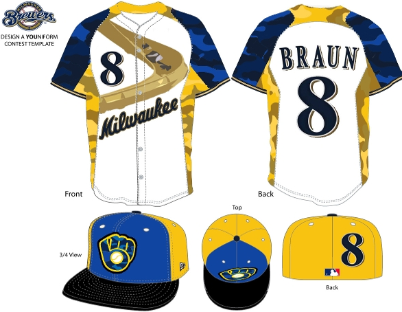
Already over 500 submissions have hit the inbox of the Brewers. And while there’s much love for a stalk of barley, some of the other team logos aren’t getting the same nostalgic treatment.
The Brewers have taken to posting the designs on their contest page in a gallery, inviting you to scroll through everything from childlike drawings to full professional renderings at your leisure (and you best have plenty of leisure time if you want to take it all in).
A gander through the designs offers plenty in the way of baby blue, barley motifs and the fabled glove logo used from 1978 to 1993. There wasn’t the same excitement for the interlocking M and B logo with the baseball bats used from 1994 to 1999. Another popular Milwaukee term getting plenty of attention was “Brew Crew,” which adorned locales from the front of jersey tops to the back of caps.
To keep the process streamlined, as reported previously by SportsLogos.net, the team offered a list of rules, but one that didn’t actually put too much restraint on creativity. So, cue the overflowing suds designs. There’s also an oddly placed mustache design and an attempt to riff off the well-known outfield slide, used by the team mascot.
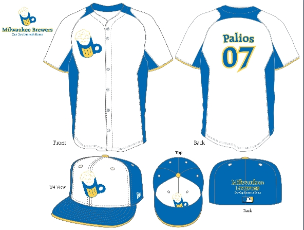
Most of the coloring keeps with varying hues of blues and yellows used throughout the history of the club, but with some neon tendencies mixed in for good measure. And there’s still a little time to get your own colorway included.
The team has been impressed with the quality of the designs and says it may even reconsider the idea of wearing the fan-created look at just the one spring training game. While there’s certainly nothing official, plan on seeing fan-created barley—or some other fan favorite—more than once this season.
Tim Newcomb is a journalist based in the Pacific Northwest covering news, culture, sports design and entertainment. He has written on uniforms and sports logos for TIME Magazine, Sports Illustrated and more. You can follow him on Twitter at @tdnewcomb. Visit his website here.


Matt
Wednesday, December 12, 2012 at 12:00Good god! Those are awful.
agege
Wednesday, December 12, 2012 at 12:13What is this, a turn forward the clock revival?
KDub
Wednesday, December 12, 2012 at 12:34Welcome to clip art hell.
Scooter
Wednesday, December 12, 2012 at 13:22I agree that a good many of the designs are, um, a bit over the top. However, if you go through the gallery there are quite a few solid designs. As a Brewers fan I'm really curious to see the finalists. Personally I'm done with the ball & glove logo (and the team already has that uni in their rotation), but a lot of submitted design leverage it. It will be interesting to see what gets picked.
Aaron
Wednesday, December 12, 2012 at 13:28Out of all the concepts, I like the one with beer mug logo. Looks like it could be an MB logo. Just maybe add the barley stocks and place the logo on the other side of the jersey.
Bites
Wednesday, December 12, 2012 at 13:59These designs simply confirm what I have always known about 'Sconies: They are insane.
Josh
Wednesday, December 12, 2012 at 16:32Great googily moogily, some of those are god-awful. But there are some really, really, really solid entries -- none of which have been posted on this page.
Bobby
Wednesday, December 12, 2012 at 17:33reminds me of the padres. they could never come up with one good timeless uni so they endlessly tinker. how about the brewers add some pitching and worry about the unis later?
John
Wednesday, December 12, 2012 at 19:28Boy, I was going through the gallery and man, a lot of them are just plain awful and some are downright bad.
Max
Wednesday, December 12, 2012 at 21:52ditch the camo and i like the slide style
sportchange
Wednesday, December 12, 2012 at 21:52Scrolling through the gallery, there is certainly an interesting mix of the good, the bad, and the ugly. The one with Bernie Brewer and the racing sausages on the cap made me laugh. I would buy one of those in a heartbeat. It will be interesting to see what we get.
Aaron
Thursday, December 13, 2012 at 09:30As far as the yellow jerseys go, would look okay for batting practice.
Jeason Gagnon
Thursday, December 13, 2012 at 09:54They should just go with a modernized MB glove logo, no pinstripes.
Ben in LA
Thursday, December 13, 2012 at 13:18There was one in particular that took cues from the Braves jersey of 1957-58 (and the colors were red, white, and blue). Switch the colors to the current ones and they'll have a winner!
Bob Johnson
Thursday, December 13, 2012 at 14:29Go to the Brewers webite to see some of the better designs, the look a hell of a lot better than these ones. http://milwaukee.brewers.mlb.com/mil/fan_forum/youniform.jsp?loc=gallery
Nick
Thursday, December 13, 2012 at 21:15The three best: http://milwaukee.brewers.mlb.com/images/mil_2012_youniform/display/301067722.png http://milwaukee.brewers.mlb.com/images/mil_2012_youniform/display/301066603.jpg http://milwaukee.brewers.mlb.com/images/mil_2012_youniform/display/301066006.jpg The three worst: http://milwaukee.brewers.mlb.com/images/mil_2012_youniform/display/301063151.jpg http://milwaukee.brewers.mlb.com/images/mil_2012_youniform/display/301036434.gif http://milwaukee.brewers.mlb.com/images/mil_2012_youniform/display/301034381.jpg And one that sucks but has a REALLY good logo: http://milwaukee.brewers.mlb.com/images/mil_2012_youniform/display/301017913.jpg
jeeyo
Friday, December 14, 2012 at 06:14my best friend's ex-wife makes $60 every hour on the laptop. She has been without work for eight months but last month her check was $20462 just working on the laptop for a few hours. Here's the site to read more
ingmar66
Friday, December 14, 2012 at 06:14The gallery has some very nice and some very hilarious and some very hideous designs. All in all it has been a great campaign, bravo Brewers and I am curious which design will be selected.
jeeyo
Friday, December 14, 2012 at 06:17my best friend's ex-wife makes $60 every hour on the laptop. She has been without work for eight months but last month her check was $20462 just working on the laptop for a few hours. Here's the site to read more http://www.g00.me/272633
Tom O'Grady
Friday, December 14, 2012 at 22:25Don't quit your day job Brewers uniform contest designers... Just kidding, there are some really good ideas in the batch... Minor League Baseball could only hope they'd see such good work like this.
Ben Peters
Tuesday, December 18, 2012 at 11:31I agree with Nick's 3 best. Especially #2, the retro one. Great Script! And the sleeve patch is the best!
Mark
Wednesday, December 26, 2012 at 19:24Except for the last, these all suck! Worst uniforms I've ever seen.
hafizmustapa
Wednesday, February 6, 2013 at 20:10hi, can i get blank template. thx