Seattle Seahawks to Go Gray: An April Hint Comes to Life

Written By:

Wednesday, December 12, 2012

Seattle Seahawks to Go Gray: An April Hint Comes to Life

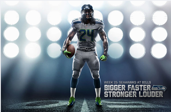
Nike calls it “wolf grey,” but admits the gray has as much to do with Seattle’s limitless bounty of clouds as anything else.

Ever since unveiling the new NFL uniform designs in Brooklyn in April, Seattle Seahawks fans have been waiting for the team to pull out its third jersey, this “wolf grey” alternate. Not that Seattle’s flick of neon on a deep blue weren’t already the most visually striking of the new batch of uniforms—okay, we all know that other than alternates, Seattle was the only team that did any significant freshening—but now we are approaching Week 15 and Seattle will pull out the all-gray for the first time when they travel to Toronto to face Buffalo.

This weekend will mark only the second time Seattle has worn an alternate look and you can expect the added color to only help with the 274% increase in jersey sales the team has already seen since April.

“We have received extremely positive feedback from players and fans about the new uniforms,” said Chuck Arnold, Seahawks vice president of sales and marketing, in a team press release.

Back in April, Nike’s global creative director, Todd Van Horne, said that teams attempt to tell stories with their uniform. Seattle, he said during Nike’s launch of the uniform, plays off Northwest themes with the Seahawks logo and Native American influences. But they use plenty of fresh colors too.

“The colors are rooted in hues of the Seattle environment,” Van Horne said in an interview with me while in Brooklyn. “The blue of the water, the green, white snow-capped mountains and the gray of the ever-changing clouds.”

With a cold and, you guessed it, gray, forecast in Toronto for Sunday, the Seahawks should feel right at home. At least they’ll look it.

Article Categories:

Share This Article

Related News

LA Galaxy Announce 1996-Inspired Alternate Jerseys, Retinas Offended
The Colors of the Open, What Golfers Will Wear in PA
Ottawa CFL Team Confirms RedBlacks Name, Logo

About Author

Tim Newcomb

Tim Newcomb is a journalist based in the Pacific Northwest covering news, culture, sports design and entertainment. He has written on uniforms and sports logos for TIME Magazine, Sports Illustrated and more. You can follow him on Twitter at @tdnewcomb. Visit his website here.

(19) Readers Comments

  1. Aaron
    Wednesday, December 12, 2012 at 21:54

    Hmmm! Grey football jersey! I know where the Seahawks are trying to go with this, but at least make the pants either blue or white. Luckily the helmets are blue. I've seen the whole jersey set several times during the season. They've started to grow on me a bit even the home blues. Although I wouldn't minded them either modernizing their original uniforms or just keeping their last uniforms.

  2. Eric
    Wednesday, December 12, 2012 at 23:11

    I call it "wolf gay."

  3. Ryan
    Thursday, December 13, 2012 at 02:46

    I like the look. Hopefully it comes across well in real action. I don't get the "wolf" part of the name, since they're birds of prey. Perhaps something more mascot-appropriate, such as Talon Gray, or city-appropriate, such as Seattle Sky Gray. And that shade of green-yellow is not found in nature in the Northwest.

    • Drew
      Thursday, December 13, 2012 at 04:04

      Their shade of green-yellow is only found in cartoons when a person gets exposed to radiation. Still, I like their new looks.

  4. Aaron
    Thursday, December 13, 2012 at 08:19

    The grey uniforms themselves look good, but as mentioned, mix it up a notch with white or blue pants. Monochromatic football uniforms look fine in white, but otherwise mix up the coloured jerseys and pants a notch for any team. Would look better.

  5. Chris Oglesby
    Thursday, December 13, 2012 at 11:02

    The metal Mario look lol

  6. Brian Dolinar
    Thursday, December 13, 2012 at 11:14

    Too many uniform changes for this team and so many ugly ones too.

  7. agege
    Thursday, December 13, 2012 at 13:32

    This is not baseball. Keep the blue but only use blue pants on the road.

  8. Scheherazade
    Thursday, December 13, 2012 at 20:36

    At least it's not those neon green uniforms......

  9. Nicolas Ballou-Perez
    Thursday, December 13, 2012 at 21:35

    When are teams gonna realize that grayish uniforms don't work in the NFL? Patriots and Raiders had silver jerseys but they didn't last long. Why? Because they look like a dirty white jersey. Get rid of them.

  10. Rob S.
    Friday, December 14, 2012 at 03:07

    The Seahawks are a JOKE!! The Ducks of the NFL!!Man I hate NIKE!!

  11. ingmar66
    Friday, December 14, 2012 at 06:33

    Horrible. Everything about this new Seahawks uniform identity comes straight out of some long forgotten Japanese comic book. It is kitschy, gaudy and tries to tell too much. Waste of the best NFL logo ever, luckily the helmets are still good.

  12. Ben Anijar Andersen
    Friday, December 14, 2012 at 09:21

    the seahawks have had ugly uniforms ever since they changed em in 02.

  13. Aaron
    Friday, December 14, 2012 at 10:29

    I might have mentioned this one one post, but I don't understand why the new blue is called College Navy. Bring back the Seahawks navy and just blend it with the wolf gray and action green. The blue helmets look okay, but perhaps they should eventually make it gray and the gray stripe on the logo green down the road.

    • Trent
      Friday, December 14, 2012 at 22:23

      A green stripe on the logo would make perfect sense, and tie the wole uniform/logo set together

  14. Discrim
    Friday, December 14, 2012 at 22:06

    I know one thing, I'd like to see a permanent gray/silver road uni in place of white somewhere. Maybe the Seahawks shoulda gone that route and they coulda had a new lime green alt instead, as this has the same unfortunate problem the Pats' silvers had: it otherwise looks like the whites.

  15. Aaron
    Sunday, December 16, 2012 at 16:30

    I'm currently watching the game between the Seahawks and Bills right now. The grey uniforms in action don't actually look bad.

  16. Steve Cramsie
    Monday, December 17, 2012 at 11:01

    Everything about the Seahawks uniforms are disgusting. They look like out-of-place spacemen playing against anyone in the league, save for maybe the Broncos. It's too futuristic and gaudy for my tastes.. oh well.

  17. Tim Smigaj
    Saturday, January 12, 2013 at 15:56

    Idk what everyone is talking about. Seattle has the sickest unis in the game. I just got my wolf grey Sherman jersey. It looks too good. I hope they wear grey sometime in these playoffs, maybe Super Bowl....

Leave A Reply

Leave a Reply

Your email address will not be published. Required fields are marked *

You may use these HTML tags and attributes: <a href="" title=""> <abbr title=""> <acronym title=""> <b> <blockquote cite=""> <cite> <code> <del datetime=""> <em> <i> <q cite=""> <strike> <strong>