Michigan to Wear Special Jerseys and Helmets for Outback Bowl

Written By:

Thursday, December 20, 2012

Michigan to Wear Special Jerseys and Helmets for Outback Bowl

Michigan Wolverines special uniform outback bowl 2012 matte flat featured


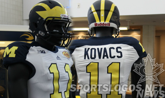
The Wolverines have announced they will be wearing a special uniform, just for their Outback Bowl game against South Carolina. Similar to the uniforms they wore to open the season against Alabama, these reverse the shoulder/number colors from their early-season specials, making the shoulders navy and the numbers maize. The numbers this time have an outline, of the navy variety.

Michigan Wolverines special uniform outback bowl 2012 matte flat - back

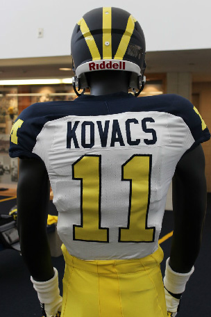
The truly special part of this one-game uniform is the helmet. While at first glance, the same as what Michigan has worn since time immemorial, these have a secret; The navy is flat. Matte helmet fans, let’s hear it! (crickets) Oh. OK.

Michigan Wolverines special uniform outback bowl 2012 matte flat - front

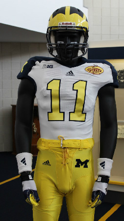
The pants remain maize. The jersey has the Big Ten logo, the adidas logo, and the Outback logo across the chest, one, two three.  In this special uniform, attention was paid to make sure the bowl logo didn’t look “stuck on.”

The players seem to be in favor, which seems to be second in importance to what potential recruits think.

Senior safety Jordan Kovacs, whose jersey was modeled for the unveiling, said; ”I like them. I think they’re pretty unique, pretty special. We like to wear our unique uniforms in big games, special games. This is a big game for our seniors. It will be fun. They look good.”

He then added that we shouldn’t expect the Wolverines to go Ducks-style, “”With Coach Hoke, you don’t have to worry too much about getting carried away with it.”

“I like the bowl uniforms,” offensive guard Patrick Omameh said. ”I am a fan of the matte look. I have been looking at them over the last couple days, and I really like them. It’s a different look, more modern. It’s something we don’t usually do. Anything you can do to change it up a little bit and throw in some flair, it’s always keep it interesting.”

Are you in favor of the matte blue with the shiny maize? Do you find the likeness to the jerseys worn against Alabama a good thing, or too boring?

Article Categories:

Share This Article

Related News

San Diego State University Shows Tweaked Logo, New Uniforms; Little Consistency
Arizona Wildcats Football Announce New Gradient-Crazy Football Unis
The Logocast Episode 28: We’re Going To Kill Off One of the Hosts

About Author

JR Francis

JR Francis is an actor, writer, director, graphic designer, UX guru, father, comedian, and craft beer snob. You can reach him at jrfrancis@sportslogos.net or on Twitter @JRFrancisSLN *One of several full-time uniform reporters this site has including its founder, Chris Creamer, who started his site in 1997

(11) Readers Comments

  1. Delayed Penalty
    Thursday, December 20, 2012 at 15:18

    Matte blue + Glossy maize wings = A+ Rest of the uniform = D- A poster on the U of M Football Facebook page said it best: "I didn't realize Steve & Barry's was making our uniforms! I thought they went out of business."

  2. Jacob Smith
    Thursday, December 20, 2012 at 17:54

    I am a Michigan fan, and I personally am sick of them wearing all of these special jerseys for big games. I wish they would just stick to the original, because I think that they have the best uniform in all of college football.

    • Aaron
      Thursday, December 20, 2012 at 18:22

      Yeah, especially for Bowl games. I think generally college teams seem to overdo the alternates too much.

  3. kurt
    Thursday, December 20, 2012 at 18:19

    i'm also a michigan fan but i am not a fan of these jerseys. from everything i read online and gather from just talking to people is that the michigan fanbase is generally open to changing the road unis a little (which they frequently do) but never messing with the home uni. that being said, i think the whites they wore for the sugar bowl last year were the best white jerseys they've had in years. i don't like the yellow numbers on these at all, and the block M's on the shoulders only makes it look that much more like a nascar jackets when they bracket 3 more logos on the chest. too much branding! stop the shameless money-grabbing! this gets my thumbs down.

  4. Brian Castner
    Thursday, December 20, 2012 at 18:30

    Oh look a matte helmet. What a shock. Can we stop this now?

  5. Andrew
    Thursday, December 20, 2012 at 18:49

    For once, a college alternate that I don't hate. Not bad really.

  6. Josh Burlein
    Thursday, December 20, 2012 at 19:23

    Michigan has the worst jerseys in all of college football and they just became worse! These are horrible!

  7. Kyle
    Thursday, December 20, 2012 at 19:28

    I love the helmet. I think matte helmets are the way to go, and I think my Wolverines nailed it. I also love the maize numbers, however not a big fan of the shoulder stripe.

  8. Sam
    Friday, December 21, 2012 at 03:44

    I like them

  9. ingmar66
    Saturday, December 22, 2012 at 15:51

    Another great traditional look being smashed to smithereens. I just don't get it.

  10. Damon Selman
    Sunday, December 23, 2012 at 01:36

    This is just ugly! This is 10,000 times uglier than even the worse of the worse Maryland jerseys. With Michigan's somewhat overrated color scheme, the conservative look is the best by far look. Their traditional jerseys are best you can do and actually looks good, and any alterations are a downgrade. Any annoying "innovativions" with their color scheme makes the whole thing look hideous, cheap, and just badly designed. Yellow numbers on a white jersey just doesn't work. There many a high school and pop warner jerseys with the exact same color scheme that much better looking than this!

Leave A Reply

Leave a Reply

Your email address will not be published. Required fields are marked *

You may use these HTML tags and attributes: <a href="" title=""> <abbr title=""> <acronym title=""> <b> <blockquote cite=""> <cite> <code> <del datetime=""> <em> <i> <q cite=""> <strike> <strong>