
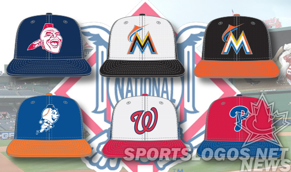
Major League Baseball and New Era are set to unveil their latest league-wide batting practice cap re-design in the coming weeks and we’re taking an in-depth look at the new batting practice caps for each team in 2013 here at SportsLogos.Net going through one division at a time.
In this piece we’re taking a look at the National League East.
ATLANTA BRAVES
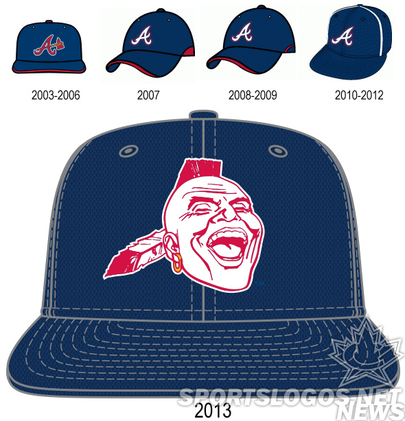
The Braves have released the most divisive, if not most controversial cap out of this year’s MLB releases. It features their indian head logo, first used as an alternate when the franchise was in Milwaukee in 1954, then used in different iterations by the organization until it disappeared in 1989. This hat logo is the most similar to the last version, used in 1987-1989 Apparently it is very popular with some, and abhorrent to others. Read more about it in the comments section following this article we wrote.
The Braves had avoided the “contrast circle” other teams had, but retained the piping on the crown. One wonders how true navy the hat will be. The graphics all seem to be primary colors, and lack the specificity of real Pantones. We expect it to be the matching navy.
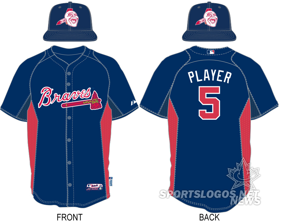
Braves BP jersey stays relatively the same, but does drop the white under the arms. The cap will mimic the “mostly navy with some red” look.
MIAMI MARLINS
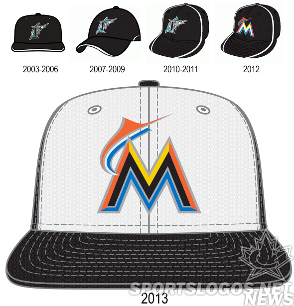 The Marlins are working on quite a run of new batting practice caps. What with changing their logo, the letter they featured, and league-wide changes. They are rocking the white front cap, with the rest being black. The M logo has a black M base.
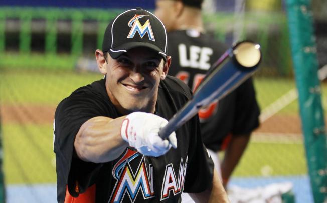
Last year the Marlins wore the standard MLB template BP cap, with the coffee-stain piping circle across the front. This year, they have gone with a home and away version. The away is black, with an orange brim and a white-base M logo.
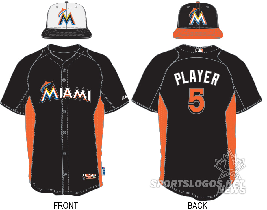
The Marlins stick with their new-last-year BP jersey and add the multiple cap versions. Black BP jerseys wouldn’t be my choice, especially if I played in south Florida where it is even hotter in the mid summer, but thats what the Marlins go with. They sport their two new cap, and the orange side panels.
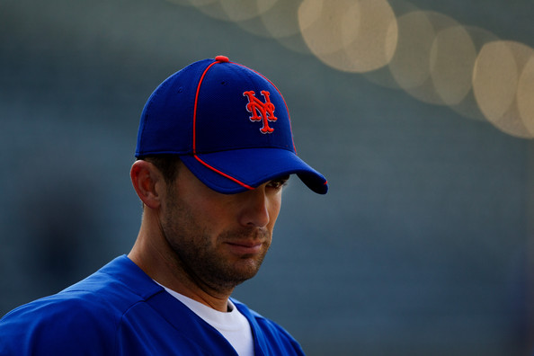
NEW YORK METS
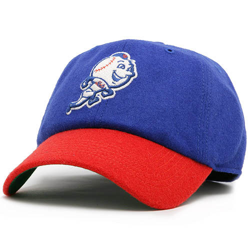
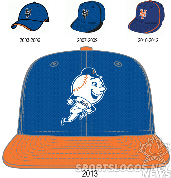 Still gone is the black from the Mets BP cap, and say hello to a running version of Mr. Met. As a giant-headed person whose baseball caps rarely fit, I was tempted to be offended by this BP hat, but then realized that it isn’t referencing me. So, now I like it.
Another team, another unnecessary piping adventure on the Mets cap from 2012
The new cap looks a lot like a hat currently available on the MLB Shop.
I am assuming that hat is actually Mets blue and orange and not as red as it looks in the store.
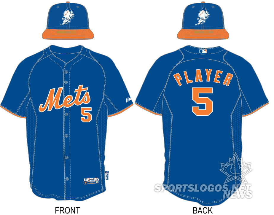
Mr Met runs around on the orange bill on top of the cap, while below, solid blue BP jerseys have orange logo, name, number, and a thin arm stripe.
PHILADELPHIA PHILLIES
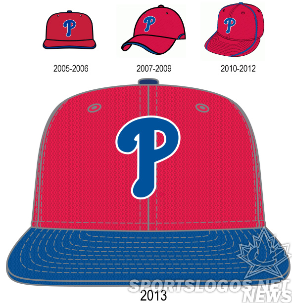
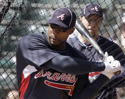
The Phillies retain their blue P, and add a blue pill. Not a lot more going on here, other than dropping the unpopular piping. Piping, in fact that we seem to have incorrectly noted on our historical graphics.
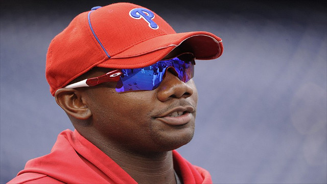
As you see in this photo of Ryan Howard from the 2012 season, the Phillies actually had no stripes on the bills. Further research by SportsLogos.Net interns could not come up with any variations on the cap, so apparently we just got it wrong in our graphic. Mea Culpa.
This is a lot like the star P from 1997-2007

Blue bill, red cap. Pretty traditional for the Phillies.
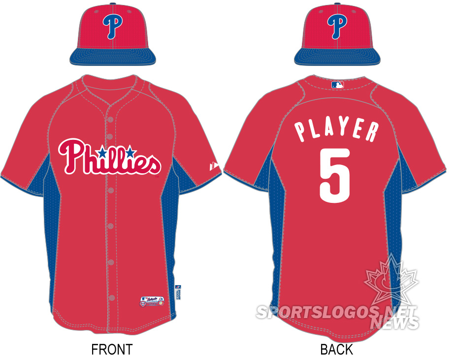
Again, the jerseys remain the same, but the caps are new, and now are matched in blue/red balance by the new BP hats.
WASHINGTON NATIONALS
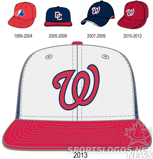 Washington will be sporting their own version of the pinwheel. Blue crowns, white front panel, red bill. The
 Walgreens Washington logo is on the front in red, with a navy outline.
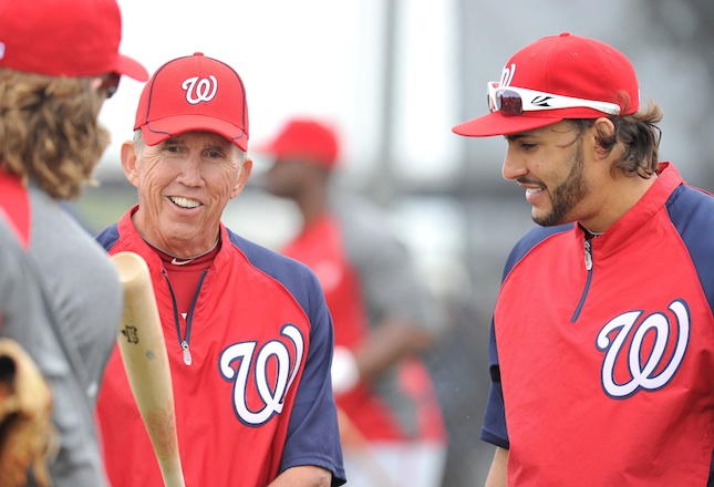
The Nationals BP caps only differed from their game caps with the blue piping crop circle on the bill and front. As you can see above, the players didn’t wear these caps very often, their biggest proponent being manager Davy Johnson. There were days some players wore the cap, but only what could best be described as rarely. Davy wore it not every day, but frequently. With the new cap and its white front, it will be much more obvious when they are being worn or not. We shall see if this inspired them to be worn more frequently.
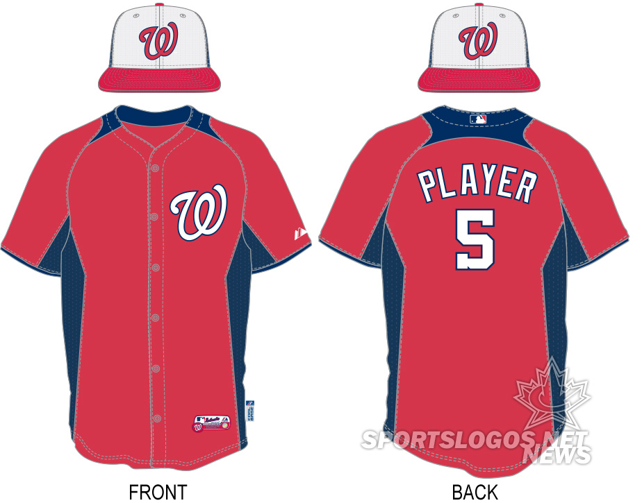
I am going to guess that the reason we saw the Nationals in their warm up jackets so often was to cover up these goofy collars and remind one of the terrible NFL contrasting collars. Both making it seem like the player has a dress shirt or polo under the jersey with their collar hanging out. Those stay the same for 2013, but are joined by the white front cap.
So, sportsfans, how do you like the NL East? Same as all the rest? The best? The worst? What did we miss?
2013 MLB Batting Practice Cap and Uniform Guides:
AL EAST • AL CENTRAL • AL WEST • NL EAST • NL CENTRAL • NL WEST
Related stories:
 New Spring Training Uniforms Across MLB for 2016
  Majestic Unveils Ten New 2014 MLB B.P. Jerseys
  Goin’ Green: A photo roundup of St Patricks Day 2013 Uniforms
  Braves Prove Cowards; Claim BP Cap Was Never Official
  Braves BP Cap is Perfectly Fine, Settle Down
  2013 AL Central Batting Practice Caps and Uniforms
  Camo Caps to be worn by all MLB Teams, Full Gallery Here
  Photos from St Patricks Day 2012