Oregon Uniform Features Color-Changing Accents

Written By:

Thursday, January 3, 2013

Oregon Uniform Features Color-Changing Accents

Admit it, you wanted there to be some more uniform news coming out of the University of Oregon at the start of the Fiesta Bowl. You know you did. And in true Oregon fashion—or do we mean true Nike fashion?—the Ducks didn’t disappoint, even if the bulk of the “what-is-that?” portion of the uniform we actually saw a few weeks ago.

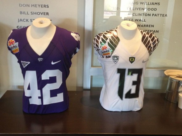
While relegated to the white jersey top (really, teams should be required to wear color vs. color whenever possible), that didn’t limit Oregon’s wildness, opting to use its silver-like shoulder-adorning duck feathers and numerals to show off the uniform’s ability to change accent colors depending on the angle of the viewer and the amount of light hitting the jersey.

Tostitos Fiesta Bowl Kansas State Oregon uniforms jerseys multi-color color-shift

Color-shift wings and numbers on the Oregon jersey, while KSU goes with “Solid-color, contrasting number” simplicity

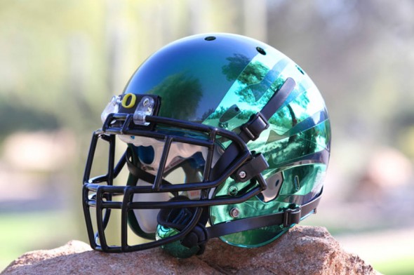
As fans grow accustomed to Oregon unveiling new looks for its BCS Bowl games—the Ducks debuted chrome helmets last year, which also changed colors in the California sunshine, that have become all the rage this year—tweaking the numerals and feathers was a surprise move that Oregon trotted out in the week leading up to the game.

By adding a new wrinkle to the uniform look, Oregon stays ahead of the rest of the mix-and-match schools out there.

To top the Fiesta look, Oregon chose a dark green helmet that fades to near black in the middle, all with some darkened duck wings. The Ducks opted for green pants to match the look. So view the a green-white/silver-green look, at least until the light hits it and shifts the colors all around.

Article Categories:

Share This Article

Related News

San Diego State University Shows Tweaked Logo, New Uniforms; Little Consistency
Arizona Wildcats Football Announce New Gradient-Crazy Football Unis
The Logocast Episode 28: We’re Going To Kill Off One of the Hosts

About Author

Tim Newcomb

Tim Newcomb is a journalist based in the Pacific Northwest covering news, culture, sports design and entertainment. He has written on uniforms and sports logos for TIME Magazine, Sports Illustrated and more. You can follow him on Twitter at @tdnewcomb. Visit his website here.

(10) Readers Comments

  1. Jed
    Thursday, January 3, 2013 at 21:08

    When will the insanity stop with Oregon and their wild uniforms and helmets?

    • Logan R
      Thursday, January 3, 2013 at 21:12

      I know! Everyone will switch to crazy uniforms and Oregon will go regular and then be weird again!

  2. Scott
    Friday, January 4, 2013 at 08:21

    Oregon has worn some zany unis over the years but it's hard not to be dazzled by the look they had yesterday -- they incorporated green and yellow nicely while still maintaining a unique look that everyone is chasing but no one has. This year's set of Oregon unis was really something and that helmet -- well, as we're starting to see now with the imitators -- that was a game-changer.

  3. Cory Hyman
    Friday, January 4, 2013 at 08:32

    I didn't realize that the "O" logo was raised on the facemask tag. That's more Nike ingenuity.

  4. Steve Cramsie
    Friday, January 4, 2013 at 10:48

    Ugh, I hate what they have done to college football uniforms -__-

  5. Mackin Bannon
    Friday, January 4, 2013 at 13:11

    Oregon wore that helmet and jersey against Washington State earlier this year, so the green pants were the only "new" element (New as in they hadn't been worn yet. They were available all year.)

  6. James S. Nies
    Friday, January 4, 2013 at 14:37

    waaah, it's expression and it's great

  7. agege
    Friday, January 4, 2013 at 15:31

    Yuck.

  8. ingmar66
    Saturday, January 5, 2013 at 11:08

    Interesting, but tacky at the same time. Interesting from a technological point of view (colours changing from the angle of view), disapointingly tacky from a design point of view. The only good thing is the raised O on the helmet. I prefer the simple, nice look of KSU.

  9. Damon Selman
    Friday, January 11, 2013 at 01:03

    Most people who Oregon just, yuck it is new! Many Nike Pro Combat jersey are ugly (see Georgia's red pant/ silver helmet). However, most of Oregon looks are good. Oregon's all white or green and gold combo are better than anything Illinois, South Carolina, and Minnesota had ever worn and will ever wear! A modern uniform can be good looking, although Oregon should bring back the green helmet with yellow O. That should return ASAP!

Leave A Reply

Leave a Reply

Your email address will not be published. Required fields are marked *

You may use these HTML tags and attributes: <a href="" title=""> <abbr title=""> <acronym title=""> <b> <blockquote cite=""> <cite> <code> <del datetime=""> <em> <i> <q cite=""> <strike> <strong>