Miami Dolphins Owner Confirms New Logo on the Way

Written By:

Monday, January 7, 2013

Miami Dolphins Owner Confirms New Logo on the Way

Miami Dolphins new logo 2013

Yep, the Miami Dolphins absolutely have a new logo, but we still have to wait before we officially see it. So says owner Stephen M. Ross in a media luncheon in Davie today.

As reported by the Dolphins official twitter account, @MiamiDolphins:
“Ross: We will have a new logo, you’ll have it by the draft”

New Miami Dolphins Helmet 2013

The 2013 NFL Draft, by the way, will be held on April 25th.

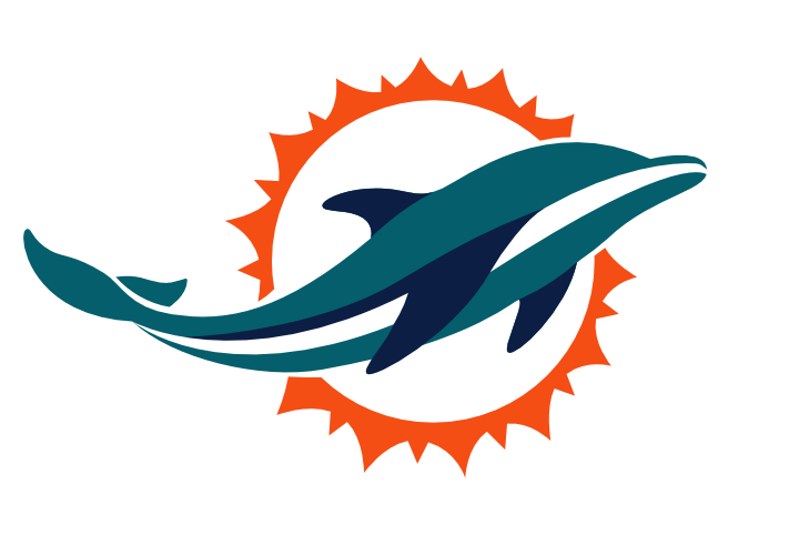
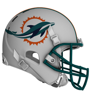
As we posted last month, there are some leaks of what several folks are saying is the new Miami Dolphins logo. The images above and to the left are of that leaked logo and are not necessarily what the team will be using next year.

The one at the top of this article has been ‘shopped onto a helmet by a Dolphins fan, Greg, as first posted on Deadspin.

This appears to us at World Sports Logos Headquarters as a very legit possibility of what a new logo would look like. If you take into account the modernizations of the Cardinals and Falcons logos, this would follow suit, taking a strongly aging logo, and giving it a spin in today’s advanced graphics tools.

What do you think, sports fans? Since the owner has confirmed the new logo is coming, do you like that there is a new one? Do you hope its this one? Or do you think we are all wrong?

Article Categories:

Share This Article

Related News

San Diego State University Shows Tweaked Logo, New Uniforms; Little Consistency
Arizona Wildcats Football Announce New Gradient-Crazy Football Unis
The Logocast Episode 28: We’re Going To Kill Off One of the Hosts

About Author

JR Francis

JR Francis is an actor, writer, director, graphic designer, UX guru, father, comedian, and craft beer snob. You can reach him at jrfrancis@sportslogos.net or on Twitter @JRFrancisSLN *One of several full-time uniform reporters this site has including its founder, Chris Creamer, who started his site in 1997

(84) Readers Comments

  1. Taylor
    Monday, January 7, 2013 at 14:06

    Looks like they're trying to match the Marlins' aesthetic.

  2. DAn
    Monday, January 7, 2013 at 14:06

    Hate it. The dolphin wearing a helmet is a classic logo that goes back to the beginning of the franchise. It has a classic cartoon look that I love. This is generic. No character to it at all. I might be in the minority, but keep the classic look!

    • wolfgangII
      Tuesday, January 8, 2013 at 02:53

      I agree. If they want to modernize it, respect the helmet dolphin.

    • Ted
      Friday, January 11, 2013 at 10:07

      Totally agree. Nothing wrong with the current logo

    • Troy Stuckey
      Saturday, February 2, 2013 at 20:44

      I am disgusted. Don't mess with the logo. It is already the best in the league. The logo represents tradition. You can change anything else but you should never mess with the logo.

  3. Josh
    Monday, January 7, 2013 at 14:16

    Too sleek and streamlined with no nuance or personality. Nothing about it says "sports" let alone "football".

  4. bob loblaw
    Monday, January 7, 2013 at 14:22

    Looks kind of like one dolphin doing the other one from behind, sort of doggy-dolphin-style.

    • Nabeel
      Monday, January 7, 2013 at 18:39

      That's hilarious!

  5. The Big Guy
    Monday, January 7, 2013 at 14:24

    Looks soft.

  6. FinsUp
    Monday, January 7, 2013 at 14:30

    Stephen Ross is a douche.

  7. Josh Truax
    Monday, January 7, 2013 at 14:34

    The lack of eyes makes the logo look more like a fishing lure than a dolphin.

    • Bean
      Monday, January 7, 2013 at 18:36

      It does need eyes.

  8. F19
    Monday, January 7, 2013 at 14:35

    Really hope the "leaked" logo is not the real one. The Dolphins have become less important to me personally over the years, but they are still a big piece of my sports fandom and it would really be a shame to lose some of the old character of the original and 1997 revamp logos. Need the helmet on the dolphin. Simplifying the '97 logo would be fine. Somewhere between the late 80s original style and the '97 version would be ideal for a new design. Though I wouldn't mind reverting to the original logo at all. Here's hoping for the best. The Marlins have been an unmitigated disaster, and the Panthers flirted with the same recently with that terrible alt logo and fauxback 3rd sweater. Don't want the Dolphins screwing things up. They've already been more or less inept on the field the last decade, but at least they looked respectable.

  9. Alan Vitello
    Monday, January 7, 2013 at 14:35

    This looks like an airline's logo!

  10. Chris Oglesby
    Monday, January 7, 2013 at 14:36

    I kinda think the logo they have now is perfect as is.

  11. Bring Back the Buzz
    Monday, January 7, 2013 at 14:37

    The Carolina Panthers logo was much more appealing to me as a modernization of a logo. This one takes away from what made the dolphin logo so unique, which was the dolphin wearing the logo. It looks like the logo for a water park, or resort. If you would like to see some of the new Charlotte Hornets logos our movement has come up with for their return...go to www.bringbackthebuzz.wordpress.com

  12. F19
    Monday, January 7, 2013 at 14:37

    Also that so-called leak flows wrong on the helmet. Flip that tail down and it's better(but still needs the "M" helmet and some eyes),

  13. redhering
    Monday, January 7, 2013 at 14:42

    DEAR GOD NO. need the personality to bland for the best color scheme in the league

  14. Zach Andre
    Monday, January 7, 2013 at 14:44

    So stupid, the Dolphins logo is classic and the best one in the league. When they change I am going to be really disappointed

  15. Matt Hooks
    Monday, January 7, 2013 at 14:48

    Better than marlins

  16. Victor DiGiovanni
    Monday, January 7, 2013 at 14:48

    If you go to the Concept Forums section of this website (Sportslogos.net), there are tons of great fan-made Dolphins concepts that are better than this one. Like this one. If you are at all a fan of sports logos, explore the forums on this site. http://boards.sportslogos.net/topic/90580-miami-dolphins-redesign/page__hl__%2Bdolphins+%2Blogo

  17. Troy Griggsby
    Monday, January 7, 2013 at 14:50

    Sports should be fun. This is not fun. There's nothing wrong with the original M-helmet Dolphin logo. It's timeless. Like many other brand refreshes, this is an owner that's looking for something to do because he can. Ugh.

  18. Michael Jaworski
    Monday, January 7, 2013 at 15:00

    Absolute awful decision to change a classic logo. And I thought the Marlins one was bad. Way to turn off your fans.

  19. Frank Ponch Torres
    Monday, January 7, 2013 at 15:02

    As a lifelong Dolphins fan I'm appalled at the thought that this can be our new logo. Mr. Ross is an embarrassment to the Dolphins legacy. I wish he would sell the team to a real football fan with some business acumen

  20. Kenneth R Mall
    Monday, January 7, 2013 at 15:03

    Huh, I don't get it? Why revamp a logo that looks like it was made yesterday??? I understand the last fins logo change.

  21. Tony Schmitz
    Monday, January 7, 2013 at 15:13

    Its aweful! take the current Dolphin WITH THE HELMET and put it over this new revamped Sun! That would look good. Hate to see how they try to change the uniforms

    • Aaron
      Monday, January 7, 2013 at 16:29

      That's really all the Dolphins had to do with the logo. As for this, hmmm, looks fine I guess. I 'll have to see these in action before I make a final judgement. The last one is a timeless classic though.

  22. Steve
    Monday, January 7, 2013 at 15:21

    Weak sauce big time. I have seen many other possible designs that looked way cooler and tougher, but still simple and sleek. Poor Dolphin fans, i feel bad for them!

  23. Lawrence Walters
    Monday, January 7, 2013 at 15:35

    I'm not a dolphins fan but I admit I like the old logo better than this one.

  24. Ben Hesse
    Monday, January 7, 2013 at 15:41

    Ew

  25. Frank Fleming
    Monday, January 7, 2013 at 15:47

    I hope this is the new logo, I can live with this

  26. ingmar66
    Monday, January 7, 2013 at 16:26

    This is very bland and way too generic for an update of one of the best logos in the NFL. This uninspired result? Could be a supermarket chain in China, could be a new fragrance from Mexico, could be an investment firm from the Cayman Islands, could be the State Lottery from Tahiti. Sun tan lotion from the Bahamas? A new Club Med logo? Bring back the M helmet and the football and why should the poor creature be blind? Also this sun looks like a gear of a racing bicycle. This is wrong in so many ways, just like the Miami Marlins new logos! I pity the pro sports fans in Miami, as the Heat and Panthers logos are also clearly not in the sports logo top division. But they are still better than this poor porpoise.

  27. Brent Stewart
    Monday, January 7, 2013 at 16:41

    i like the current fins logo, this one looks like a sea world logo

  28. Aaron
    Monday, January 7, 2013 at 17:18

    ATTN: Chris You also noticed that neither the Cardinals, Falcons had to get rid of anything very noticeable. The Dolphins omitted the helmet from the logo.

  29. Aaron
    Monday, January 7, 2013 at 17:20

    Oh yeah, you also forgot the Seahawks, Lions and potentially the Jaguars.

    • wolfgangII
      Tuesday, January 8, 2013 at 03:00

      and Vikings tweak to the horn helmet logo.

      • Aaron
        Tuesday, January 8, 2013 at 12:06

        And a tweak in the blue and gold witht the Rams.

  30. Swiss
    Monday, January 7, 2013 at 17:34

    I like the new logo but I wouldn't use it on anything about the Dolphins... because the helmeted Dolphin carries alots of tradition... it's like the interlocked NY of the Yankees or Mets, don't touch it too much.

  31. Ruy Pinto Schaffroth
    Monday, January 7, 2013 at 17:34

    I like the new logo but I wouldn't use it on anything about the Dolphins... because the helmeted Dolphin carries alots of tradition... it's like the interlocked NY of the Yankees or Mets, don't touch it too much.

  32. Don
    Monday, January 7, 2013 at 17:48

    I personally think this logo is great. I was never a fan of the old logo and they needed a change. I think a lot of teams needs to change their helmets and logos. My beloved Patriots for one.

  33. Carlton
    Monday, January 7, 2013 at 18:11

    Ugly. Looks like a flying Whale...or an Airlines logo. This is the way to go: http://www.thedolphinsmakemecry.com/forums/index.php?topic=21000.0

    • FIN FAN
      Monday, January 7, 2013 at 20:49

      www.redpindesign.com more versions of that logo

  34. BENJAMIN
    Monday, January 7, 2013 at 18:22

    I LIKE IT

  35. Andrew
    Monday, January 7, 2013 at 19:09

    Absolutely dumb idea. The logo and look they have already is fine as it is. Dumb.

  36. Jed
    Monday, January 7, 2013 at 19:10

    I'm a HUGE Dolphins fan but I feel they can do better IF this happens to be the one released. We'll wait until the draft in April to officially find out what has been chosen and by the way, to the owner of the Fins, FIRE JEFF IRELAND!!!

  37. Travis
    Monday, January 7, 2013 at 19:48

    Eh, it'll take some getting used to...

  38. Matt
    Monday, January 7, 2013 at 20:12

    This new logo is horrible. There is no reason to change the current Dolphins logo.

  39. Matthew Schilling
    Monday, January 7, 2013 at 20:36

    Horrible. Is this a spinoff of the Miami Marlins' logo? p.s. Marlins, bring back the fish!

    • Aaron
      Tuesday, January 8, 2013 at 08:22

      At least this logo has an actual dolphin.

  40. Dave
    Monday, January 7, 2013 at 20:53

    The dolphin in this logo looks a whole lot like the Donlphin's stadium logo circa 2006-2009. http://www.sportslogos.net/logos/view/5s7rhrluhhl3cnax98h4/Miami_Dolphins/2006/Stadium_Logo

  41. Michael Q.
    Monday, January 7, 2013 at 22:02

    Awful... just awful...

  42. agege
    Monday, January 7, 2013 at 22:56

    They could at least make it less cartoony.

  43. agege
    Monday, January 7, 2013 at 22:59

    http://www.google.com/imgres?imgurl=http://sphotos-a.xx.fbcdn.net/hphotos-snc7/1571_321119094663828_1612702690_n.jpg&imgrefurl=http://www.facebook.com/NEWMIAMIDOLPHINSLOGO&h=542&w=800&sz=29&tbnid=5KzYn8Pv3-EhPM:&tbnh=90&tbnw=133&zoom=1&usg=__-0OPcLbRQU30pUTiyQ6JcTptpa4=&docid=FbEWJpKrC7CbjM&hl=en&sa=X&ei=apnrUOelD6bYigKB8oGADA&ved=0CDwQ9QEwAg&dur=392

  44. Dave Giff
    Tuesday, January 8, 2013 at 00:01

    It's just boring and an odd shape. Looks like a glass tchotchke from the Jersey shore.

  45. Jarrod Boyd
    Tuesday, January 8, 2013 at 08:41

    Must have been designed by the guy who did the Buffalo Sabres revamp a couple of years back.

  46. Ivan
    Tuesday, January 8, 2013 at 10:32

    Change what's on the field not the helmet. By the way this logo looks like an ad for Sea World.

  47. Not A Dolphins Fan
    Tuesday, January 8, 2013 at 12:27

    I don't like the new logo idea

  48. Rob S.
    Tuesday, January 8, 2013 at 12:57

    This design is horrible!The Dolphins had already modernized their logo with the current one not too long ago. The current one is perfect. Dolphin fans should create a backlash and protest this design immediately, like the 49er fans did when their team presented a piece of junk to replace their classic helmet awhile back.

    • Aaron
      Tuesday, January 8, 2013 at 13:02

      The Dolphins also had a design helmet prototype years back as well and it never saw the field. Thank goodness.

  49. Toofy
    Tuesday, January 8, 2013 at 15:28

    Super pumped that the dolphin will be losing its goofy helmet. This is an upgrade in my opinion.

  50. Frances
    Tuesday, January 8, 2013 at 15:49

    Idiotic fool don't do that I really hate it!

  51. Eduardo
    Tuesday, January 8, 2013 at 17:36

    Agree that it looks like an airline - or other corporate - logo. In that regard, it's sort of cool.................but not appropriate for a football team. Also, it looks more like a porpoise. The old logo had that certain DNA from the old AFL that this new one completely lacks.

  52. Steve D'Acchioli
    Tuesday, January 8, 2013 at 19:14

    Let's not forget the Seattle Seahawks modernization of their original logo. In this day and age of logos changing at a rapid rate in all the 4 major sports, it is fun to see the new ones and compare them to the ones they are replacing. I for one am old school, being 61 years of age. When my NY Giants went back to the old "NY" logo, I was happy. But, I will reserve my judgement when the official Dolphin logo is revealed in April.

  53. Bob Gassel
    Tuesday, January 8, 2013 at 20:32

    I like it because it's still instantly recognizable as the 'Miami Dolphins', and I bet the sizing, angle and orientation on the helmet mockup is wrong

  54. David Turner
    Tuesday, January 8, 2013 at 23:15

    Out of ALL the logos out there, this is the best I've seen so far. www.redpindesign.com The leaked logo looks like a 747 airliner.

  55. FJOJR
    Tuesday, January 8, 2013 at 23:35

    I have an inkling we may go Oregon-like crazy with our uniform coming since Nike is involved and Fins fans have become disinterested in their franchise the past decade.

  56. Dante
    Wednesday, January 9, 2013 at 00:58

    Everyone should check out the blog link several comments back. That concept should be pitched by all of us logo lovers to the team. I don't know about it being "soft," but I like the decision to upgrade the logo. I actually would like to see the aforementioned concept attach a hemet logo to the collar area. That should make some fans of the old design happy.

  57. 13owie
    Wednesday, January 9, 2013 at 01:05

    Looks like a beached monorail. Kinda smells that way too. Maybe this leak is only to make the actual/eventual change more palatable. Needs eyes at least. X |

  58. Sean Carter
    Wednesday, January 9, 2013 at 01:47

    hope this logo doesn't end up in graveyard like one day logo that 49ers had in early 90's

  59. KDub
    Wednesday, January 9, 2013 at 12:59

    The Fins have one of the best logos in the NFL. Quit screwing with it and worry about fixing your sucky football team.

  60. Joe
    Wednesday, January 9, 2013 at 17:49

    good improvement, in the style of the Bills & Lions, I like it.

    • kim fitz
      Thursday, January 10, 2013 at 19:36

      DONT CHANGE IT UNLESS IT IS BETTER THAN THE ORIGINAL!!!! AND THAT LOGO ABOVE IS RIDICULOUS & TERRIBLE!! HIRE THE DESIGNER FROM:: The Oregon Ducks! Now....those are uniforms ;-)

  61. EMI
    Thursday, January 10, 2013 at 21:52

    Logo looks good, but I liked the old one too. NFL usually is the league that logos never change significantly, so its refreshing to see something new.

  62. Tom Paolino
    Thursday, January 10, 2013 at 23:04

    Love the Original Dolphins Logo...This is a nightmare

  63. Damon Selman
    Friday, January 11, 2013 at 00:51

    This just doesn't work.

  64. John
    Friday, January 11, 2013 at 10:42

    Other than the game itself, one of the things I love about the NFL is the tradition of the logos. It seems other sports are always changing their logos. The recent changes to NFL logos such as the Lions, Cardinals, and Vikings are so subtle it's hardly noticed. I also liked it when the Jets and Giants returned to their traditional logos. I wish the Patriots would do the same. Obviously I wish the Dolphins would keep their current logo, but even if they change don't use this one it's terrible.

  65. Aaron
    Friday, January 11, 2013 at 15:49

    Maybe add the helmet on this logo and the ligo would only look like it was subtly changed. Don't forget, the Bills current logo wasn't the original.

  66. Edilberto Hernandez
    Tuesday, January 15, 2013 at 19:59

    I LOVE GABY

  67. Gazzoo
    Wednesday, January 16, 2013 at 22:23

    Yet ANOTHER logo treatment has apparently surfaced...no one can vouch for the source of this blurry photo, but it seems legit. http://a.yfrog.com/img875/7236/w5vvl.jpg http://www.thephins.com/forums/showthread.php?73211-Update-on-new-logo&p=1959744&viewfull=1#post1959744

    • Chris Creamer
      Thursday, January 17, 2013 at 13:04

      I'm highly skeptical of this version, looks like someone's photoshopping attempt to get something going viral. I'm calling this one Fake.

  68. Ben Yelich
    Tuesday, January 22, 2013 at 19:48

    Miami needs new colors & new team name. What is so scary as a dolphin with teal and orange. LOSERS!!!

  69. TimC
    Sunday, January 27, 2013 at 20:18

    The current one is fine. This new one is awful. Like someone else said, leave the logo and worry about fixing the team.

  70. Ricky
    Friday, February 15, 2013 at 15:17

    The logo in this logo looks highly similar to the one used for the stadiums when known as Dolphin Stadium after they dropped the "s" from Dolphin.

  71. r.d.
    Wednesday, February 27, 2013 at 18:24

    Yo know,after the bronco's changed their logo,they won the next 2 super bowls,tampa bay changed their logo and colors,they won a super bowl.If nothing else,changed the fins colors,never was very fond of orange and teal.

Leave A Reply

Leave a Reply

Your email address will not be published. Required fields are marked *

You may use these HTML tags and attributes: <a href="" title=""> <abbr title=""> <acronym title=""> <b> <blockquote cite=""> <cite> <code> <del datetime=""> <em> <i> <q cite=""> <strike> <strong>