Jacksonville Jaguars Unveil New “Fierce” Logo

Written By:

Tuesday, February 5, 2013

Jacksonville Jaguars Unveil New “Fierce” Logo

Jacksonville Jaguars Logo - featured

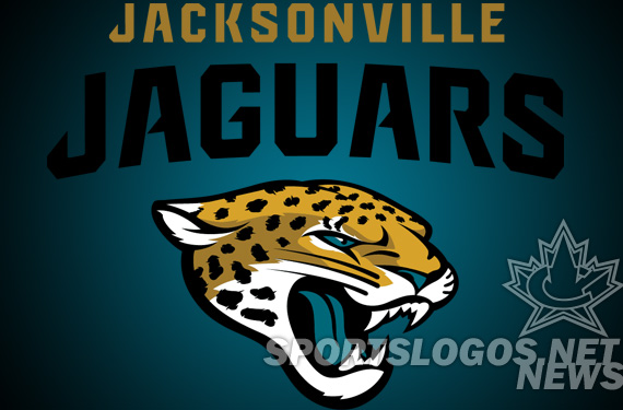
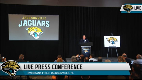
Today at a “State of the Jaguars” event, also streamed live on jaguars.com the Jacksonville Jaguars announced their new logo.

The Jags did a phenomenal job of keeping the new logo release under wraps. The logo community didn’t even hear about the new logo being an option until late yesterday, when CBS Sports’ Pete Prisco tweeted that he had “heard” about it.

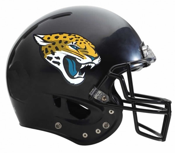
Hear Jacksonville Jaguars new uniforms will have a Nike edge with a lot more gold and a new Jaguars logo on the helmet. For those who care

- Pete Prisco

Very little was out in the world about the new logo, and no leaks availed themselves. Congrats to the Jags organization at keeping the wraps on these.

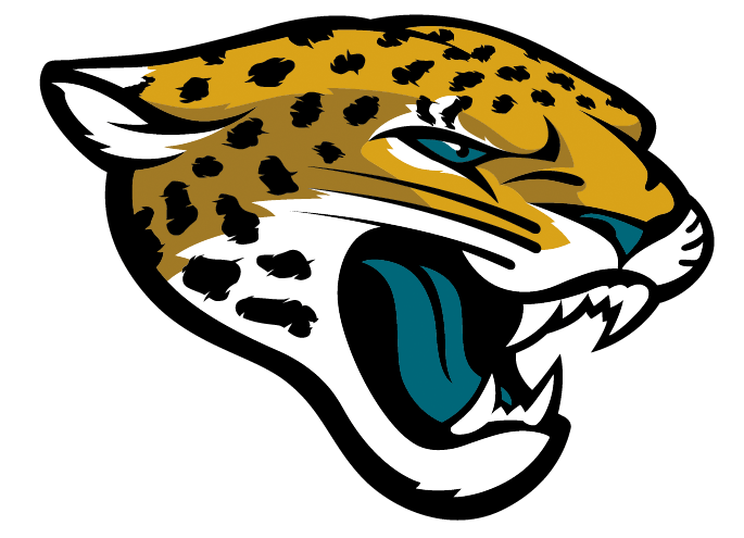
For reference this was the logo the Jags had from their inception in 1995 till yesterday (leaving the Houston Texans as the only NFL franchise with the same logo they used at launch.)

Jaguars Primary Logo 1995-2012

As you can see, the new logo is almost cartoony, less logo-ish like their old. Initial response on Twitter hasn’t been overwhelmingly positive, but that is to be expected. The colors remain the same (similar?), the 3/4 view is the same,. Bigger ears, more accurate spotting for the Jaguar.

Also released were a new secondary logo, a military inspired badge with the “Jags” nickname

Jags Shield

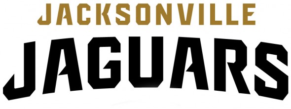
As well, a new wordmark was announced. Very similar to last year’s but now without the motion lines. Cleaner.

Jacksonville Jaguars new wordmark

Jacksonville Jaguars new wordmark

Jacksonville Jaguars Logo - font

New cleaned-up Wordmark

The Jaguars Foundation also adopted the new look.

The teal has dropped to a very tertiary color with gold becoming more prominent, almost their primary.

Jacksonville Jaguars Logo - helmet

Helmet mockup of how it may look. Pending possible change of helmet color.

So, what do you dear readers think about the logo? We don’t get to see a new NFL logo release very often. Does this one strike you?

Let’s hear form designers, too. What would YOU have done differently? Get us YOUR Jaguars redesigns, and we will post them! Email them to jrfrancis@sportslogos.net

Article Categories:

Share This Article

Related News

San Diego State University Shows Tweaked Logo, New Uniforms; Little Consistency
Arizona Wildcats Football Announce New Gradient-Crazy Football Unis
The Logocast Episode 28: We’re Going To Kill Off One of the Hosts

About Author

JR Francis

JR Francis is an actor, writer, director, graphic designer, UX guru, father, comedian, and craft beer snob. You can reach him at jrfrancis@sportslogos.net or on Twitter @JRFrancisSLN *One of several full-time uniform reporters this site has including its founder, Chris Creamer, who started his site in 1997

(123) Readers Comments

  1. AlMaFI
    Tuesday, February 5, 2013 at 16:39

    I can't believe they retained the worst part of their logo--the teal tongue. Yikes.

    • Merchant1874
      Tuesday, February 5, 2013 at 16:45

      I think it is an improvement although that's not hard. I still hate the colours though.

      • AlMaFI
        Tuesday, February 5, 2013 at 17:07

        Right. They could've taken the opportunity to completely remove teal from their set and go with minimalist black and gold.

    • Cam
      Tuesday, February 5, 2013 at 21:13

      They also changed the eyes and nose to teal.

    • tedward_jags
      Friday, February 8, 2013 at 09:07

      I always liked the teal tounges. teal is a misunderstood color

    • thomas
      Saturday, February 9, 2013 at 12:04

      he drinks that gatorade

  2. Mike Steelers
    Tuesday, February 5, 2013 at 16:41

    kool

  3. Hasheem
    Tuesday, February 5, 2013 at 16:43

    holy moly this is horrible. it toes the line of stylized and cartoonish in the worst way

  4. Braden Leibovitch
    Tuesday, February 5, 2013 at 16:45

    Is this a joke? Ugh.

  5. Delayed Penalty
    Tuesday, February 5, 2013 at 16:46

    Major downgrade. Looks very clipart-y, especially against the hard lines of the text in the secondary crest. Not a fan.

  6. Marcus Jackson
    Tuesday, February 5, 2013 at 16:46

    I like it, but I hope that teal isn't really gonna be marginalized. I did wanna see hold play a bigger role, though.

  7. michael spisak
    Tuesday, February 5, 2013 at 16:46

    Logo don't play the game, the team play the game

    • Floris
      Wednesday, February 6, 2013 at 10:10

      The team sucks too.

  8. PJ
    Tuesday, February 5, 2013 at 16:49

    Woah, that is horrendous....Not NFL quality at all. It's cartoony, yet way too detailed. And as if the teal tongue wasn't bad enough...they made his eyes and nose teal too. Brutal.

  9. oz loya
    Tuesday, February 5, 2013 at 16:51

    ..not bad for the team, the thing is very cartoonish, hope the new Dolphins logo looks awesome.

  10. Matthew Schilling
    Tuesday, February 5, 2013 at 16:53

    I think gold should've been the color that was marginalized. I've never been a fan of the color.

  11. Troy Griggsby
    Tuesday, February 5, 2013 at 16:53

    It's waaay too detailed. The microscopic feathering on the spots is totally unnecessary and will not print well on about, oh, a million different fan merchandise items.

  12. Chris Huber
    Tuesday, February 5, 2013 at 16:56

    this would be a great update for IUPUI. It's a step back for an NFL team.

    • AlMaFI
      Tuesday, February 5, 2013 at 17:07

      It looks almost identical to IUPUI. Hilarious!

  13. PB Paulie
    Tuesday, February 5, 2013 at 16:56

    It's a good logo but the previous logo was far better. Well they had one of the most underrated unis in the league and then ruined it. Great color scheme. Logos were solid and now completely ruined everything. Way to go.

  14. Kurt VanPatten
    Tuesday, February 5, 2013 at 16:56

    I like it overall but agree with Troy Griggsby. Too much detail.

  15. SDFanBoy619
    Tuesday, February 5, 2013 at 17:00

    It definitely leans more towards an illustration of an animated jaguar, than what we would consider a standard logo.

  16. Long island
    Tuesday, February 5, 2013 at 17:01

    Why?

  17. bleujayone
    Tuesday, February 5, 2013 at 17:01

    The Jaguar is still eating all the raspberry blue Icees.

  18. Brian Castner
    Tuesday, February 5, 2013 at 17:05

    The new wordmark is nicer but the rest is terrible. At least when they went for a stupid nickname secondary they went with "Jags" and not "Jax". Overall a major step backwards but it fits with their step back with the current uniform set.

  19. IPGComic
    Tuesday, February 5, 2013 at 17:08

    It's not bad...but it sorta looks like a logo you'd use on Madden for a Create-a-Team. I dunno maybe a slight upgrade? Maybe a lateral move. I definitely like the shield logo and new script logos though. If they could use black, gold and teal similar to the Arizona Rattlers then the new unis could be boss. 7/10

    • Jeriat
      Tuesday, February 5, 2013 at 23:23

      Oh no. The Create-a-team logos on Madden are WAY more generic looking than this.

    • Jack
      Friday, February 15, 2013 at 17:44

      yeah, it looks alot like madden, but they should of simply moved to Birmingham, Memphis, San Jose, or maybe LA

  20. AlMaFI
    Tuesday, February 5, 2013 at 17:10

    I always like the old (now) Jaguars' logo. It had kind of an artful 2-D cave painting look. Now, it just looks like the Jags are following their kindred spirits (the Panthers) by going with the fierce, more realistic look. Very surprising choice.

  21. Aaron
    Tuesday, February 5, 2013 at 17:10

    Love the modernization of the Jags logo. Nothing too drastic although noticeable. Also glad they're keeping the teal, gold and black.

  22. Travis
    Tuesday, February 5, 2013 at 17:11

    YES!!!!!!!!!!

  23. Jeannette
    Tuesday, February 5, 2013 at 17:13

    I actually love it! But, I hope the Teal will be more as an accent colours (like Seahawks lime green, Patriots red) to the uniform.. That would give it a fresh look.

  24. elmo10
    Tuesday, February 5, 2013 at 17:15

    Looks like it could pass for a WNBA logo.. The Jags should of stayed with the original!

  25. Andy
    Tuesday, February 5, 2013 at 17:17

    This is just awful, but I can see it growing on people.

  26. Wesley Mcfarland
    Tuesday, February 5, 2013 at 17:20

    This Falcons fan isn't scared

  27. Kurt Pittman
    Tuesday, February 5, 2013 at 17:20

    hmm. it's kinda cartoony for my taste. could probably do without the second gold color for shading. at least it's clean and professionally done, unlike the panthers redesign.

  28. Jeremy Schooler
    Tuesday, February 5, 2013 at 17:21

    its good

  29. John
    Tuesday, February 5, 2013 at 17:30

    at least there are no more Cheeto spots...

  30. Miss Svoboda
    Tuesday, February 5, 2013 at 17:33

    wow...underwhelming to say the least. The word mark is an upgrade, but the Jag is a lateral change. I would have thought they would have taken this momentous opportunity(first change in franchise history) to solidify the franchise with a solid, original logo that could over time be iconic and unique to the Organization and the City. Something for them to take pride in, something to build on. Instead they chose to alter an OVERUSED image of a Jaguar(see just about every sport and level with a cat mascot, they can't even differentiate from the Carolina Panthers in their own league) and once again push the image of their franchise to the periphery.

  31. Tom Cowboy
    Tuesday, February 5, 2013 at 17:36

    WOW! TIGGER looks mad!! Look out Winnie the Pooh... He's coming for you!!

  32. Kyler Danger Wilson
    Tuesday, February 5, 2013 at 17:36

    With some cleanup and thickened lines, this could be amazing

    • JR Francis
      Tuesday, February 5, 2013 at 23:08

      Do it! Then send it to me.

  33. Joshua Powers
    Tuesday, February 5, 2013 at 17:44

    No I do not

  34. Blake Snodgrass
    Tuesday, February 5, 2013 at 17:47

    This would make a good 50-yardline logo. As for the helmet, you could go with a "double-J" (initials) interlock or a gold helmet with black spots all over it.

    • Jack
      Friday, February 15, 2013 at 17:47

      yeah, like the bengals.

  35. B Clay Lauramore
    Tuesday, February 5, 2013 at 17:50

    To cartoony too feminine, Besides you could tell the upgrade is needed.

  36. Paul Pelkonen
    Tuesday, February 5, 2013 at 17:54

    Old logo looked like a jaguar. New logo looks like a leopard. Let me guess, "spotted" stripes coming?

  37. Fletcher Keel
    Tuesday, February 5, 2013 at 18:03

    I've seen high schools with better logos

  38. Bryan
    Tuesday, February 5, 2013 at 18:04

    I'm just excited to see what the Nike uniforms will look like because I feel like the Seahawks have been the only team to capitalize on Nike's creative styling on uniforms this season

  39. Craig Michaels
    Tuesday, February 5, 2013 at 18:06

    It'll change when they move to L.A. in two years anyway.

  40. Craig Michaels
    Tuesday, February 5, 2013 at 18:06

    It'll change when they move to L.A. in two years anyway.

  41. Matt
    Tuesday, February 5, 2013 at 18:09

    Too bad it won't help the football team.

  42. Aaron Thew
    Tuesday, February 5, 2013 at 18:09

    i can see why they were able to keep it such a secret. that thing is UGLY. bet you anything they will have gold helmets to go with it.

  43. Aaron Thew
    Tuesday, February 5, 2013 at 18:09

    i can see why they were able to keep it such a secret. that thing is UGLY. bet you anything they will have gold helmets to go with it.

  44. Nicky Santoro
    Tuesday, February 5, 2013 at 18:12

    I find it to be a vast improvement. Beautiful logo, nicer, livelier shade of gold (in my opinion). I just hope the jerseys aren't like the awful new Seahawks ones.

  45. T.j. Monteiro
    Tuesday, February 5, 2013 at 18:13

    I really liked the old one but this one is even better...

  46. T.j. Monteiro
    Tuesday, February 5, 2013 at 18:13

    I really liked the old one but this one is even better...

  47. Michael Kaiser
    Tuesday, February 5, 2013 at 18:13

    I think it looks better, like someone came along and cleaned up the original. I don't have a dog in this race, however.

  48. 54321
    Tuesday, February 5, 2013 at 18:23

    It does not work as a logo. I can't picture that thing on ESPN or in my newpaper depicting JAX... gives me a strong Florida Panthers not-a-logo vibe.

  49. Michael Dworsky
    Tuesday, February 5, 2013 at 18:28

    That will not help still moving to London

  50. Andrew
    Tuesday, February 5, 2013 at 18:31

    I it's an improvement. We'll have to wait and see who they look with the new uniforms & on the field...that said, glad it's not my team.

  51. Travis Gagnon
    Tuesday, February 5, 2013 at 18:42

    love it

  52. Valdazzar
    Tuesday, February 5, 2013 at 18:43

    Great change. I like it a lot. It's far better than the previous one.

  53. Valdazzar Wallpapers
    Tuesday, February 5, 2013 at 18:43

    this one is far better than the previous. A very good change

  54. Yancy
    Tuesday, February 5, 2013 at 18:58

    Yeesh. What are the Jags doing? They didn't need to fix their uniforms but they did. They didn't need to fix their logo but they did. They went from one of the NFL's best, most original looks to a joke. So sad....

    • wolfgangII
      Wednesday, February 6, 2013 at 15:17

      Agree.

  55. Cesare Bellano
    Tuesday, February 5, 2013 at 18:59

    Now all they need is a football team, and they'll be set.

  56. Ron Fiedler
    Tuesday, February 5, 2013 at 19:06

    love the font treatment!

  57. Jed
    Tuesday, February 5, 2013 at 19:09

    New logo looks nice but they should go with a different color scheme..mostly black and gold.

  58. Josh Truax
    Tuesday, February 5, 2013 at 19:13

    Looks like what the old logo might have looked like if for some reason it were drawn in a comic book.

  59. Alan Vitello
    Tuesday, February 5, 2013 at 19:26

    Don't mess with the color-changing teal/black helmet!

  60. Alan Vitello
    Tuesday, February 5, 2013 at 19:26

    Don't mess with the color-changing teal/black helmet!

  61. Scheherazade
    Tuesday, February 5, 2013 at 19:36

    The logo looks kinda feminine to me but if they can have the proper uniform and helmet design to go with it then im all for this logo.

  62. Alex Pieczynski
    Tuesday, February 5, 2013 at 19:38

    Pitiful

  63. Koozee Kingdom
    Tuesday, February 5, 2013 at 19:42

    The ears and spots are a definite upgrade. The old ears looked like those of a dog that had just been scolded. The old spots looked more like packing peanuts. The deeper shades of gold are also an improvement. Could it have been better? Probably, but it's a step in the right direction. The helmet mockup looks too plain though. Hopefully the real thing will look different, with some stipes or something.

  64. Torrey
    Tuesday, February 5, 2013 at 19:49

    Wow...I thought this was a highs school logo at first...or a concept that wasn't finalized. I strongly dislike it. If anything, I would've touched up the spots on the old logo to look like the dots on this new one...and then maybe modernize it a tad like Carolina did to theirs. This though? Pass.

    • Torrey
      Tuesday, February 5, 2013 at 19:51

      High school...not highs school...my bad.

  65. TrueYankee26
    Tuesday, February 5, 2013 at 20:09

    Looks like a Looney Tune. Way too cartoon-y.

  66. Jim Pericotti
    Tuesday, February 5, 2013 at 20:19

    I don't get the hate. I never really cared for the older version, it looked like it was yawning or sleeping. This one really looks like it's growling or some other more aggressive sound. I do think that some of the line weights could be beefed up a bit, but it definitely looks more realistic, and I like the way it incorporates more teal. Not a fan of the double gold though...I think it could work fine with one shade.

  67. Steve
    Tuesday, February 5, 2013 at 20:27

    They can't be serious?!?! WTF? this must be a sick joke. ABSOLUTELY TERRIBLE.

  68. Nick
    Tuesday, February 5, 2013 at 20:44

    Looks like a high school logo. Although the first logo wasn't much to look at either.

  69. Richard Lyman
    Tuesday, February 5, 2013 at 21:29

    It's an improvement for sure. I like it better than the current one. Here's a challenge for you, create a "fierce" Cardinal for Arizona!

  70. Scott
    Tuesday, February 5, 2013 at 21:32

    I love it, I loved the original logo too, and I've always thought the team had one of the best uniforms and color schemes in the NFL

    • BringItBack
      Tuesday, February 5, 2013 at 21:43

      @ Richard Lyman - That "fierce" cardinal came a few years ago, ughhhhh....i know what you mean...

  71. Jim Pericotti
    Tuesday, February 5, 2013 at 21:34

    My friend Brad Joiner had done one years ago. Unfortunately, a lot of vendors have co-opted that logo as their own, and have sold it to their own clients.

  72. BringItBack
    Tuesday, February 5, 2013 at 21:41

    The original Jags logo was unique and very authentic. This one looks very generic. What's up with the teal eye, tongue and nose?

    • Jack
      Friday, February 15, 2013 at 17:52

      the teal color was created to look like it just ate a panther (carolina)

  73. Brad Joiner
    Tuesday, February 5, 2013 at 21:42

    "Don’t worry about people stealing your design work. Worry about the day they stop." - Jeffrey Zeldman

  74. Chris Oglesby
    Tuesday, February 5, 2013 at 22:00

    Looks like a generic create a team logo in Madden

  75. Andy
    Tuesday, February 5, 2013 at 22:11

    Looks like a high school logo. Too much detail in the logo makes it kind of look like Washington State's old logo. A minimalist change like the Panthers did last year would have been better. Grade:C-

  76. ghhking
    Tuesday, February 5, 2013 at 22:20

    Ears are too big. Make them smaller, and this would be a great, Panthers-esque update. But the ears make it look terrible.

  77. Jordan
    Tuesday, February 5, 2013 at 23:16

    It's not a bad drawing in my opinion, it just makes for a bad logo. I think it looks way too cartoony and clip-art-ish. It's also too detailed with the feathered spots and the two-tone gold shading.

    • ingmar66
      Friday, February 8, 2013 at 09:15

      Could not agree more. I am not enthousiastic at all, especially not with the police-show shield and the black outline on a black helmet.

  78. vap19
    Tuesday, February 5, 2013 at 23:28

    So the tongue is teal. Those are the team colors! Real lions aren't blue and I'm pretty sure real vikings never wore purple, Hawks aren't navy blue, and... you get the idea. At least the teal is repeated to balance it out whereas the old one just had bright teal in the middle. As usual though, it doesn't matter what we say, it only matters what Jaguars fans say in merchandise sales. Most of us on the SportsLogos forum hated the new Marlins logo and yet it was one of the top selling caps in baseball this year including one from this convert.

  79. walkerws
    Tuesday, February 5, 2013 at 23:37

    This is absolutely rediculousl horrible. This looks like clipart! It's unpolished and it's nose is broken. Totally a downgrade hre.

  80. Erik J. Barlik
    Wednesday, February 6, 2013 at 00:31

    it's a good one!

  81. SFforlife
    Wednesday, February 6, 2013 at 01:57

    I actually like it. It's better than the previous, and I dislike cartoony updates (I'm looking at you, Sharks..) but the problem for me was the black smudge on the old Jaguar's face. Glad they cleaned up his mouth. So the logo is a win for me, not bad. The badge logo, however, is horrendous. As is the word font, and the color scheme. Seems like they're favoring the gold and black and minimalizing the teal. That sucks, teal was what made them unique. But I guess they're realizing actual Jags are gold and black, and are slowly diminishing the teal, whatever. Fix the atrocious font, scrap the terrible badge, and balance the colors, and you're alright. I've always thought Jax would look really cool if they just fixed their font, scheme, and unis. HOPEFULLY, Nike doesn't butcher their uniforms....but as is par for the course for Nike, I'm not holding my breath.

  82. Von Schober Francis
    Wednesday, February 6, 2013 at 02:57

    I like the new one better even if more classic... Also like the addition of more Gold !!! Can't wait to see the new uniform !!

  83. Phil Kizer
    Wednesday, February 6, 2013 at 05:04

    It looks cheap and unprofessional. Why do pro teams think it's okay to go with the generic look? Downgrade IMO

  84. Steve
    Wednesday, February 6, 2013 at 06:30

    I know it's a bit cartoonish but I like it

  85. CurrDawg
    Wednesday, February 6, 2013 at 06:49

    Definite downgrade...the helmet mock up with the new logo says it all! It looks like some lame logo they made for Madden create a team! Should have kept the original...now they look as bad as the team plays!

  86. RC Thompson
    Wednesday, February 6, 2013 at 07:51

    This is the WORST re-do in NFL HISTORY!!!!!

  87. Bill A
    Wednesday, February 6, 2013 at 08:33

    Definitely an improvement.

  88. Marco
    Wednesday, February 6, 2013 at 08:38

    Eh, I think it looks a but too whimsical/cartoonie... The varying line weight around the head seems a bit off. I'm not sure what the reasoning is for having that black outline thick at the bottom around the jaw and then thin around the rest of the head. There is also something weird going on with the top row of teeth. The top the right fang is showing up as if it's on top of the lip. The top row has an odd number of teeth for some reason. There should be either four or six teeth not five.

  89. KDub
    Wednesday, February 6, 2013 at 11:26

    I think it's leaps and bounds above the old logo, but I agree with some of the previous posters that it would have been a good opportunity to eliminate the teal tongue/nose. Cats in general are tough to make look unique and have them stand out from other breeds ie, panthers, cougars, etc. I do think it looks lost on the plain black helmet though.

  90. Michael
    Wednesday, February 6, 2013 at 12:16

    A bit cartoony, but the badge logo is legit.

  91. Rob S.
    Wednesday, February 6, 2013 at 12:34

    There was a time when all NFL Helmet Logos were cool.You can't say that anymore.With the possibly new leaked Dolphins helmet and now the Jaguars, a horrible trend is beginning. This logo is absolutely hideous! I have to wonder about people who like this.A bunch of comic book kids?The old logo was great,this SUCKS!!

  92. John Turcotte
    Wednesday, February 6, 2013 at 13:02

    Awesome jaguar head ! Can't wait to see the numbers !

  93. Doug
    Wednesday, February 6, 2013 at 14:32

    Not perfect but better than the Downs Syndrome Jag they were using before.

  94. CurrDawg
    Wednesday, February 6, 2013 at 20:07

    I think trying to envision this logo without the tongue does improve it a bit but I still think it won't look good on helmets. Just a weak logo altogether!

  95. Jason
    Wednesday, February 6, 2013 at 21:16

    I wouldnt be suprised if more then 99% of the people complaining about the teal are even from the North Florida area. Each region/City has its own colors or theme. Jacksonville is split by the St.John's river and is about 20 minutes away from the Atlantic so the color teal has more of an appeal to the local beach goers. The northwest is the same way with the bright (almost painful) to look at lime green. If we took out the teal then we would have saints colors nothing would be special about our image.

    • Aaron
      Wednesday, February 6, 2013 at 22:51

      Yeah, who really wants to be a carbon copy of another team unless you want to have a good team like them. I'd take teal over lime green for any team everyday. Although if done properly, lime green could work. Case in point the Seahawks. But only as an outline colour.

  96. Roger C.
    Wednesday, February 6, 2013 at 21:59

    MUCH BETTER. Great job, screw the people who hate it.

  97. Jordan H
    Wednesday, February 6, 2013 at 22:18

    Looks like something out of Madden create a team

  98. Dante
    Thursday, February 7, 2013 at 03:01

    I think it's an upgrade, mostly. The teal tongue and nose do make it more cartoon-like. I look forward to the uniforms as Jacksonville alters them for the second time in a few years.

  99. Jumbotron
    Thursday, February 7, 2013 at 10:33

    teal tongue! A good logo but not on a helmet

  100. Paul Pelkonen
    Friday, February 8, 2013 at 14:41

    It looks like a leopard. And I'm expecting spotted stripe pants. Nike Fugliness, don't let me down.

  101. C.d. Luebke
    Sunday, February 10, 2013 at 01:37

    Not bad, but wish they'd ditch the teal finally. It's not 1993 anymore...

  102. C.d. Luebke
    Sunday, February 10, 2013 at 01:37

    Not bad, but wish they'd ditch the teal finally. It's not 1993 anymore...

  103. Jack
    Friday, February 15, 2013 at 18:00

    The name Jaguars doesn't make sense with Florida. they should of named the team "the Sharks" or the "Bulls" or something that either is traditional, or makes sense with the fact that the team plays in north florida.

  104. porkchop75
    Wednesday, February 20, 2013 at 16:51

    I'm a hardcore Tennessee Titans fan, and I have very little respect for Jacksonville, and to me, this looks like an elementary mascot logo. It just looks childish! What's happening? Are the Jags going into a Peewee football league? No offense, but They have been playing like they should for a couple of years...

  105. Pod
    Wednesday, March 20, 2013 at 11:43

    The more I've seen this, the more I like it. It's still cartoony, almost like a triple-A team, but it's better than the original one.

  106. {Jeremy Scott Adidas|Jeremy Scott Bones|Jeremy Scott Shoes}
    Thursday, April 11, 2013 at 08:20

    Someone necessarily help to make significantly articles I would state. That is the very first time I frequented your web page and so far? I amazed with the research you made to make this particular publish amazing. Fantastic job!

Leave A Reply

Leave a Reply

Your email address will not be published. Required fields are marked *

You may use these HTML tags and attributes: <a href="" title=""> <abbr title=""> <acronym title=""> <b> <blockquote cite=""> <cite> <code> <del datetime=""> <em> <i> <q cite=""> <strike> <strong>