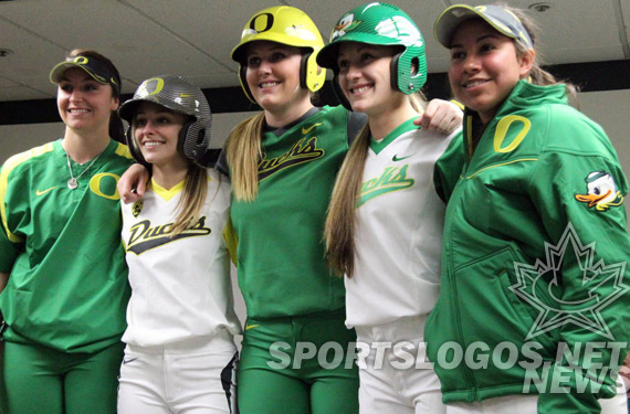
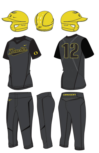
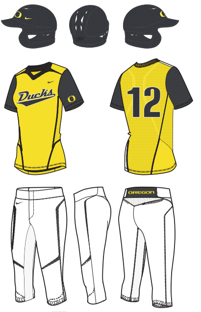
In the world of uniform design, the Oregon Ducks set a certain kind of standard via their football team for breaking new ground, releasing a myriad of combinations, and bringing textures to hard goods. Along the way, they have transcended merely making people gasp with new designs into a position of leadership in maintaining consistency and solid design within their realm. While other brands, teams, uniforms are going all wacky, Oregon looks good because they are consistent in their reach.
This has expanded past football, into their other sports, the latest of which is women’s softball. Whether or not you are particularly into the sport, as a uniform design fan, you have to appreciate the smooth transition of the football designs onto the backs of the softball team.
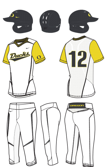
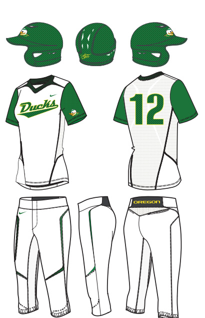
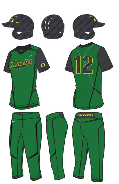
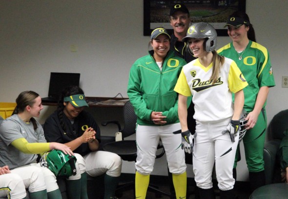
They announced 5 different uniform looks for the lady Ducks, two white-base and three color-base. Green, Yellow, and Black all make their presence known.
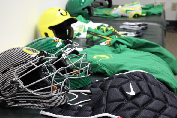
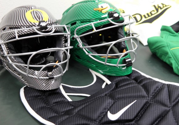
They showed off not only their uniforms, but shoes, helmets both batting and catching, as well as warmups and jackets.
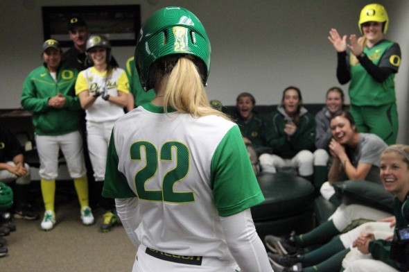
The numbers and Ducks script are stretch twill to maximize movement and comfort. They share a carbon fiber texture with the helmets.
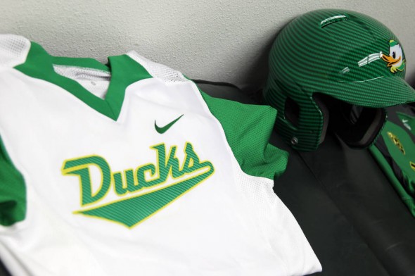
Both white-base jerseys have team color sleeves, one in green, the other yellow.
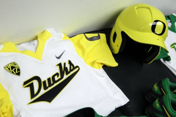
The yellow goes with the modern O and the Ducks script in black, while the green has a green script and a seldom-seen modernized duck head logo.
The three dark jerseys are green, yellow, and charcoal.
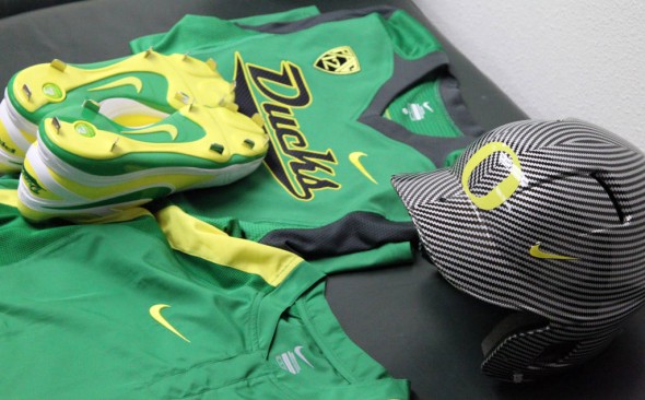
All the official combinations are shown below.
The women’s softball team is going to look every bit as good as the football team, thanks to these Nike creations. What do you think? Do you like the look? Is it consistent with Oregon’s other sports? Do you like to see softball coverage? Are these renderings a tad bit too realistic and looking a bit like yoga pants?

