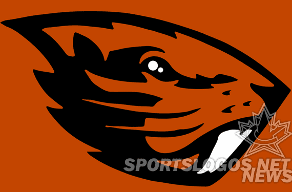
As we reported back in September of 2012, Nike has been working with Oregon State on new identify pieces. It was never made particularly clear what pieces would change, what what if any would stay the same. From images that have been floating around online, it looks like the primary Beaver logo is getting the Nike redesign.
Setting aside why on earth a school would sign with the same company that uses its in-state rival as their feature school in the first place, Oregon State has been slow to undergo huge changes. This new logo would qualify as such.
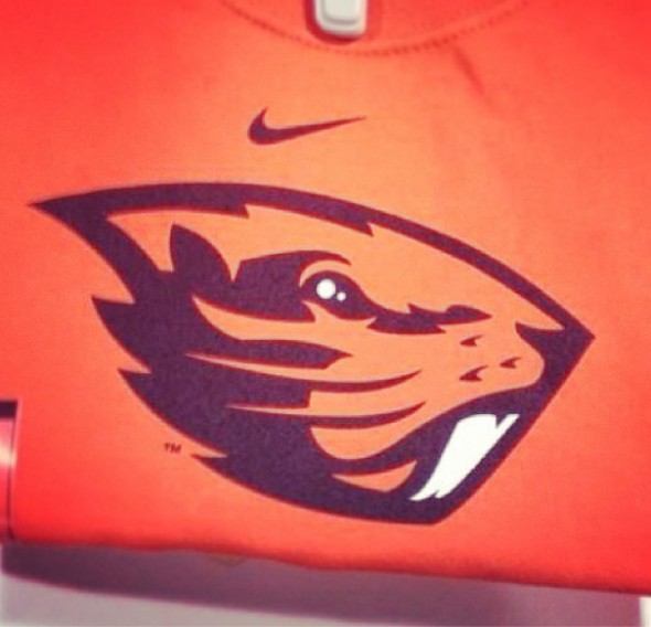
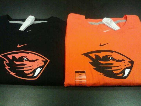
Jacob Tauscher, an employee at Just Sports, a retailer with 27 locations throughout the Pacific Northwest first posted it, possibly from his store’s shelves (although Just Sports emailed us to say the photo was taken at a competitors shop). The shirt in question does not appear on their web site. The logo is shown on what looks to be in-store merchandise. Complete with Nike logo, sizing sticker, and security dongle.
The new Beaver, if it is indeed genuine, has what we will call an “interesting” look. The silhouette seems somehow forced into its shape, as if its trying to be the outline of the state, county, campus, or an axehead. The teeth, in bright white, seem to spell out a letter N. The eye, also in white, has a double circle appearance.
Whiskers as slash lines, and additional “dots” give the shape a beaver-like appearance. The eyes look a little vacant, the shapes around them almost abstract.
As a whole, it is not a bad logo. But its difficult to call it a huge upgrade over their previous.

1997 – 2012 Logo with wordmark
It is certainly a massaging of the current, rather than a totally from-scratch work.
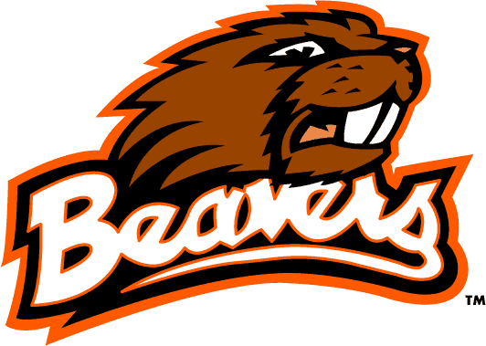
Our favorite here at Worldwide Logo Headquarters is their 1973 look.

1973-1996
So, what do you think? Is this legit? Or are we being punked? If it IS legit, do you like it? Does this help OSU keep up with their in-state design mavens, the Ducks of the University of Oregon?
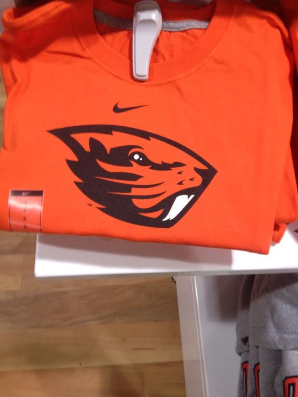
UPDATE: In our comments section, “BeaverFan” posted a photo they claim to have taken themselves, from an early drop-shipment to a store.
Looks pretty legit. Do you still doubt the authenticity? Or is this more photoshopping?
JR Francis is an actor, writer, director, graphic designer, UX guru, father, comedian, and craft beer snob. You can reach him at jrfrancis@sportslogos.net or on Twitter @JRFrancisSLN *One of several full-time uniform reporters this site has including its founder, Chris Creamer, who started his site in 1997


J.Mueller
Sunday, February 10, 2013 at 02:09I personally hate this logo. The beaver head looks misshapen and the left side is very similar to the Oregon Duck wings. I hope they are being punked but I think it is legit. I wish they would've stayed with the old one, because I'm not digging it.
@joshuamtaylor
Sunday, February 10, 2013 at 02:12First of all, thank you for using the word "dongle." Secondly, I love the logo. I think it's a big upgrade from their current logo. Their current looks like he's having a seizure.
Katie Barrie
Monday, March 4, 2013 at 01:36It's a piece of crap it looks like its trying to turn into a duck are you serious you must really like the ducks if you like this logo your whack.
Brent Stewart
Sunday, February 10, 2013 at 02:57i like it but looks too oregon like, like the outline forms the wings almost
CAPTAIN CORNHOLIO
Tuesday, March 26, 2013 at 00:31YOUR AN IGNORANT NIGGER YOU SHOULD HAVE YOUR BLACKASS DEPORTED BACK TO YOUR NIGGER ASS PORCH MONKEY COUNTRY IN NIGERIA BIACH
Sandy Hilton
Tuesday, March 26, 2013 at 00:34You have a foul mouth if you were my child i would make you eat a bar of soap its obvious that he is very ignorant but you should still be polite!!!
CAPTAIN CORNHOLIO
Tuesday, March 26, 2013 at 00:36YOUR RIGHT IM SORRY I CALLED YOU A NIGGER BUT EVEN SANDY AGREES WITH ME THAT YOUR IGNORANT. ITS AN OREGON SCHOOL THATS WHY IT WOULD APPEAR TO BE OREGON LIKE.
Chris Oglesby
Sunday, February 10, 2013 at 06:09Huge upgrade. The current one looks like its getting an anal probe.
Peter Baxter
Sunday, February 10, 2013 at 07:13They needed an upgrade, but I don't like this one.
Jeti Mar
Sunday, February 10, 2013 at 09:44Looks like they took the old jags logo and morphed it into a beaver.
Tom Richards
Sunday, February 10, 2013 at 09:59Naked mole rat!
Spinney
Sunday, February 10, 2013 at 10:38Feels like someone hit "Live Trace" in Illustrator a couple of times and tried to work something out of it. HOWEVER, if someone made the decision to do it this way for a more rustic, tougher, woodsy look, then they were dead on. I suppose it depends on the intentions of the artists and the request of the school.
Alex Parisi
Sunday, February 10, 2013 at 10:55I would've liked to have seen a full bodied beaver and not just the head. That Beaver tail is something to behold. Missed opportunity.
KTemp
Monday, February 11, 2013 at 03:18I agree with Alex. The beaver tail could be really cool. Could you imagine the tail texture on helmets or jerseys? That being said, I really like the new logo.
Alan White
Monday, February 11, 2013 at 15:23http://www.zazzle.com/rodents_gone_wild_bumper_sticker-128052431650166037 Someone had mentioned that the new Beaver logo looks like the, Patriots logo (shape). I think it's whiskers look like fish gills.
Ian
Sunday, February 10, 2013 at 10:57Old one is better IMO.
Fletcher Keel
Sunday, February 10, 2013 at 10:59Looks like the new JAX Jags logo..
Uzz
Sunday, February 10, 2013 at 13:43Are you blind ?
Logan R
Sunday, February 10, 2013 at 11:19Dafuq did I just see?
SFforlife
Sunday, February 10, 2013 at 11:31Trying to make any beaver look tough and angry is most likely going to fail, but this looks incredibly stupid. It looks like a giant gopher! Idiotic...
Rob S.
Sunday, February 10, 2013 at 12:09Man, I am getting tired of complaining, but this logo is awful!!! The current one looks great 97-12. I continue to despise NIKE, Hate everything about that company.
Bliggy
Sunday, February 10, 2013 at 12:29Love this.
Brian in Boston
Sunday, February 10, 2013 at 12:36Why clients - particularly college athletic departments - continue to hand responsibility for their branding to Nike is beyond me. Miserably crap-tacular.
Squizz
Sunday, February 10, 2013 at 13:37Really? Really? You don't get it? Well Nike makes a lot of money, it brings revenue and recruits into colleges, and it sells. See people like you can complain about Nike and sports logos on a website like this all you want, do you think Nike cares? No they just laugh as the money rolls in, OSU will rejoice as they get coveted recruits and merchandise sales go up. You see Brian once you look beyond the socialist agenda of Massachusetts you will realize we as a nation are still a capitalist society, and in that capitalist society NIKE is a big deal, does that help?
Brian in Boston
Sunday, February 10, 2013 at 19:07Squizz... no need to take my disdain for the dreck Nike regularly peddles so seriously. Believe me, I know why Nike continues to engage in their so-called "branding" efforts: it is the M-O-N-E-Y you mentioned. So long as the college clients continue to buy-in to Nike's rep as a "branding" partner, Nike will continue to take their cash. And you're right, the suits at Nike are likely laughing all the way to the bank... particularly at the college sports lemmings that continue to lap-up the pap that Nike's selling. As for my being influenced by a "socialist agenda" in Massachusetts... you're going to have to do better than that. First of all, the notion that everyone who calls Massachusetts home is a "socialist" is dated, hackneyed crap. Second, while I was born and raised in the Bay State, I've spent the vast majority of my adult life living elsewhere. Why the moving around for me? Part and parcel of plying my particular trade in the capitalist system I'm a successfully functioning member of. Look, Nike may strike you as being a "big deal", but from where I'm sitting, they've become - particularly with regard to their "branding" efforts on the part of colleges - a tired, overrated outfit whose work borders on self-parody. You're free to celebrate their supposed greatness with each and every college identity they churn out, but I'll pass on doing so until I see something that strikes me as actually worthy of praise. Frankly, it has been a good long time seen I've seen such a result from them. To each their own.
Squizz
Monday, February 11, 2013 at 22:17Ha ha ha ha ha!!! Oh my gosh your just a straight up dolt. Oh I needed the laugh thank you.
Pakwest
Tuesday, February 12, 2013 at 10:54You must work for Adidas.
Chris Creamer
Tuesday, February 12, 2013 at 17:56I apologize to the usual readers of this site for the level of intelligence that "Squizz" has shown in his comments... this is not YouTube, let's take the quality of comments up a notch shall we?
Aaron
Sunday, February 10, 2013 at 13:53Any sharper and you might as well call them the Porqupines.
KDub
Sunday, February 10, 2013 at 14:45In a word, NO.
Mike
Sunday, February 10, 2013 at 15:49original photo from here https://www.facebook.com/photo.php?fbid=10200653622531682&set=a.2551067144684.143578.1494044478&type=1&theater
Cody
Sunday, February 10, 2013 at 16:33Just awful.
Jeriat
Sunday, February 10, 2013 at 18:45What.... in the hell....?
Bleuet
Sunday, February 10, 2013 at 20:28The 1973 logo is the best one.
Jon
Sunday, February 10, 2013 at 21:29"If it ain't broke... don't fix it." Apparently Nike wasn't informed about that phrase...
Paul Pelkonen
Monday, February 11, 2013 at 02:38So that's what happened to all those failed Jacksonville Jaguars concepts.
ingmar66
Monday, February 11, 2013 at 09:21Never leave a mascot design to a sports company. The N teeth cynically stand for Nike, the gopher-like look is what Minnesota can expect should they ever redesign their logo, care of Nike, and the vacant look of this creature is mirroring the empty stare of the lethargic masses that are going to buy OSU stuff with this logo. Bring back and update the '73 beaver! And employ independent designers!
MD
Tuesday, February 12, 2013 at 20:05Are you kidding me? The top part of the teeth shows the gum, suggesting that there are 2 teeth and not one large tooth. The lower part show that they are angled. If Nike's designer was to A) Create a solid black line all the way down separating the teeth or B) Remove the curves at the top and bottom it would look AWFUL
Jasen
Monday, February 11, 2013 at 10:50Looks like the gopher from caddyshack
beaver fan
Monday, February 11, 2013 at 12:13THIS IS REAL. NOT A FAKE.. the shirts came on a drop shipment to the store and they were not supposed to have been sent out yet. THIS IS THE REAL LOGO. I have held the shirt and seen them in person
beaver fan
Monday, February 11, 2013 at 12:15one more thing this is not a leak from nike.
beaver fan
Monday, February 11, 2013 at 12:20http://sphotos-a.xx.fbcdn.net/hphotos-snc7/426053_4322531417262_1857578585_n.jpg here is the photo i took of the shirts
Chris
Monday, February 11, 2013 at 12:23Well, I have to admit that the new logo is a step up from the outdated logo that they were using...however, it leaves plenty to be desired. I think it might look good on a football helmet, but as an overall design it's not strong and it will definitely not pass the test of time, much like the outgoing logo which is completely outdated and carries all the signs of what was 'in' back in the 90's. The new logo has all the trappings of a logo with no staying power...and I think it's disappointing, because while Oregon State has admitted that it was time for a make-over, it seems that they pride themselves on being unlike the Oregon Ducks, hence, they should have opted for a more classic look that will age better. I would have preferred a refresh of the 1973 logo, or perhaps (as many here have pointed out), a full beaver body. Even a beaver silhouette on a matte background could work to provide that sort of rugged + throwback look (think montreal 76 olympics, or roots canada logos).
Chris
Monday, February 11, 2013 at 12:25In addition, I hate franchises or college programs that run away from their own identities. The overall uniform should honour the colours, name and traditions of the team.
JD
Monday, February 11, 2013 at 13:22It looks like a naked mole rat, not a beaver.
RAB
Monday, February 11, 2013 at 13:50How do you not include the tail!?
54321
Monday, February 11, 2013 at 14:12It must suck to be the in-state cousin of the most progressive uniform design team/franchise in organized sports. For that alone, I give them a pass - not for copy-pasting ideas, rather for at least looking up to date.
Alan White
Monday, February 11, 2013 at 15:26http://www.zazzle.com/rodents_gone_wild_bumper_sticker-128052431650166037
MelMay
Monday, February 11, 2013 at 15:57FAIL! I LOVE my Beavers but HATE this logo!
Koozee Kingdom
Monday, February 11, 2013 at 16:17Why is the Beaver head in the shape of a "D"? They are the Beavers, not the Ducks.
amoody
Monday, February 11, 2013 at 17:07Flat out Honest answer - what a waste of time and money. That logo is terrible. I'm a PROUD beav but I will not support this rediculous logo. Go back to the drawing board Nike Team, start over and this time come up with something that people will like.
Mike
Monday, February 11, 2013 at 19:58Personally, this logo is starting to grow on me. I hope this is a secondary thought. I would rather see a text logo for football helmets and playing fields.
Ian
Monday, February 11, 2013 at 20:35I think it's terrible. Its the worst of all the logos. It doesn't look like a beaver. I can't even decide what it does look like. Personally I would rather go back to the 1973 Benny Beaver logo.
Beavblazer
Tuesday, February 12, 2013 at 10:55It's photoshopped. On the retail picture, look at the upper left portion where the orange doesn't match. Also, the swoosh isn't centered.
beaver fan
Wednesday, February 13, 2013 at 03:51wrong both pics taken same day i had to remove the product from the sales floor due to Nike requesting we remove the product as it will not be for sale until April. so i snapped a quick pick in an area with bad lighting. the other pic was taken where there was way more light.
Pod
Tuesday, February 12, 2013 at 12:52don't like it, but I didn't like the older one either.
Concerned Uni
Tuesday, February 12, 2013 at 12:53Awful...just awful. Whats wrong with the current logo?
Dan
Tuesday, February 12, 2013 at 22:19Why do we need a Beaver logo to go on helmets, jerseys, etc.? How 'bout using the inter-locking OS on sports uniforms and Benny Beaver at games with the current logo on flags, T-Shirts, etc. as needed ...
affolter
Wednesday, February 13, 2013 at 15:39No! No! No! I hate it. The current one is better. The '73 version better yet.
dustyman
Wednesday, February 13, 2013 at 16:07what is nike trying to do take over the state of Oregon?
EG
Thursday, February 14, 2013 at 12:30I have a legitimate question: Can I get shirts or sweat tops or decals with the old logo the one from pre-1996? I mean the FB team was bad then but this logo is far better than either.
James
Friday, February 15, 2013 at 00:17I may stand alone on this but I think it looks sharp.
rb
Friday, February 15, 2013 at 02:24This still my favorite bieber logo. http://www.thesportsbrewery.com/wp-content/uploads/2010/12/biebers_1.jpg
Daniel Moore
Sunday, February 17, 2013 at 09:41ARE YOU KIDDING ME!!!!!!! Phil Wants to make us the laughing stock of the PAC 12. Very bad idea going with them as we all know where his heart and checkbook lay. Disappointing if we agree to this!
Katie Barrie
Monday, March 4, 2013 at 01:35If they agree to this they have ruined the beavers for life.
carrie
Wednesday, February 20, 2013 at 19:41a total thumbs down...that new one need to be chewed up and spat out
Kelly
Wednesday, February 27, 2013 at 12:54Well, since it's not suppose to be released until Monday night here at OSU, I have a hard time believing somebody miraculously found a picture of the logo on a tshirt already in a business like the above photos. I'm hoping it's a smoke and mirrors tactic and they're just trying to ramp up the interest before the big release.
Dave
Sunday, March 3, 2013 at 00:30Kelly- you're not that naive are you?
Katie Barrie
Monday, March 4, 2013 at 01:33They are saying that they want to change the logo, the font, and the colors, (to blue and gold because of the oregon state flag colors) they have enough blue and gold teams not many orange and black, if they do that than they wont be the beavers anymore they will be something else but not the beavers. I feel extremely bad for the fans as i am one of them, as well as feeling bad for the players of OSU who have played for them for 2 or 3 years and then have to change to this crap its sad to say but my brother in law is already saying that if they change everything about OSU's logo he will be going to the ducks.
Sara
Tuesday, March 5, 2013 at 12:49Oregon State NUTRIAS.... Ugh, hate it!!!!!
mc
Saturday, April 13, 2013 at 08:49I am trying to digest the new UConn logo and I came across this. I am a classic kind of guy and don't like any new team logo designs. Trying to make things fierce, sleek and more serious just makes all the logos look the same and takes the character out of them. It seems the same guy, or same team, designs all these logos. Very cookie cutter. Sad.