Minnesota Vikings Spit-Shine Their Logo Into 2013 Shape

Written By:

Thursday, February 14, 2013

Minnesota Vikings Spit-Shine Their Logo Into 2013 Shape

featured Minnesota Vikings 2013 New Logo

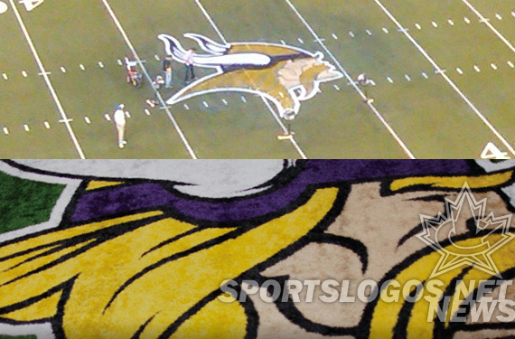
The Minnesota Vikings, in the first stages of a franchise refurbish that includes a new stadium and possibly new uniforms, announced to season-ticket-holders this morning that the team has a new, cleaned-up logo. With thicker, cleaner lines, the logo will begin to appear immediately on their web site, in March on merchandise, and “as we go” in the new stadium designs.

old and new Minnesota Vikings 2013 New Logo

Side-by-side for comparison

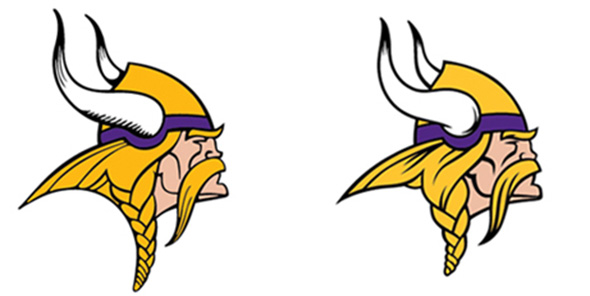
Not entirely new, rather a modernization of their current, the logo differs in 5 ways.

1. Horn Shape

The horns are obviously different, but by how much? We have traced them, then laid one on top of the other so we can compare.

01 Shape Minnesota Vikings 2013 New Logo

Difficult to tell in the full logo, the shape of the horn has changed quite a bit.

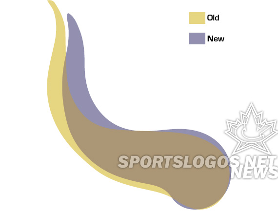
Taller, thinner, longer.. the old horn is different in many ways. The curves used to be almost “meandering” which now they are simpler and, as will be a theme throughout this design, cleaner.
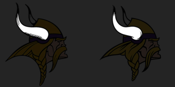
2. Horn Design

The old horns had a dated hatching to provide depth and shadow. The new uses more solid, flowing black lines to create the same effect.

02 horn style Minnesota Vikings 2013 New Logo

Shading and accenting changes

The changes bring the logo more in line with the Vikings helmet treatment, changed in 2006.

Helmet Minnesota Vikings 2013 New Logo

The 2006 – 2012 helmet logo

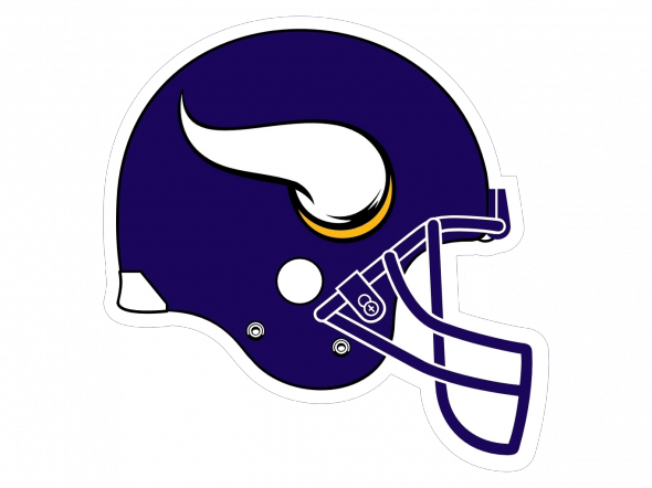
Will the helmet get a redesign if the team gets new uniforms? One would guess no, since this now almost exactly matches the logo.

3. Line Details

The lines in the old logo were very thin, in an old-school way, which is to be expected, as the logo was first used in 1966, itself a cleaned up version of the logo created in 1961. Now, the lines are thicker, bolder, easier to reproduce. Several lines have changed, such as the cheekbones, eyebrow, mustache, and hair. The eyebrow has added a slight “furrowed” quality that makes the new logo look perceptively meaner, even though the change is small.

4. Vikings Gold

A new Vikings gold is used on the logo, a small tweak meant to remove some of the “brassiness” and make the color more vivid. We are looking into the exact specifications. Check back here for info as we get it.

5. Overall Height

Vikings logos; the head and the V, have always been tall and thereby a little challenging to work with. The new logo has a “rebraided hair style” that combines with the new horns to reduce the overall height.

05 height Minnesota Vikings 2013 New Logo

The old logo is taller. Now, kiss.

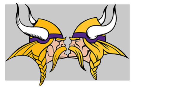
This brings the logo closer to square, so it will be more gracefully included in spaces where it would previously be scaled a little small in order to fit.

So, those are the changes for the Vikings. How many did you notice right away? Do you like the massage, or do you wish they would have left it alone? Or, redesigned it completely?

Article Categories:

Share This Article

Related News

San Diego State University Shows Tweaked Logo, New Uniforms; Little Consistency
Arizona Wildcats Football Announce New Gradient-Crazy Football Unis
The Logocast Episode 28: We’re Going To Kill Off One of the Hosts

About Author

JR Francis

JR Francis is an actor, writer, director, graphic designer, UX guru, father, comedian, and craft beer snob. You can reach him at jrfrancis@sportslogos.net or on Twitter @JRFrancisSLN *One of several full-time uniform reporters this site has including its founder, Chris Creamer, who started his site in 1997

(32) Readers Comments

  1. Paul Pelkonen
    Thursday, February 14, 2013 at 15:56

    It's like the original Mighty Thor meets 90s Thor AKA Thunderstrike. http://en.wikipedia.org/wiki/Thunderstrike_(Eric_Masterson)

  2. Karol Sidorowski
    Thursday, February 14, 2013 at 15:57

    nice

  3. Adam Hernandez
    Thursday, February 14, 2013 at 16:04

    A little goes a long way.

  4. Chip Hendrix
    Thursday, February 14, 2013 at 16:05

    Need to go back to the deeper purple like in the 70's

  5. Carlito
    Thursday, February 14, 2013 at 16:05

    i like it, good job now is a little stronger but still the same style

  6. Michael Kersey
    Thursday, February 14, 2013 at 16:08

    Personally, I don't think there is enough there to warrant the change.

  7. Trent Steffes
    Thursday, February 14, 2013 at 16:09

    I like the update. Makes it clean (for new uniforms??)

  8. Troy Griggsby
    Thursday, February 14, 2013 at 16:16

    Nice. Now go back to the Alan Page uniforms. Stat.

  9. Justin
    Thursday, February 14, 2013 at 16:25

    I like the changes, especially that they reduced the height but I wouldn't have been opposed to a total redesign.

  10. C.d. Luebke
    Thursday, February 14, 2013 at 16:44

    I am a lifelong Vikings fan, and I dislike the changes a bit. The new horns look like sperm. (I wish they would go back to the old helmets, too.) The differences are subtle, but the old Norseman was better.

  11. MxT
    Thursday, February 14, 2013 at 16:45

    It's certainly bolder, which is the same direction we saw the Cardinals and Panthers go recently to better market themselves to a rugged North American sports culture. The same goes for SUV's; thicker lines and proportional designs are more aesthetically appealing to those personalities. I like the upgrade, at least.

  12. C.d. Luebke
    Thursday, February 14, 2013 at 16:45

    Totally agreed with Chip and Troy, by the way.

  13. Travis
    Thursday, February 14, 2013 at 17:30

    A small upgrade, but a good one

  14. dustyman
    Thursday, February 14, 2013 at 17:38

    more and more teams need to do this

  15. Charles Bruns IV
    Thursday, February 14, 2013 at 18:07

    Negligible upgrade.

  16. ingmar66
    Thursday, February 14, 2013 at 18:11

    We must have deeper purple for the logo and the new uniforms, they are the original purple gang of the NFL (and not the Ravens). As for the retouches, I like the thicker outlines of the update but the horns are now too short and not 3D enough. They look more like flames right now. I also liked the perfect arch acting as a robust shoulder under the head, now the arch is cluttered by hair. Which may look more realistic, but not as crisp. The gold looks a bit too pastel and powdery, it should be solid and loud, combined with deep purple. Like LSU.

  17. Koozee Kingdom
    Thursday, February 14, 2013 at 18:12

    I guess that making it more square makes sense, but otherwise it seems like an unnecessary way to make all current merchandise out of date. If you didn't show them side by side, I probably wouldn't have been able to point out the differences; and I look at these logos everyday.

  18. Marcus Jackson
    Thursday, February 14, 2013 at 18:21

    I like the new Viking. He does look just a tad meaner. The big change will be in the uniform set.

  19. Brian Castner
    Thursday, February 14, 2013 at 18:49

    Not a bad update. Kind of like the Panthers and Jaguars and not exactly anything major. But not bad. Although the uniforms needed the change more than the logo. And please no going to a throwback/fauxback! Change them but make them something new.

  20. Aaron
    Thursday, February 14, 2013 at 19:02

    If they can just stick with the subtlest changes, everyone is happy. I like them. Totally agree with most people saying darken the purple. The new gold looks pretty good.

  21. Nick
    Thursday, February 14, 2013 at 19:14

    I'd like to see the actual Viking on the helmet, rather than just his horn.

    • Howard
      Friday, February 15, 2013 at 09:37

      If Nike has their way, this logo will end up on an alternate Vikings helmet very soon!

  22. Rich Hendrickson
    Thursday, February 14, 2013 at 19:16

    whoa guys... one step at a time here

  23. 54321
    Thursday, February 14, 2013 at 19:46

    Vikings update >>>> Jaguars update

  24. MetalLegacy
    Thursday, February 14, 2013 at 19:56

    I don't really understand this update, but it's a lot better than what the Panthers and Jaguars did. Thy went all out and competley changed the logos. Sometimes, tradition is better than new and this is case and point.

  25. madpanda
    Thursday, February 14, 2013 at 20:12

    As said, more of a mass-tweak than an upgrade. Still, deeper purple would be nice. What if they ditched the braid and let the Norseman's hair flow back freely? I always thought the braid and the back hair gave sort of a fishtail appearance.

  26. Sue Rennie
    Friday, February 15, 2013 at 00:33

    That's my team !

  27. Howard
    Friday, February 15, 2013 at 09:36

    Looks great. I wish the Los Angeles Lakers freshened up their logo like this.

  28. b.a. smith
    Friday, February 15, 2013 at 10:51

    I like it. The Buccaneers should've done the same think back in '97 instead of there current.

    • Aaron
      Friday, February 15, 2013 at 11:31

      I somewhat agree, but the Bucs have had more success with their current logo and colours. So I don't think they'll be changing it any time soon.

  29. Rob S.
    Friday, February 15, 2013 at 11:47

    Minor Change so ok.I was kind of hopeing that they would go back to the previous horn on the helmet,but this updated logo,as pointed out above, is more in line with the minor 2006 horn change, so I think the helmet will be staying the same. If I owned the team I would go back to the early 70's Jersey's and helmets w/ darker Purple and be done with it

  30. Ian
    Sunday, February 17, 2013 at 11:37

    Dang it I LOLed at "Now kiss".

Leave A Reply

Leave a Reply

Your email address will not be published. Required fields are marked *

You may use these HTML tags and attributes: <a href="" title=""> <abbr title=""> <acronym title=""> <b> <blockquote cite=""> <cite> <code> <del datetime=""> <em> <i> <q cite=""> <strike> <strong>