
Day two of Jersey Week has come and gone, and we’ve seen a new clash kit from Philadelphia and a new primary in Toronto. Sporting KC delayed their announcement due to a snow storm, and Chivas was announced too late for this story’s press time.
There was even rumor of a new MLS league logo being in the works, though that talk was dismissed by the MLS themselves.
We regularly review all aspects of our business operations, including marketing. While the possibility of a new or refined MLS logo has been discussed, no final decisions have been made. – MLS executive VP of communications Dan Courtemanche
Maybe the eminent announcement was dismissed, but the talk obviously stems form something real. We look forward to a new MLS logo, a league in need of a freshened look.
But what was announced Tuesday were new kits.
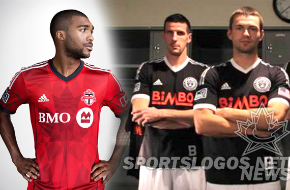
Toronto FC
One of the several teams announcing a new primary this week, Toronto went Canadian in a big way, using the front of their jersey for a huge piece of maple leaf art.
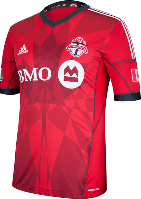
The team has tweaked their official red, as well as their grey, both shown here in their new jersey. The grey piping and white adidas shoulder striping frame the huge maple leaf on the chest, made from intersecting angular pieces.
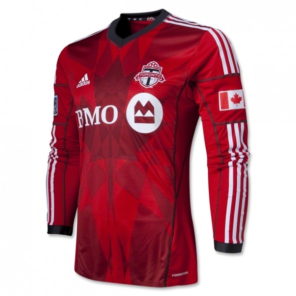
The Toronto FC crest is on the player’s left chest, adidas logo on their right. The Canadian flag, in case one was unsure where the team was from after seeing the giant maple leaf and reading Toronto, is on the player’s left arm. Opposite arm sports the MLS patch.
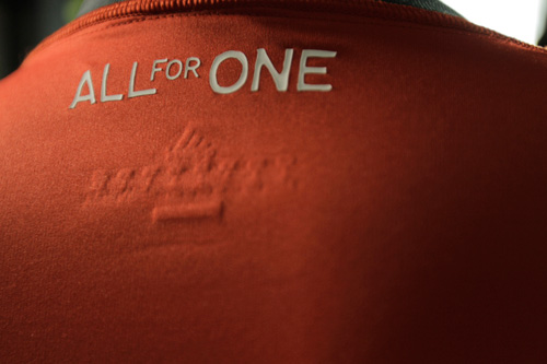
The back of the jersey has the team’s slogan, or rallying cry; One for All
We didn’t see any shots that showed the numbering, so we assume it to be the same as last year.
In 2012, the Toronto club had a similar look, with red and gray.
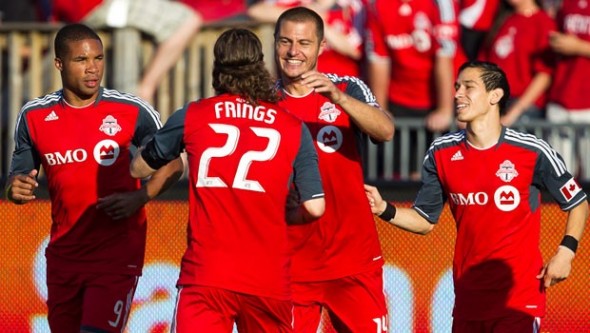
The gray has been reduced on the shoulders and arms, down to a simple arm band. The color is cleaned up as well, with a traditional style v-neck design.
Do you like the new look? Are you picking up the new jersey’s visual clues about what country they represent?
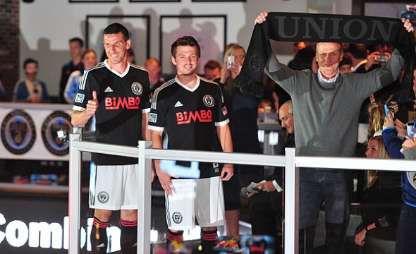
Philadelphia Union
We here at World Sports Logo Headquarters tend towards being fans of the Union’s look. A distinctive yet not obnoxious combination of time-tested gold and navy with a unique application of powder blue, some of us here expected their clash kit to feature the blue.
But no. The Philadelphia organization went back in city soccer history to pay honor to their most successful franchise, the Bethlehem Steel. Calling Philly their home from 1911-1930, Bethlehem Steel is fondly remembered.
As five-time winners of the U.S. Open Cup in 1915, 1916, 1918, 1919, and 1926 the team has the type of success with which any team would be wise to associate their identity.
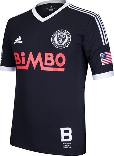
The Union wisely placed a one-color white version of their crest on the player’s left chest. The Bethlehem Steel FC is called at the lower left, a popular placement for this year’s selection of jerseys.
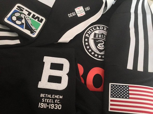
Sponsor Bimbo is represented with their original logo, though not period correct as Bimbo as a company isn’t quite as old, it is nice to see them authorize the use of an older, single-color logo for this application.
The backs here were shown, with the number and typeface.
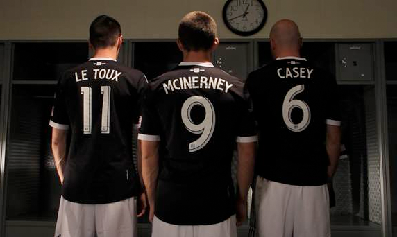
How does the black and white, historical call-back, Philadelphia clash kits strike you? Very clean. WHich seems to be a theme for this week’s jersey releases. I have to say, I’m a fan of clean.
Though, Sporting KC still has a chance to throw a monkey wrench in those plans, as their tease image seems to allude to at least some use of checkerboard pattern.
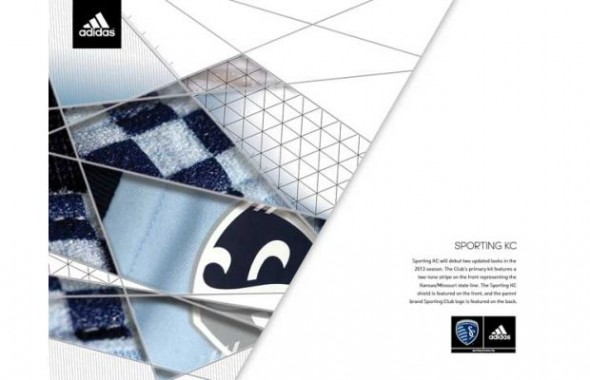
Will they go full-on checkers like a Croatia? Or just texture their shoulders? A side hem in checkers? A set-in piece?
___________________________________________
Keep up with all the changes
Day 1 Story
Colorado Rapids – Primary
Colorado Rapids – Secondary
Houston Dynamo – Primary
Houston Dynamo – Secondary
New York Red Bulls – Primary
Day 2 Story
Toronto FC – Primary
Philadelphia Union – Tertiary
Day 3 Story
Seattle Sounders – Primary
Seattle Sounders – Secondary
Sporting KC – Primary
Vancouver Whitecaps – Primary
Montreal Impact – Tertiary
LA Galaxy – Secondary
Day 4 Story
Portland Timbers – Primary
Portland Timbers – Secondary
Day 5 Story
Chivas USA – Secondary
Related stories:
 2023 Football Kit Preview: Major League Soccer
  Another 5 MLS Kits Unveiled Friday Ahead of 2023 Season
  MLS Media Day Photo Leaks Portland Timbers’ New Primary Kit
  Photos of Leaked New Kits for 4 MLS Clubs Pop Up Online
  MLS Releases 2022 Pre-Match Pride Jerseys for All 28 Clubs
  Four More MLS Clubs Unveil New Kits for 2022 on Saturday
  Friday Flurry of Activity Across MLS Sees 11 Teams Unveil Kits Ahead of 2022 Season
  Photo of New Inter Miami Home Jersey Leaked on Reddit