
In remarkably Portland style, the Timbers held a jersey announcement party last night in an art gallery/coffee shop where they unveiled the 2013 primary and secondary jerseys. They are the 11th of 12 teams releasing a new look for this year during Jersey Week.
The two jerseys have a very similar style, but the difference is in the details.
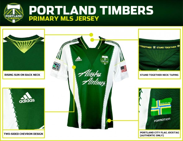
Not noted in the MLS-supplied details sheet is the huge mesh neck piece that creates a V down the center. adidas product manager Mike Walker calls it a “50’s look.” The V continues onto the backs of the jerseys. On the green’s back, it shows a rising sun.
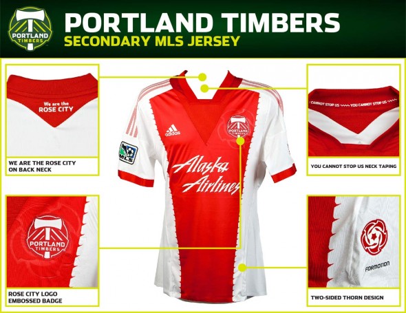
For the red jersey, the V in the back contains the supporters’ chant, “We are the Rose City.” Roses proliferate the red kit, embossed behind the main crest, and at the bottom left hip, which seems to be referenced as the “jock tag” area.
The color-block-on-white look is consistent across both jerseys, though the detail of the juncture differs. On the green, it is comprised of chevrons. On the red, it is rendered as rose thorns.
Neck taping is a detail that is completely off-the-field, so it interests us a little less, but here you get your choice of “You cannot stop us” or “Stand together” for the red and green respectively.
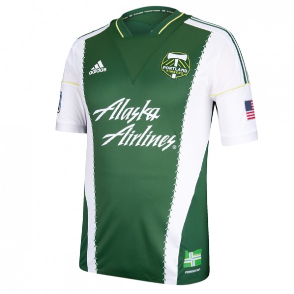
The look is clean, distinctive, and attractive. Almost half white and team color, the jerseys will straddle an interesting border between the two colors.
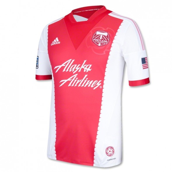
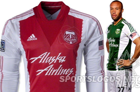
Interesting how over-exposed the photograph of the red jersey is on the MLS site, including in their shop. Makes the color wash out into a pink. Perhaps to show the rose embossing, but an interesting appearance for the main location to sell the jerseys.
These jerseys replace the 2012 edition, noted for their two-tone color blocking, segmented down the middle.
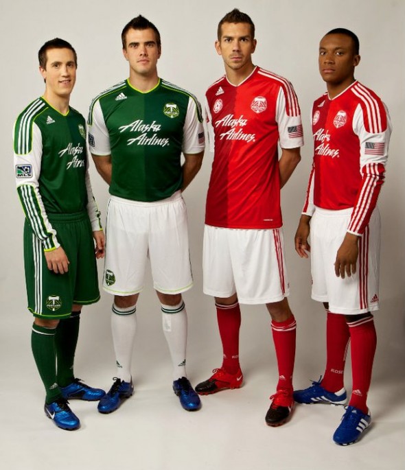
More traditionally “white sleeved” on a team color shirt base, it is entirely a matter of taste if one prefers the 2012 or 2013 version. Being as resistant to change as fans tend to be in their uniforms, we suspect there will be some resistance to the new look, though we can’t imagine hate, as they aren’t a bad look at all.
What do you think? Do you appreciate the same but different look? The details? Will you be buying?
___________________________________________
Keep up with all the changes
Day 1 Story
Colorado Rapids – Primary
Colorado Rapids – Secondary
Houston Dynamo – Primary
Houston Dynamo – Secondary
New York Red Bulls – Primary
Day 2 Story
Toronto FC – Primary
Philadelphia Union – Tertiary
Day 3 Story
Seattle Sounders – Primary
Seattle Sounders – Secondary
Sporting KC – Primary
Vancouver Whitecaps – Primary
Montreal Impact – Tertiary
LA Galaxy – Secondary
Day 4 Story
Portland Timbers – Primary
Portland Timbers – Secondary
Day 5 Story
Chivas USA – Secondary
Related stories:
 2023 Football Kit Preview: Major League Soccer
  MLS Media Day Photo Leaks Portland Timbers’ New Primary Kit
  2022 Football Kit Preview: Major League Soccer
  Portland Timbers make secondary logo new crest
  Multiple 2015 MLS Kits Leak Over This Past Weekend
  MLS Reveal Week Day 5: Chivas Closes Us Out with Vertical Stripes
  Sporting KC Unveils New Team Jersey with Sponsor