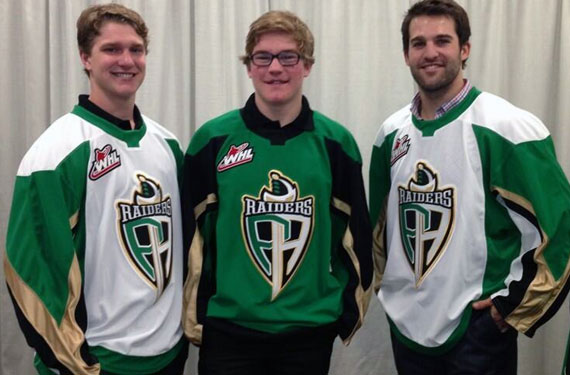
The Western Hockey League’s Prince Albert Raiders unveiled their new logo and uniforms earlier today at a press event. The new look re-introduces green as the primary team colour 17 years after it took a back seat to black for the upcoming 2013/14 WHL season.

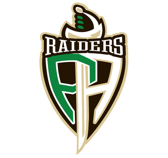
Replacing the pirate lookin’ fella with a RAIDERS branded sword in his mouth is a shield with an interlocked “PA” design, the left side of the “A” also forming the blade of a sword which is displayed over the shield. “Raiders” is featured above the shield in a dog bone-esque shape.

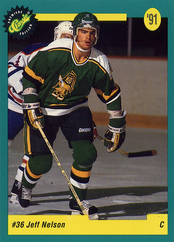
Aside from the logo change the biggest difference in the new set is the re-birth of green as the main colour in the colour scheme, green was no more than a trim or secondary colour since the club’s previous major rebranding before the 1996/97 season. Green becomes the colour of the home jersey, black becomes trim, and gold basically stays as involved as it ever did although is more of a Pittsburgh Penguiny “Vegas Gold” than last years Boston Bruinsy “Yellow Gold”. There are no shoulder logos on the new uniforms and unfortunately we didn’t get a look at the name/number font.

The change stemmed from a league-wide project to document the history of team logos and uniforms in the Western Hockey League (uh, 16 years too late there fellas), as they went through their own history Raiders ownership felt it was time to revisit the roots of the franchise.

We’ve added the new logo to the Prince Albert Raiders team page here on SportsLogos.Net, you can give it a rating from 1-to-10 stars here.


