The designers: anyone with a computer and some time to kill. The judges: a writer, a player, and a guy who designs suits. How could this have possibly gone so awry?
This past Tuesday The Toronto Star announced the winner and runners-up of their unofficial Toronto Raptors re-branding design contest, the winning design was created by local 30-year-old graphic designer and blogger Matthew Stasyna. Stasyna has proclaimed himself as the “Toronto Raptors unofficial artist” on his desktop wallpaper website called “Turbozone.” Yup, there are still wallpaper websites out there.
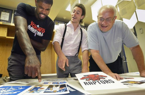
Anyways, Matthew’s “Dual-Bite Black Justice” entry was inspired by the early days of the Raptors when the dinosaur dominated the front of the team jerseys – an era when the Raptors uniforms were an embarrassment to fans and players alike – and it was the unanimous choice among the three-member panel of Raptors forward Amir Johnson, Star columnist Doug Smith, and Christopher Bates, who is one helluva good suit designer (basketball players have to wear nice suits, so… I guess it makes sense?)
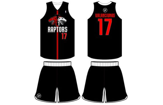
According to the Toronto Star article, the judges picked Stasyna’s design because it was “masculine” (Johnson) , with a “strong logo design” (Bates), while the other judge (Smith) just nodded in agreement. Well done, boys.
“The logo in itself actually looked like a maple leaf in a whole. If that was intentional, it was brilliant,” added Bates, giving readers the impression he’s never seen a maple leaf before.
As you can see, Stasyna’s uniform is an all black getup with a red line thrown down the middle vertically. On either side of the red line is a raptor head (and it’s mirror image), one raptor is red, the other is white. Between the raptor heads is a black “T” and behind all that (but in front of the red line) is a red maple leaf. “RAPTORS” is across the chest beneath this design in all white with the “T” lining up with that red line, the player number in red to the lower left of the wordmark.
“The main thing I like about this jersey is the detail they did with the two Raptors heads”, said judge Amir Johnson.
Yes Amir, those Raptor heads are indeed detailed and I’m not surprised it’s the main thing you like since it’s the only thing from the winning design created by a professional graphic designer, carried right from the primary logo the club has used for the past 17 seasons.
Tweets to us have been clear, fans think the winning design is a colossal failure.
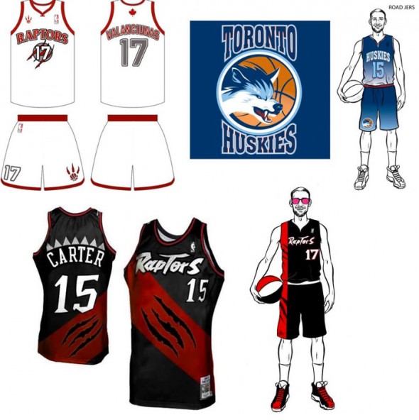
In the graphic above we see second place in the top left, while it is fairly boring, it’s a much more realistic and overall eye-appealing design than the winning entry is. Number 3 gets some points for picking a new name (even if it is the tired and predictable “Huskies” one) but it has gradients all over the uniform, sorry, that’s always an automatic fail. Fourth place is actually something I would’ve loved to see the team wear as an alternate jersey during their early years, it really isn’t that bad when placed in that era. But it doesn’t work quite as well today.
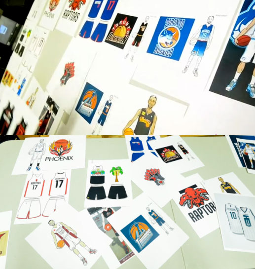
There’s a few designs seen in that graphic near the top of the article (or click here to see it again) which are intriguing, there’s a Huskies concept partially cut-off on the extreme right in those images which looks promising but that logo may be too much of a University of Washington ripoff to pass. Not to mention the Toronto Towers and “TD” (edit) “T.O.” shield designs (not sure what that D stands for), both look like they could have taken a top 5 spot in this contest, they’re certainly both more interesting than the winner.
What can be learned from all this?
Well, leave the designing (and judging, for that matter) to those qualified to do so. Sports. Branding. Experts. Designers who work almost exclusively in sports. A guy who designs men’s suits, while extremely skilled in fashion sense, presumably has little to no expertise when it comes to picking or designing a decent basketball uniform (as is evident in his choice and comments here) – it’s a completely different world. A basketball writer may know a lot about the game, but they largely ignore what the players are wearing to the detail that’s required to play a role in choosing a good design. Finally, the basketball player should have some say in materials they’re comfortable in, design elements they may prefer (such as “no large dinosaur on the chest” as the late ’90s Raptors made clear), but ultimately that’s it. Put these three together to pick a design and, well, you get the mess you saw here.
In the end it really doesn’t matter, the Toronto Raptors won’t be using any of these designs here nor anything close to the lack of quality design this contest produced, when they do end up rebranding (rumoured to be for the 2015/16 season, hence the reason the Star held this contest in the first place) it’ll likely be done by the NBA Creative Services team. A new name might be part of that plan but I think they’ll end up sticking with the Raptors, probably in a blue and white colour scheme to go well with the Leafs and to pay some homage to the one-and-done Toronto Huskies of 1947. It’ll be simple, it’ll be nice, it’ll be clean, but best of all? It’ll look professional!

