
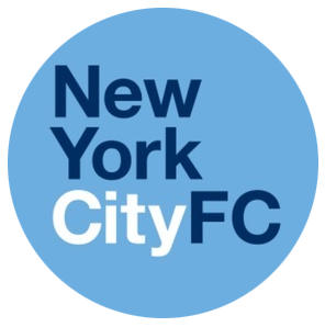
New York City FC will be entering Major League Soccer next season in 2015. After Manchester City FC and the New York Yankees unveiled MLS’ new expansion club, a very simple placeholder logo was unveiled: A sky-blue circle with the words “New York City FC” inside of the circle, using the font of their parent club.
However, as the 2014 MLS season kicked off, we got a look at what could potentially be the official inaugural crest for NYCFC when the club revealed two logos to the public; One badge-shaped crest (referred to as a shield) and one roundel-shaped crest (referred to as a circular badge). Here are descriptions of both logos from NYCFC’s press release on the matter:
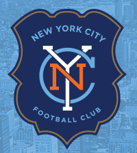
“The shield is the result of extensive research into global soccer. Seeking to give the Club a unique and distinctive character within MLS, we examined badges from every professional soccer team in the world. In the end, we found the answer right here at home. This design features the historic shield of the official Seal of New York City – a mark that signifies the pioneering spirit of the early settlers, which in the modern era, has fueled America’s undoubted move onto the world soccer stage.”
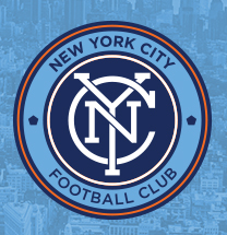
“The circular badge is inspired by the old New York City Subway Token, created by the Transit Authority in 1953 and used for 50 years as the standard fare for a ride. The last version of the token had a cut out pentagon in the center representing the five boroughs, similar to what appears on either side of the monogram, to reinforce the Club’s connection to the entire city. The circle is also a symbol of unity, wholeness and infinity, and is often associated with potential and the number one. This is a modern and confident badge that clearly speaks to New York City’s status as a leading city”
The two crests were actually subject to a fan vote that started on March 10th and ended on the 13th. The winning crest will be officially used as the club’s crest going forward. Also, while it was to be expected that NYCFC would inherit Manchester City’s colors of sky blue and navy, there’s also a bit of orange added to the color scheme as well, with both crests having at least a tinge of orange in the design. Surely this is a nod to New York City’s civic flag.
Personally, I prefer the circular badge, even if it looks extremely similar to a previous Inter Milan. But which one do you prefer? And even though voting ended the same day of this press release, which one do you think will win the vote to become New York City FC’s first ever crest?
Related stories:
 2023 Football Kit Preview: Major League Soccer
  2022 Football Kit Preview: Major League Soccer
  Friday Flurry of Activity Across MLS Sees 11 Teams Unveil Kits Ahead of 2022 Season
  New York City FC Unveils New Home Jersey
  NYCFC and Columbus Crew reveal their away kits for 2016
  New York City FC Unveils New Uniforms
  NYCFC Reveals Winning Crest From Public Vote
  20th MLS Team Announced: New York City FC