

The city of Charlotte, North Carolina, was named for Queen Charlotte of Mecklenburg-Strelitz, wife of King George III of the United Kingdom, who held a career 0-1 record in American Revolutionary Wars. And where there are kings and queens, there are knights. So it is that the triple-A minor league baseball team in Charlotte, one of the many American cities that goes by the nickname “The Queen City,” is the Charlotte Knights.
“The symbolism there is we’re defending the Queen City,” said the team’s general manager Scott Brown. “If you look at the knight’s helmet, the top of it is adorned with the Queen City crown. You see that crown in different forms throughout the city, on signage. The Queen City moniker is really something that is used here as a pretty common synonym for the city of Charlotte.”

The Knights had a big year in 2014, not only moving from a dumpy old stadium that was technically in a different state (Knights Stadium in Fort Mill, South Carolina) to a beautiful new stadium in downtown Charlotte, but brandishing a new identity that’s unlike anything else in their league.
“We knew the ballpark was going to transform our identity in the market—create a Renaissance, so to speak,” Brown said. “Our location was a bit of an Achilles heel for us previously. We just thought this was the time. Everything was new with the ballpark, let’s create a new look…. The new logo was the next step.”
In a growing city with lots of new residents, the buzz around the new stadium created the perfect opportunity to rebrand. “The city, it’s really just taken to our location, but also the new look,” Brown said. “For the first time in probably a long time, you’re seeing a lot of Knights garb on heads and backs.”


The new logos were designed by the prolific firm Brandiose, responsible for such wackiness as the El Paso Chihuahuas and the Lehigh Valley IronPigs, among many others. But the team had a specific vision in mind.
“They’re known for telling a story, but they’re also known for the more way-out, far-out type of look,” Brown said. “Very early on, we said that’s not what we’re after. We were interested in keeping things classic, big league, crisp, clean.”
In a city that thinks of itself in terms of the big leagues, it was important for the Knights to embrace a certain type of identity. “Charlotte’s a major league city, with the NFL and the NBA,” Brown said. “We wanted to keep that minor league affordability, but at the same time appeal to the major league fans who were looking for that classic look.”
The first question was whether the team would choose a new name or stick with the Knights, which they had been since 1989. One option was to go way back in the city’s substantial baseball history to a team that appeared first in 1892 as an independent team and then in various iterations until the early 1970s, when they were an affiliate of the Washington Senators.
“Hornets was one of those nicknames that we considered as we were making the move uptown,” Brown said. “Just about about that time is when New Orleans gave up the name and things started to percolate around the NBA circles here that they were going to reclaim Hornets.”
 So the city’s baseball team stayed with the Knights, but went away from the green and blue chess piece logo that they had used since 1999 to a color palette unique to the International League.
“When you look at our league, it’s dominated by red, white, and blue,” Brown said. “So we kind of skewed away from that.”
The logo features silver, an obvious reference to a knight’s armor, but even more prominent is gold, which is not just a reference to the riches of the Queen City.
“Gold was discovered here back in the 1830s,” Brown said. “It’s why Charlotte is a banking hub for the southeast. It’s in large part due to the discovery of gold and the need for banking.” (That discovery of gold is why UNC-Charlotte goes by the name 49ers.)
Finally, the team’s scheme features black and white. “We thought black and white, when you look at baseball, was classic, whether it’s the Yankees, or in our case, the parent club being the White Sox,” Brown said.
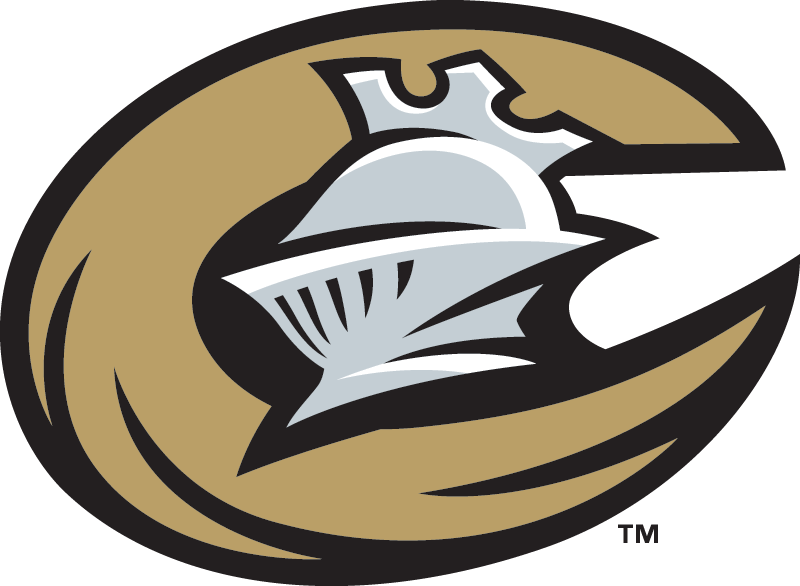 The team’s primary logo features a knight’s helmet and a letter C that references something not completely obvious to the casual observer. “The C itself is emblematic of the horse’s tail wrapped around the knight’s helmet,” Brown said.
I asked how often he has to explain that the C in the team’s logo is a horse’s tail and Brown did not hesitate: “Pretty much every day.”

 The Knights nickname does create something of a conflict with their longtime mascot, a dragon named Homer. “Naturally, a dragon’s main enemy is a knight, who’s charged with slaying it,” Brown said.
In fact, one of the team’s alternate logos might be particularly alarming to Homer. “If you look at our alternate cap, it’s the shape of a K with the sword going through the breast of the dragon,” Brown said.
But Homer should breathe easy, as the Knights rely on him to be the face of the team. “In the minor leagues, players come and go, so it’s hard to market around them,” Brown said. “Homer is the most iconic symbol of the franchise…. Homer is the friendly dragon and a member of the team.”
In a city named for a queen from 200 years ago with a baseball team named for warriors from Medieval times, it feels surprisingly like a brand new day for the Charlotte Knights. With a new stadium and a classic-feeling identity, the minor league Knights have staked a claim to their place in a major league city.
Related stories:
 South Claw: The Story Behind the Lakewood BlueClaws
  Waterfalls, a Crown, and Sasquatch: The Story Behind the Northwest Arkansas Naturals
  Aces Are Wild: The Story Behind the Reno Aces
  Get your kicks with the Inland Empire 66ers: The story behind the nickname
  It’s Elementary: The Story Behind the Albuquerque Isotopes
  Holy Sea Cow! The Story Behind the Brevard County Manatees
  Everything is Better with Bacon: The Story Behind the Lehigh Valley IronPigs
  Rock ‘n’ Roll Cats: The Story Behind the New Britain Rock Cats