

The 38th anniversary of Elvis Presley’s (supposed) death is 15 days from today. But nearly four decades since he died (or had massive reconstructive surgery and went into hiding), the world still has questions. For instance, did he really die? Is he secretly celebrating his 80th birthday later this month on a beach in Uruguay? Or did he just get called home by his alien overlords?
 Most importantly, the world wants to know, did he inspire the name of the Southern Professional Hockey League’s Mississippi RiverKings? The answer is definitely yes. Or maybe, but probably definitely yes.
“We don’t really know where the RiverKings came from,” said the team’s broadcaster Lukas Favale. “My best guess is, the Mississippi River is obviously right here, so I’m sure that’s where the ‘River’ part came from. The ‘King’ thing, we have no idea.”
But we DO have an idea.
The team was born as the Memphis RiverKings in 1992, and though they moved a few miles away across the border into Mississippi in 2000, they proudly claim to be “the longest, continually operating sports franchise in the Memphis area.” And do you know who lived (or lives) on 13.8-acre estate called Graceland in Memphis, Tennessee?
“The ‘King’ could be just the king of the river,” Favale said, “or Elvis is from around here, so that could be another thing—The King.”
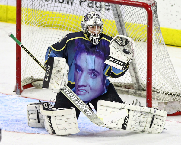
 To that end, the RiverKings work closely with Graceland to feature Elvis’s likeness and work on a special themed night each season.
“We have one game a year that is Elvis Night, where we actually have an Elvis jersey,” Favale said. “We’re pretty fortunate to be able to do that every year because people here go nuts. We always get calls, ‘Are you selling them online?’ and we can’t, but people are always hoping to snag one of those jerseys because they’re a unique sports memorabilia thing related to Elvis, which you don’t see very often.”
The team has been around for 23 years, and there’s been a lot of turnover in the front office, so much of the reasoning behind the logos and nickname has been lost to history. In addition to whether Elvis inspired the name, there are other questions.

For instance, why did the team’s logo feature a turtle from 2001 to 2014? According to herpetologists Tom R. Johnson and Jeffrey T. Briggler of the Missouri Department of Conservation, “a total of 13 species and subspecies of turtles are known to live in the Upper Mississippi River, its backwaters, and tributaries.” So maybe that?
“I don’t know 100 percent who decided that a turtle would be the appropriate way to represent a RiverKing,” Favale said. “I guess they decided there must be a lot of these floating around the river, up and down in the area. It’s not like you’re watching the news and you see turtles all the time. It’s not like it’s a big part of the culture around here or anything.”

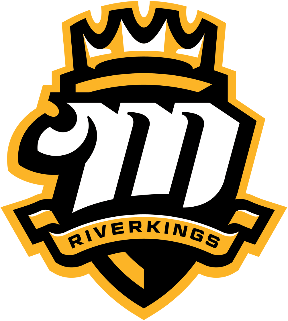
With all the uncertainty regarding their own identity, the RiverKings decided this year to rebrand altogether. They ditched the turtle—including mascot Sheldon, who is “probably going to be retired,” according to Favale—and unveiled a regal-looking logo (on the right above), which is an updated version of their original identity (on the left). The idea to throw back to their old look was ultimately inspired by the team’s fans.
“A couple years ago, we had a throwback jersey night, when we basically brought back the original look, and it was yellow and black. The fans loved it,” Favale said. “We kept it in the back of our heads and when we went through this whole process…. We went through a whole bunch of options, but we kept going back to that yellow and black idea.”
The new logo, designed by Studio 1344 in Detroit, features the letter M—for Memphis, Mississippi, or Mid-South, according to Favale—and a crown over a shield. A banner that reads “RIVERKINGS” under the M is borrowed fom the original logo.
 There’s one happy accident regarding the design of the logo that has been pointed out by fans—and it’s something that hockey fans in particular would be likely to notice.
“A lot of people mention the M kind of looks like a fist,” Favale said. “It kind of does look pretty cool if you consider someone maybe throwing a punch in hockey.”
The departure from the cartoon turtle is an intentional decision by the team to adopt a new kind of identity.
“It might not look like all the minor league hockey logos, which sometimes can be cartoonish—but we wanted to have a real hockey look,” Favale said. “It kind of fits in line with some of the NHL looks, really, rather than some of the minor league hockey looks in our league and some of the other leagues. It kind of is a little more dignified than some of those cartoony looks.”

When the RiverKings’ season starts in October, they’ll take the ice with a new look that hearkens back to the team’s early days. While players in the Southern Professional Hockey League’s players may be a long way from the NHL, the tone and tenor of their uniforms will not be.
And somewhere, on a beach in South America, the team’s namesake, The King himself, will nod approvingly while sipping on an umbrella drink in the privacy of his secret Elvis compound.
Related stories:
 Ballclub Thinks Similar Emoji Hockey Jerseys are Frowny Face, Chocolate Swirl
  G Love: The Story Behind the Gwinnett Gladiators
  Right as Reign: The Story Behind the Ontario Reign
  Hockey’s Scariest Scavengers: The Story Behind the Bakersfield Condors
  Gonna Fly Now: The Story Behind the Philadelphia Flyers Brand
  The Tale of the Whale: The Story Behind the Hartford Whalers