

When I first contacted the Beloit Snappers to talk about the reasons for their nickname, their director of media relations and marketing Bobby Coon told me exactly what I expected to hear: “There are a lot of snapping turtles in the Rock River that runs through Beloit.”
The end! There are a lot of snapping turtles here and we’re the Snappers. Right?
Turns out there’s a little more to it than that. The Snappers, Single-A affiliate of the Oakland A’s in the Midwest League, play in the southern Wisconsin town of Beloit, which has something of a longstanding obsession with turtles.
“There’s just a kind of theme of turtles around here,” Coon said. And that’s putting it lightly.

The town’s association with turtles goes back possibly as far back as the year 400, when Native Americans built an effigy mound ostensibly shaped like a turtle. Turtle Mound is one of 20 mounds still found on Beloit College’s campus, but it’s the one that seems to have caught the area’s imagination. In the early 1800s, according to an article by William Green in Nature at the Confluence, there was a Native American Ho-Chunk village called Ke-Chunk (Turtle Village) at the mouth of Turtle Creek.
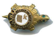
According to a Beloit College Magazine article by Marlo Amelia Buzzell, turtles have long been the unofficial mascot of Beloit College, where there was from 1901 to the mid-1970s a secret organization called the Turtle Mound Society (whose secret members wore secret gold pins so members could recognize each other), there was a synchronized swim team called the Terrapins in the 1930s and 1940s, and major donors have been given lapel pins shaped like turtle shells since 1969.
“Also, next to Beloit is a town called the town of Turtle,” Coon said. “I actually had the privilege of getting a speeding ticket in that town.” (Guess the town of Turtle likes to take life at a slower pace! Hello? Is this thing on?)
Of course, the natural progression from an ancient, turtle-shaped effigy mound to a present-day town-wide affinity for turtles is best summed up in the Beloit College article by Marlo Amelia Buzzell: “Beloiters abroad take photos of turtles or turtle objects and post them to their Facebook pages, often with captions along the lines of, ‘Beloit!'”
In 1995, the Beloit Brewers switched parent clubs from Milwaukee to Minnesota, and the team decided it was time for a unique identity that paid homage to their town’s turtle love. Not prepared to shell out (get it?) a ton of money for the new look, the team took a different approach.
“From what I was told it was a former general manager’s cousin that designed it,” Coon said. “And he didn’t even do it for any money or anything. He just wanted some of the merchandise that we put the logo on.”
Of course, the modern era of the wacky minor league baseball logo was still in its infancy at the time, so Snappy the turtle was all the rave.
 “At that time, in 1995, that was cutting edge. That was unique,” Coon said. “There’s little bit stranger names nowadays, and more cutting edge, and those teams are obviously selling tons of merchandise just because of their uniqueness.”
In the face of new and increasingly wacky logos in minor league baseball, the Snappers have discussed the possibility of updating their look, but they can’t seem to find the number for that former general manager’s cousin—or anyone else willing to work for a few caps and a T-shirt. (UPDATE: You’ll see from the comments below that the designer of the logo is Chris Kretz, who actually did get paid!)
“We’re a not-for-profit organization and community owned, and we just don’t have the staff or the money,” Coon said. “You know, we can’t hire a company and say, ‘We want you to design our new logo and we’ll give you this amount,’ because chances are we don’t have that amount.”
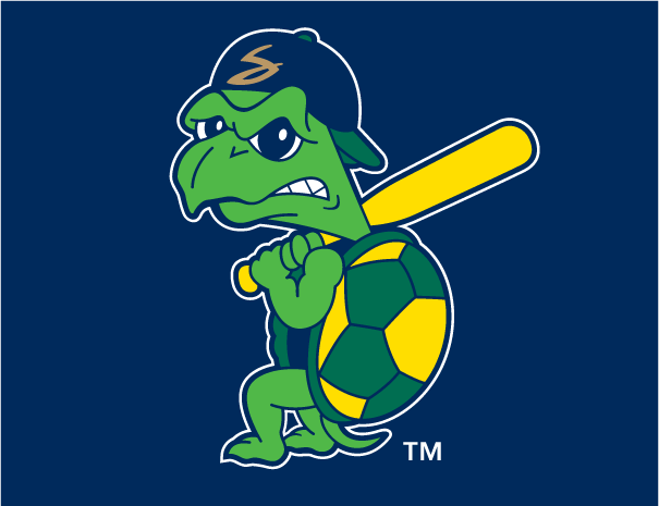
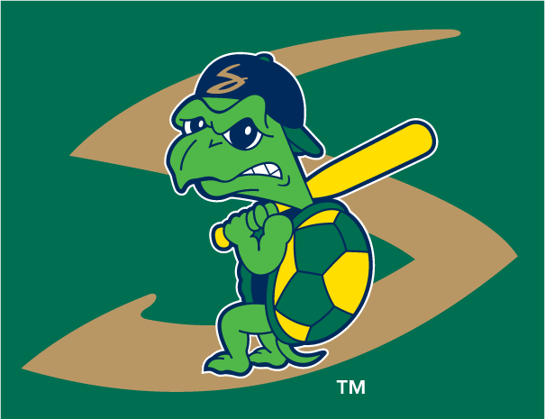
The logo features Snappy holding a yellow bat (which Coon assured me was not a whiffle bat, but a real wooden bat colored yellow because of the team colors). Notable about Snappy—apart from the fact that he’s a turtle who has teeth—is his facial expression.
“Snappy’s got his game face on,” Coon said. “He’s kind of PO’d at the pitcher and he’s stepping up to the plate and he’s going to hit a bomb. He looks kind of angry.”

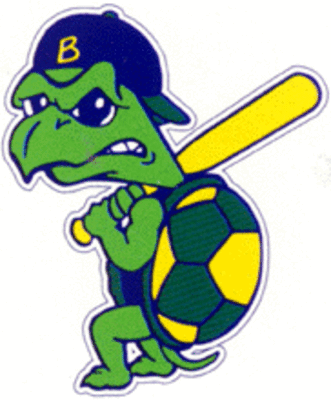
While Snappy has remained almost entirely unchanged for two decades, there has been one small update. In the team’s early years when they were affiliated with the Brewers, Snappy’s hat had a B on the front, as seen on the above 1996 photo from the amazing website Dave’s Team Mascot Photos. That B became an S when the team became a Twins affiliate in 2005.
After eight seasons with the Twins, the Snappers switched parent clubs again in 2013 to Oakland, which led to something of a happy branding accident with the team’s colors roughly matching. More than that, though, even though the new parent club is two time zones away, the team’s fans feel a certain affinity for the A’s. “The Oakland A’s, they’re kind of a small market team, they’re the Major League version of the Beloit Snappers in the Midwest League.”
That said, when the team was affiliated with closer-by parent clubs, it was more likely for fans to come to games just to see their team’s future stars. That’s not to say it doesn’t happen, though.
“I see people that are going on road trips or something like that, and they’ll come into the office or come through the gates and they’ll say, ‘Yeah, I’m super excited to be here. I’m a huge Oakland A’s fan.’ And I’ll say, ‘Really?’” Coon said. And not only that, “I’m not even kidding you, I go to the Qdoba down the street in Beloit. The manager has an Oakland A’s tattoo on his forearm.”
 Baseball fans talk about “what minor league baseball should be.” I attended a Snappers game on a frigid April opening day last season, and with the team’s small park, diehard fans, and folksy logo, I felt I had stumbled on what minor league baseball should be. (I ended up leading the crowd in “Take Me Out to the Ballgame” that night because I was hanging out in the media box when they discovered moments before they needed it that the computer with the audio file they were going to play over the PA had been moved to another location.) The Snappers logo may not win any of Minor League Baseball’s clash of the caps (or whatever) contests—those will go to the flashier new ones—but it’s kitschy, and it’s just right for this small-town team.
Related stories:
 More Cowbell: The Story Behind the Visalia Rawhide
  Pilot Episode: The Story Behind the Lakeland Flying Tigers
  The Evolution of Dinosaurs in Utah: The Story Behind the Ogden Raptors
  Here there be the story behind the Dayton Dragons
  It’s Corny, But it’s Good: The Story Behind the Cedar Rapids Kernels
  Glory Days: The Story Behind the Clinton LumberKings
  The Story Behind the Carolina Mudcats: It’s the Fish, Stupid
  The Apple of Our Eye: The Story Behind the Fort Wayne TinCaps