

As we get set for the 2015 World Series let’s take a look back through the logo and uniform history of the Kansas City Royals starting back at the very beginning of their franchise in 1969.

1969: Kansas City Royals baseball begins just one year after the Kansas City Athletics relocated to Oakland, California in 1968. The new expansion team is named after the American Royal Livestock Show which is hosted each year by the city of Kansas City, Missouri. Because of that, the Royals almost go with a logo featuring a large cow but shift gears and instead debut a blue and gold logo featuring a crown above a royal banner in the shape of home plate. On this banner is a large white “R” with “KC” in gold above it, below the banner is “ROYALS” in gold.

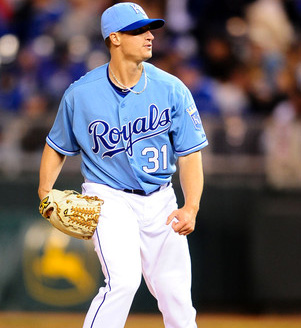
Team caps are royal blue with a monogrammed “KC” in white, this is worn both at home and on the road and is still worn to this day with minor adjustments to the shade of blue.

At home the Royals wear a plain white jersey with “Royals” scripted across the front in blue, like the caps the team will wear a very similar version of this wordmark on their home jersey right through to the present. On the road the team uses a grey button-up jersey with “Kansas City” both arched and scripted (you don’t see that combination too often) across the front in blue.

1971: The wordmark on the road grey jersey switches from a script to a block-serif font, still arched, still royal blue.

1973: Powder blue makes its first appearance on a Kansas City Royals uniform, the road jersey switches from grey to the (in?)famous light shade of blue. The wordmark across the front remains the same but now in white instead of royal blue.
![]()
1979: The “Royals” wordmark below the primary logo switches from a gold straight serifed font to a blue diagonal script, the font of this new wordmark is very similar to the one already worn on the Royals home jersey.

1983: “Kansas City” is removed from the powder blue road jersey replaced with the same scripted “Royals” logo worn on the home jersey. Like the previous powder blue uniform the wordmark is white. This is the last time the Royals will wear “Kansas City” on a team uniform for 12 years.
![]()
1986: One year after their first World Series championship the team tweaks their primary logo once again. The “Royals” wordmark below the logo increases in size considerably, now twice as wide overall as the “KCR” banner/crown logo above it.

1992: So long powder blue as the Royals (along with the Montreal Expos) are one of the last two holdouts to switch back to grey on the road. The new grey road jersey will still read “Royals” scripted across the front but now in royal blue with a white outline.
![]()
1993: The shade of gold used on the crown and the “KC” on the primary logo are changed to a more traditional metallic version of the colour.

1994: An alternate jersey is adopted by the Royals for the first time in team history, it’s royal blue and uses the same scripted “Royals” wordmark across the front as the home and road uniforms, this time in white.

1995: “Kansas City” returns to the road grey jersey, arched in a royal blue with white trim serifed block font. The Royals also mess about with their ballcap for the first time, a grey cap with “KC” in blue is worn on the road. The experiment is a dud, the team only wore the grey lids for the 1995 season before returning back to the royal blue cap for all games.

1998: Time travel is invented allowing the Royals to wear uniforms from the future! Sorta. The Seattle Mariners hold a “Turn Ahead the Clock” promotion during which the Royals are the visiting team and sees both teams wearing uniforms supposedly from the year 2027. Kansas City wears metallic gold helmets with yellow vests and a large team logo placed diagonally across it… with only 12 years remaining until 2027 it’s safe to say this will not be happening, at least not as the standard Royals team uniform.
![]()
2002: The “R” is dropped from the home plate of the primary logo, the “KC” now in white with a black drop shadow takes its place, this is the same primary mark the team uses today. The shade of blue is also darkened slightly across the board – logos, caps, jerseys, everything.

Black accents are also added to the colour scheme as was the fad in sports at the time, both the “Royals” script on the home jersey and the “KANSAS CITY” arch on the road get a black drop shadow. A new sleeve patch is added to the home and alternate jerseys, the familiar Royals primary logo now with a black crown instead of gold, while on the roads a patch showing a black circle around a baseball and the “Royals” wordmark is added. The road jerseys are converted to grey vests with a black undershirt and are paired with a black ballcap with a “KC” in white on the front.

2003: The home jersey, like the road jersey the year prior, is also converted to a vest, a blue undershirt is worn with the new white vest, the “Royals” wordmark with a black dropshadow remains on the front. A new black alternate jersey is added as a second alternate uniform, the “Royals” wordmark appears across the chest in blue with white trim, it is worn with the same black cap as the road jersey.

2006: After just five seasons the black era is pretty much ended in Kansas City. All traces of black are removed from the home and road uniforms which are now also no longer vest-style, the black road cap and black alternate jersey are both scrapped entirely. The road jersey sees yet another new wordmark, “Kansas City” is now scripted across the front in a style very similar to that of the “Royals” mark on the home jersey. The only appearance of black on the 2006 set is on the new road alternate jersey, it’s black with “Kansas City” across the front in blue with white trim worn with the standard blue cap, this jersey only lasts the 2006 season before it too is eliminated.

2008: After it was ousted 17 years prior, powder blue makes a return to the Royals uniforms via a new alternate home uniform. The jersey is entirely powder blue with “Royals” scripted across the front in blue with white trim, player names and numbers in white.
2010: The powder blue train keeps on rolling along as a new powder blue cap is introduced to be worn with the alternate uniform introduced in 2008. This seemed to be a little more powder blue than could be tolerated, the cap was dropped after the 2011 season.

2012: Slight changes to both the road and powder blue alternate jerseys, the “Kansas City” script on the road jersey is squished down to not appear quite as tall while the “Royals” wordmark changes from blue to white on the powder blues. As mentioned earlier the powder blue cap is no longer a part of the rotation, the standard royal blue cap is worn with all team jerseys.

2014: The royal blue alternate, first introduced in 1994, undergoes some changes. The “Royals” script is removed and replaced with the “KC” logo also worn on the caps, white piping also runs down the front of the jersey and around the cuffs. Both the KC logo and the piping have powder blue trim, standard royal blue cap is worn with this jersey.
Related stories:
 Fountains of Reign: Kansas City Royals Unveil New City Connect Uniform
  Photos: Expos Return! Oh, and Royals Throwback Too
  The Future Is Now: Mariners-Royals In Futuristic Uniforms Today
  KC Royals Show Off 2018 Turn Ahead the Clock Uniforms
 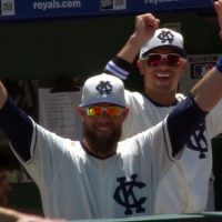 Photos: Royals-Tigers in Negro League Throwbacks
  Kansas City Royals will continue wearing gold-trimmed uniforms for Friday home games
  KC Royals 2014 World Series Phantom Champs Merchandise
  Camo Caps to be worn by all MLB Teams, Full Gallery Here