
For all intents and purposes, the NBA is probably the most well-run major North American sports league out there. The league is regaining the star power that they seemingly lost in the ’90s, ratings are going up, team values are going up, and thanks to a new TV deal having an effect on the salary cap, the players are about to be making an even more obscene amount of money. Simply put, basketball is entering another golden period in every possible category — except the uniforms. Good grief, the uniforms.
Now, I’m not going to sit here and say that alternate uniforms are bad. Actually, alternate uniforms are one of my favorite things about sports logos and uniforms. It’s always fun to see what various manufacturers and teams can come up with when they have a chance to get really creative. With that being said, things are a bit out of hand in the NBA. Not only are there a bit too many, they’re also growing increasingly uglier and uglier.
The obvious examples here would be the Nuggets and the Wizards and their latest sleeved alternates. Now, I’ll give the Wizards credit for putting a creative spin on the Baltimore Bullets’ uniforms from back in the ’60s but let’s be honest: Was anybody really clamoring to see that design come back?

As far as the Nuggets are concerned, their latest WhiteGold effort is just weird looking. They’ve already got a pretty solid set of home and road uniforms, and their regular alt is one of the better ones in the league. So what’s the point of adding this one, especially when it’s not as good looking as anything else that they have to offer?

Then we have the teams who just took a whiff on their latest rebrands. I’m not talking about the Bucks and 76ers, who by all accounts have done an excellent job with their latest identity updates. Even though I’m not crazy about the Fear The Deer alternate, it’s still a nice attempt at a fun look, and combining it with an alternate court was a great idea.
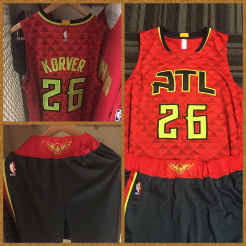
However, I can’t say that the Hawks and Clippers rebrands were great. As much as I love my hometown Hawks, I’ve had to continuously convince myself that their new uniforms really aren’t that bad. When you have to have an internal monologue in which you’re convincing yourself that something’s “not really all that bad,” then it’s probably bad. Plus, they didn’t do themselves too many favors with the whole mix-and-match deal. I’m going to go ahead and predict that we’ll see a few tweaks to this uniform set within the next few years.
Then, we have the Clippers. I understand that the franchise wanted to escape the stench of Donald Sterling’s odious time as owner there, but they could’ve gone in plenty other directions than what they eventually went with. Their new logos look like something you’d see on Create-A-Team from the old NBA Live video games from back in the ’90s, and that is in no way, shape, or form a compliment. To make matters worse, they basically slapped the new logos on the old uniforms. If you’re going to make a clean break from the past with your new logos, then why cling on to the old uniforms? And don’t get me started on the black alt that has yet to debut. Simply put, the Clippers’ visual identity is currently a mess, which is a shame considering the fact that they finally appear to be a competently-ran basketball franchise for what appears to be the first time in their history.

Those are just the most egregious examples of bad NBA looks, and it’s a wildfire that’s spreading rapidly. It really seems like Adidas and the teams that they’re collaborating with are going with daring looks just for the sake of being daring, and as a result, a lot of teams just come off looking ugly. Look no further than this past Friday night’s slate of NBA matchups. There were 12 NBA games on Friday, October 30th, 2015, and five of them included some pretty woeful uniform matchups.

The Thunder already have one of the worst overall identities in the NBA. Combine that with the Orlando Magic’s pinstriped-pajama look, and you’ve got yourself a pretty ugly-looking NBA game.

You know it’s getting bad when the Boston Celtics are getting in on this calamity. Match that with the weakest uniforms in Toronto’ new set, and you’ve got yet another bad uniform matchup.

Can you believe that these are the Detroit Pistons and the Chicago Bulls? Neither can I. What would normally be one of the better-looking uniform matchups in the league is now a hodgepodge of bad uniform trends. Terrible matchup.

Now, I’m not really all that opposed to Charlotte’s home uniforms and their teal uniforms are pretty solid. Their purple uniforms are the weakest of the bunch, though. Combine that with the weakest uniforms from Atlanta’s new adventurous set, and we’ve got our fourth ugly uniform matchup of the night.

I’ve gotten a lot of flack for saying that Golden State’s current uniforms are bad, but that’s my opinion and I’m sticking to it. Meanwhile, I think it’s universally accepted that the Rockets’ gray-and-sleeved uniforms are bad. This game was on national TV, and it was a complete blowout. What a great way to advertise the game!
Now, I’m going to say it again — I’m not against alternate jerseys or modern looks in general. When done right, alternate uniforms are a great way to advance the aesthetics of sports in general, and plus it’s just fun to see new looks every now and then. With that being said, teams and manufacturers really have to do a better job. I know that people might be loathing the day that Nike gets the NBA’s manufacturing license, but really: Can they do any worse than what Adidas has done? If anything, I’m actually looking forward to Nike. Yeah, when they get it wrong, they go all the way wrong, but when Nike does something right, they absolutely nail it, and I’m anticipating that they’ll nail it more often than not. But we’ve still got a bit of a way to go until the 2017-18 season, which means that we’ve still got plenty of time for Adidas and co. to unleash some more strange uniforms on us. Here’s hoping that they come to their senses before they leave. Otherwise, we’ll probably be in for a multitude of ugly (gray) uniforms and terrible uniform nights in the NBA.
Related stories:
 Brooklyn Nets Unveil New Statement Edition Uniform for 2022-23 Season
  Milwaukee Bucks Add New Black Uniform, Bringing Back Purple in 2022-23
  Golden State Warriors Unveil New “Statement” Uniform for 2022-23
  Utah Jazz Unveil New Logos, Uniforms, and Colours — Instead Choose to Focus on a Throwback
  The Pioneering Role of David Stern in NBA Logo, Uniform Design
  Orlando Magic Unveil New Citrus-Themed Uniforms
  Cavaliers Wearing Orange Retro Uniforms Tonight
  Orlando Magic Officially Reveal Sleeved Pride Jersey

