
When Philadelphia’s National League baseball team took the field for its first-ever game on May 1, 1883 (a 4-3 loss to the Providence Grays), it was called the Phillies. More than 13 decades later, Philadelphia’s National League baseball team carries the same name.
According to the team’s media guide, “the Phillies endure as the oldest, continuous, one-nickname, one-city franchise in all of professional sports.”
Prior to the Phillies, the city played host to the Philadelphia Athletics, who played in the now-defunct National Association from 1860 to 1875 and the National League in 1876 before being disbanded for financial reasons. (This Athletics team is not to be confused with the Athletics of the American League, who played in Philadelphia from 1901 to 1954 before moving to Kansas City and then Oakland.)

Following the demise of the Worcester Brown Stockings, who folded in 1882, the National League saw an opportunity to get back into the City of Brotherly Love, and the Phillies were born. Until 1890, the team was called both the Quakers (an homage to Pennsylvania founder William Penn, a Quaker himself) and the Phillies.

And why were they called the Phillies? The answer lies with Alfred Reach, a prominent member of that National Association’s Philadelphia Athletics team in the 1860s, who would go on to become a successful businessman and the first owner of the Phillies.
“There’s a quote in a couple different sources from one of our original owners, Al Reach,” said Phillies director of merchandise Scott Brandreth. “His quote is, ‘It tells you who we are and where we are from.’ And that’s why Phillies is Phillies.”
The Phillies media guide puts it succinctly: “Starting a ballclub from scratch, the new owners named the team ‘Phillies,’ because they wanted the club to be identified with the city of Philadelphia.”

 It’s important to note that the Phillies baseball team was well established by 1910, when Phillies cigars—immortalized in an ad above a diner window in Edward Hopper’s famous 1942 painting Nighthawks—came along.
It is also important to note that while the Phillies baseball team was preceded by the existence of horses, the team name has nothing to do with fillies, a term for female horses under the age of four.

Having a nickname that basically represents the team’s location has allowed the Phillies to subvert a longstanding convention of baseball uniform design. “We’re one of the only teams that don’t have their city name on their road uniform,” Brandreth said. “We’re one of them, partly because Phillies means Philadelphia so there’s no need to put Philadelphia on there.”
 The team’s current look is the longest-tenured identity the Phillies have had in their lengthy history. The look was well received by fans when it debuted in 1992 because it hearkened back to one of the team’s rare eras of (relative) success, the Whiz Kids days.
“They basically went back to the Richie Ashburn days with the pinstripes and Phillies across the chest, and made a few changes by making the stars blue instead of red,” Brandreth said. “They nailed it, it was still a classic look.”
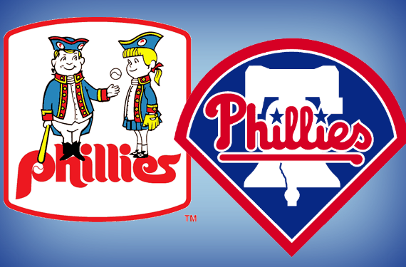
The Phillies current logos were designed in conjunction with Major League Baseball, and feature a custom typeface that the Phillies call Scriptwurst. (This name is the greatest thing ever, as it combines baseball, typography, and encased processed meat. What else do you need in life?)


That said, the Phillies’ current look replaced an identity that had lasted 22 seasons, the classic and still-beloved burgundy and powder blue worn by the likes of Steve Carlton, Mike Schmidt, and Tug McGraw. (On a personal note, I’m obliged to mention that this is the logo that I grew up with in the Philadelphia suburbs as a diehard Phillies fan.)
“We won our first World Series in that uniform,” Brandreth said, “so that color pattern, the burgundy and the powder blue, is still very, very popular, especially with merchandise. You use the old P, you use the old Phillies script, you do something in burgundy, and it’s still very popular.”
The Phillies are planning a throwback night in June of next season in which they’ll wear uniforms from 1976. One problem in throwing back to that old identity is that there’s something of a lack of consistency with the colors associated with it.
“It was confusing in the ‘70s, whether our hats were red or were they burgundy? Were the helmets red or were they burgundy?” Brandreth said. “They were actually more red. Everyone remembers it as burgundy. The pinstripes were our current red until ’83 or ’84 and then they became burgundy.”
The date for that throwback game next season has not been finalized yet, Brandreth said, but one possible matchup would be against the Milwaukee Brewers, who have some pretty sweet throwbacks of their own.

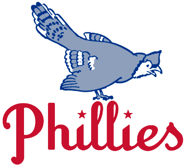 Over the decades, the history of Phillies logos, especially their cap logos, is not extremely varied. It’s essentially a series of the letter P in different styles. They did have a brief flirtation with a logo that featured a blue jay in 1944 and 1945 and even wore a sleeve patch with a blue jay logo, but they never officially adopted the name.
The historical consistency in the team’s name and logo is reflected in the team’s current logo set and uniforms. While some Major League teams, like the Diamondbacks and Padres, have been expanding their color palette options and pushing the envelope with uniform designs, the Phillies have kept it simple.
“I like the traditional look that we have,” Brandreth said. “You can get as fancy as you want to get in design and fashion for the store and all that, but on the field itself, it should be more traditional.”
While the Phillies’ logo and their current branding are not likely to change any time soon, the possibility exists that they’ll add an alternate logo some day. “I think we will probably look into that, since it’s really just the P, the primary, and the Phillies script,” Brandreth said. “There may be something alternate there, maybe that includes ‘Philadelphia.’”
If the team had been founded today instead of 1883, a name with as simple an origin story as “Phillies” would never have survived its first focus group. But with more than 130 years under their belt in a city steeped in history and tradition, the Phillies have one of the most well-established brands out there.
Related stories:
 World Series Patches Returning to Astros, Phillies Jerseys for 2022
  New York Knicks Dump Throwback Uniforms Plus A Look Back at Other Scrapped Sets
  Phillies, Red Sox Wearing 1915 Caps Tonight
  Pics: Phillies and Reds Turn Back to 1991
  Camo Caps to be worn by all MLB Teams, Full Gallery Here
  Photos from St Patricks Day 2012
  Top o’the Logo to You
  Philadelphia Phillies 2009 Phantom World Champions Merchandise