
The Toronto Maple Leafs are getting a new logo?
Sacrilege!
I mean… how could they do that?! An “Original 6” team should never change their logo!
Woah, woah, woah… woah. Let’s simmer down now, folks. This has happens far more often than you think.
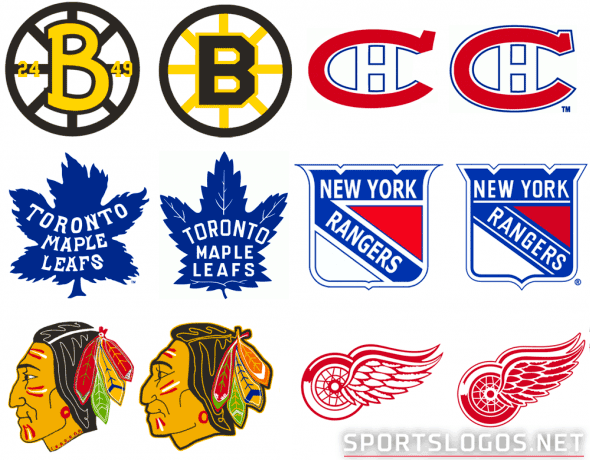
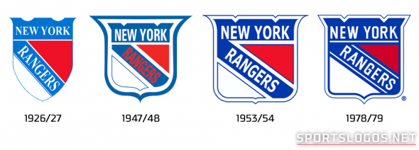
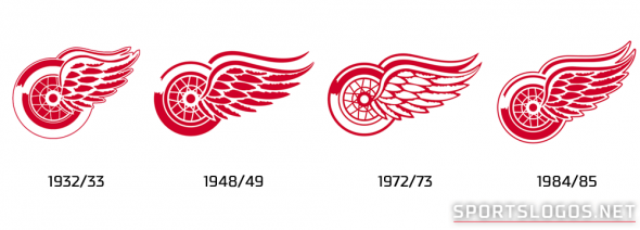
When it comes to the “Original 6” teams — the Boston Bruins, Chicago Blackhawks, Detroit Red Wings, Montreal Canadiens, New York Rangers, and the Toronto Maple Leafs, yes, the *basic idea* of their look has remained the same since the first half of the previous century. The Rangers have had a diagonal wordmark on-and-off since the 1920s, the Red Wings “winged wheel” the 1930s, Boston’s “Hubcap B” since the 1940s, the Blackhawks the Native American head the 1950s, while the Canadiens general look has been in use over 100 years, a “C” on a blue horizontal striped red jersey has been worn by the club since 1912.
But all of those teams listed above, Maple Leafs included, have made logo and uniforms changes in the decades since. Several times, in fact! Heck, even the Montreal Canadiens changed their uniforms this year, their fans *loved* it!
Take a look at side-by-sides showing some of the earlier team logos with what those same “untouchable” clubs use now:

Sure, the changes are fairly subtle…

In some cases, anyways.

But they are changes nonetheless.

Some have said, “you don’t mess with tradition”
But by not allowing your logo, classic as it may be, to evolve appropriately with the times…
You are effectively messing with tradition.
No, we have not been able to confirm to what scale the changes to this new Maple Leafs logo will be; in my article yesterday I used the term “entirely new” and some folks really ran with that idea. The assumption was that I meant we’re seeing something wild and crazy from the club next year. Nope. That’s not at all what I meant… but I see how it could have been interpreted that way. I simply meant it *won’t* be a tiny change that nobody but us detail-obsessed design geeks would notice; for example see: Dodgers 2011, Vikings 2013, and Browns 2015… these are tiny changes most nobody notices. So while I haven’t actually seen the new look, it’s probably going to continue to be a simple, stylized blue leaf on a white jersey; just how that leaf is designed and how the wordmark is applied are the real questions… merely another step in the process we see above.
So let’s stop worrying so much, eh? There’s some smart fellas in charge of the Leafs these days – Brendan Shanahan and Lou Lamoriello to name a few in that front office… these guys come from heavy-tradition-focused backgrounds, Shanahan spending most of his playing days in Detroit, and Lou in/famously refusing to allow the Devils to change much at all (or even add a third jersey!) during his time in New Jersey.
These supposedly untouchable “Original 6” clubs change their look all the time, there’s nothing wrong with that… just as long as each iteration retains the basic idea or concept of what the club has used throughout the decades that’s a-ok with this Leafs, logo, and a fan of traditional designs.
Personally, I’m really looking forward to this!
Related stories:
 Our Talk with Adidas about the NHL Digital 6 Uniform Project
  Opening Night 2016-17 NHL Team Logo Power Rankings
  Top Selling NHL Player Jerseys of 2015
  New York Rangers Phantom Stanley Cup Champs
  The 7 Best-Dressed Stanley Cup Finals of the Past 25 Years
  Leafs, Red Wings Unveil 2014 Winter Classic Jerseys
  Red vs Blue at Winter Classic? Leafs, Wings Jerseys Spotted
  The Logocast Presents NHL Power Rankings