

In case you may have missed it, the offseason is officially over for Major League Soccer, as the teams in our domestic soccer league have begun preseason work and are getting ready for the season to kick off in March. Now, normally MLS would celebrate the upcoming season by having a special week near the end of the preseason known as “Jersey Week.” I don’t know for sure if this is still going on, but we’re in January and two teams have already officially unveiled their new home kits for the upcoming season.
First, Real Salt Lake unveiled their new home kits over the weekend and for RSL, it’s a return to a simpler kit design after their past two had some special idiosyncrasies about them — what with the detailed yellow stripe on their previous home kit and one sleeve being blue on the one before that. It’s a look that reminds me of what the Spanish national team would wear. Considering that this club’s managed to ham-handedly shoehorn the Spanish term of “Real” into their name, I think that they nailed it here when it came to the kits.


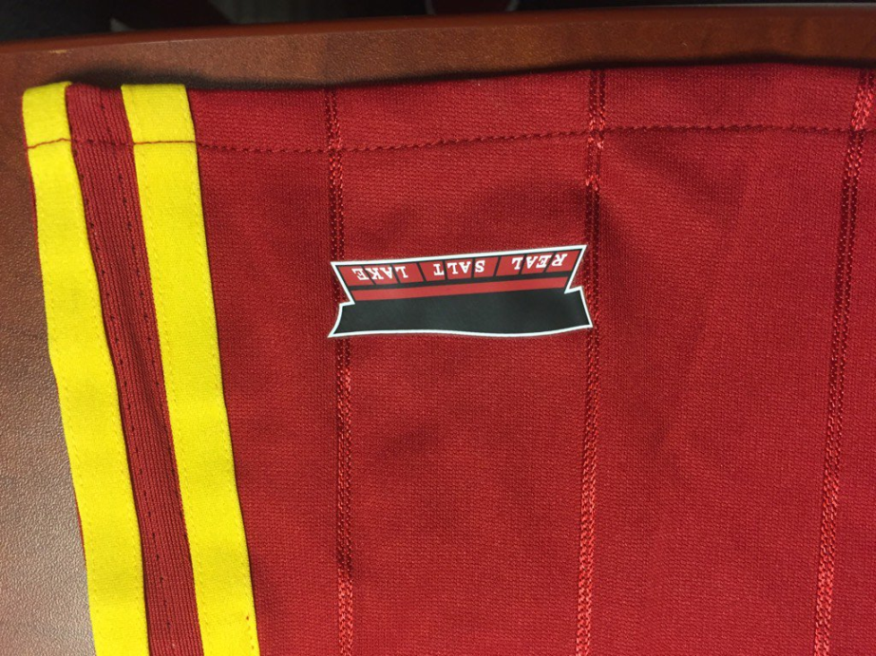
MLS and adidas always seem to get creative when it comes to jock tags, and for RSL, things are no different. If you look at the jock tag from an upside down angle, apparently it’s meant to invoke an image of Rio Tinto Stadium, which the team and fans have affectionately nicknamed “The RioT.”
Meanwhile, the Chicago Fire unveiled their home kit for 2016 as well, and it’s similar to Real Salt Lake’s in that it’s another return to a simpler look, and it’s also a return to tradition as well. When the Fire first broke into the league as an expansion team in the late ’90s, the team did so wearing red kits with a white stripe across the chest. They got away from that look in recent years, but they’ll be returning to it for 2016, at least.


The look also includes small firefighter’s axes on the back of the collar and the jock tag is an embossed, sublimated version of Chicago’s iconic city flag.

What both of these kits have in common is the fact that the traditional Adidas three stripes have been moved from the shoulder to the sides of the jersey. This is getting to be increasingly common with Adidas kits in 2016, which means that you should probably expect to see this become the norm for any other Adidas kits we see released for this upcoming season. So keep an eye out for that, since it’ll take a little bit of adjusting to see the three stripes absent from the shoulders.
But what do you all think of the new kits so far? Which one is your favorite from the two that were recently unveiled?
Related stories:
 MLS Renews Calls to End Plastic Waste With Return of Parley Kits
  2023 Football Kit Preview: Major League Soccer
  Adidas, Major League Soccer Extend Contract Until 2030
  8 More Major League Soccer Kits For 2023 Unveiled on Thursday
  Another MLS Leak: Photos of Real Salt Lake Secondary Kit Show Up on Twitter
  2022 Football Kit Preview: Major League Soccer
  MLS 2021: What’s New in Kits and Logos