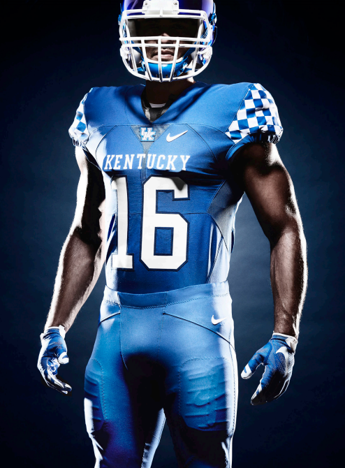
The Kentucky Wildcats have once again updated their identity, but this time we’ve got a major update on their hands. Not only have they given their UK logo another facelift (and this time it’s way more obvious than their previous tweak), they’ve also added a new secondary logo, and new football uniforms to boot.
First, let’s take a look at the new logo. This isn’t a major departure from what they’ve had since the mid-1990s, so there won’t be too much of an adjustment period when it comes to their new primary logo. Here’s an explanation from Kentucky in their press release:
The centerpiece of UK Athletics’ graphic identity remains the interlocking UK logo. The most recent iteration of the globally recognizable logo has been in use across all UK sports since 2005. It has been revitalized using consistent and practical geometry to bring balance to the mark in size and scale and improve the interlocking relationship between the “U” and the “K.”
Meanwhile, there’s also a brand new secondary logo. This logo will immediately be used by the basketball team on their shooting shirts, which willmake them the first athletic team at Kentucky to actually wear any part of the new logo identity.
I have to say, it bares a striking resemblance to Texas State’s primary athletic logo. That might just be my opinion, though.
To cap it all off, Kentucky decided to unveil new uniforms for the football team. The uniforms are relatively simple when compared to what you’ll see across the landscape of college football: A blue home uniform, a white road uniform, and an anthracite/gray alternate (because this is college football and everybody needs at least some element of gray in their uniform set). There’s also a white helmet, which you can take a look at here.
In my opinion, the most interesting element to take a look at is the checkerboard design on the sleeves. They’re continuing to embrace that particular part of their identity, and it’s definitely a nice addition to their uniforms. It’s unique, but not too crazy.
Overall, it’s not a bad update for Kentucky. The new primary logo looks cleaner, and while the jury may still be out on the secondary logo and whether or not it’s too similar to Texas State’s logo, it’s not bad at all. What do you think? Good move for Kentucky?
For a look at their logo slick, click here.
For a look at their photo gallery, click here.


