
Imagine you’re a logo designer and you’ve been tasked with creating a brand for a minor league baseball team. You’re free to let the creativity flow, but you have a few constraints to consider: The team plays in a town called Casper, so the team is going to be called the Ghosts, only it can’t be Casper the Friendly Ghost because that’s trademarked. They play in a cowboy town, so the logo has to have a western feel and be kind-of badass. The brand has to break new ground, push the envelope, and put this town of 55,000 people (the second-largest in Wyoming!) on the map.
Also, the client really likes Aboriginal art, so work that in there.
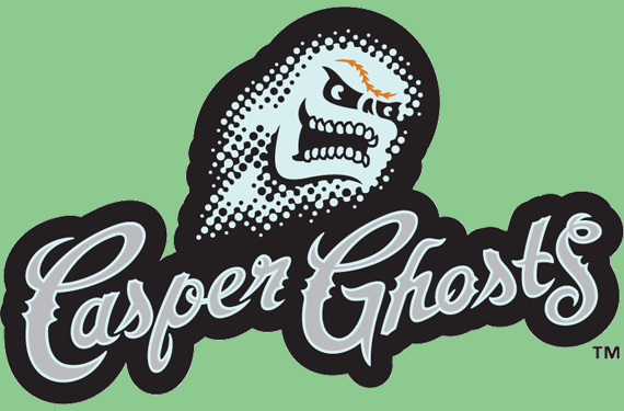
 It was with this in mind in 2006 that Plan B Branding—now Brandiose—set about creating an identity for the Casper Ghosts, rookie-league affiliate of the Colorado Rockies. They had been the Casper Rockies since moving to Wyoming in 2001, but the team’s CEO Kevin Haughian had a bigger, bolder vision.
As Brandiose’s Jason Klein tells it, Haughian approached the design firm with this message: “I really just want something that’s out there, that’s never been done before, that really breaks the mold, gets people talking.”
The project would take two years, the longest Brandiose has spent on a single identity, according to Klein. It would result in a logo that is well-known for being the first on-field glow-in-the-dark cap in professional baseball, but less well-known for being inspired by indigenous artwork from the other side of the world.

“He was really into Aboriginal art,” Klein said of Haughian. “He said, I want to see if we can create a ghost character out of Aboriginal art. At first, our thought was all these dots are going to make things really difficult because Aboriginal art is mostly made of dots. How are we going to embroider all this?”
Klein and his Brandiose partner Casey White turned to a 19th-century printing process developed by artist and printer Benjamin H. Day Jr.—a process popularized in paintings by pop artist Roy Lichtenstein in the 1960s.

 “We started looking at Ben-Day dots, how dots connect,” Klein said. “Could we create a logo where the thread continues from dot to dot that wasn’t just separate dots on a cap?”
It took a lot of back and forth between the team and the design firm getting sizes and shapes to work correctly, but dots became an integral part of the logo. With Aboriginal art and the Ben-Day printing process being such important influence in the design process in this already-unique identity, you can’t help but wonder how many fans knew where those dots in the logo came from.
“Probably zero,” Klein said. “I don’t think it was even in the press release. That’s one of those unique examples where every designer has some sort of reference that maybe the world never is privy to, yet inspires something unique.”
Of course, with the Ghosts playing in a small Wyoming cowboy town, there was no lack of inspiration for concepts. The Brandiose guys found a way to put themselves in a ghostly, western mood—”We listened to Ghost Riders in the Sky, that song, over and over and over,” Klein said. With Johnny Cash ringing in their heads, they set to work.

Early concepts included a ghost bat (which looks to me like a possessed version of a Lowell Spinners logo that would come later) and an eery cowboy, among others.


A visit to Casper’s Wonder Bar inspired concepts that combined ghosts and cows.

“Casey and I were really, really into this skull … and less into the Ben-Day dots because it was so abstract,” Klein said. “Looking back, whether fans would have loved one or the other, or if the skull would have given the team as much publicity, we’ll never know.”

One part of the identity where the western feel shined through was with the script, which accomplished two tasks at once. “I really feel it was cowboy and ghostly at the same time,” Klein said. “It just had a ghost town feeling to it.”
 In the ephemeral world of minor league baseball, nothing is constant, and four seasons after their debut, the Ghosts vanished. After the 2011 season, the team left Casper for Colorado’s western slope and became the Grand Junction Rockies. This is a shame not only because it’s boring when minor league teams adopt their parent clubs’ identity, but Grand Junction Ghosts would have been a perfectly good team name. Minor league teams have based their identities on less than simple alliteration, and sticking with an established identity in a new town is certainly valid.
That said, Klein has no regrets.
“I’m glad that we were able to create something that made history,” he said. “It was a very cool little design experiment that we were able to do, where someone pushed us in trying something new from an artistic perspective. I think that was really cool to be a part of that.”

 The Ghosts’ claim to fame is that they were the first team to wear a glow-in-the-dark logo on their cap—something that’s been in the news recently with the Columbia Fireflies unveiling glow-in-the-dark caps—but the story behind the Ghosts’ brand goes a lot deeper than that one factoid. The number and variety of influences on this identity are surprising, to say the least.
And it’s probably for the best that Casper the Friendly Ghost was not an option for the logo, because research reveals that he was not much of a ballplayer.
Related stories:
 Grand Junction Rockies rebrand as Jackalopes
  Pioneer League’s Glacier Range Riders pay homage to National Park
  Pioneer Baseball League introduces new branding for new era
  Truly Trippy: The Story Behind the Great Falls Voyagers
  The Logocast Episode 25 – Brandiose
  A minor league logo tour of the U.S.A